
Yandex Games
2024-2025, Product Design
Yandex is an IT giant that unites a huge set of different teams and companies. Currently, about 20 thousand people work at Yandex. I worked in the international projects department, at Yandex Games.
Yandex Games is a catalog of online web games. In addition to Yandex Games, we also operate several international gaming platforms. Web games are actively evolving — both capabilities and quality are growing.
The product’s total MAU is about 90M users from different countries. The product is free. Monetization comes from ads and in-app purchases. The main product is B2C, but there is also a B2B side through our interaction with game developers.

Intro
How we work
We had 3 product designers and 3 product managers. Designer + manager pairs worked in different directions. My main focus was game discovery. This includes working with recommendations, game presentation formats in the catalog, categories, and tags, the game page, and the first steps of gameplay.
Below, I’ll describe the three main areas I worked on. Experiments with game previews and catalog diversity relate to discovery. Growing in-app purchases is a separate product strategy where I also worked on the discovery stage.
Case. I
Game Preview
As part of our work on discovery, one of our first questions was: how do we help people get to know a game in the most convenient and effective way?
Analytics showed that we had a huge number of micro-sessions under one minute. This means a large portion of users explores new games by directly trying to play them.
User research showed that people mostly choose games based on the image and the gameplay snippet we show on hover over the game card.
Overall, this is not a problem — and as we’ll see later, it’s even beneficial for the business, because every such game launch is accompanied by an ad impression. However, games load quite slowly. Having to wait for the loading each time just to be disappointed is a bad experience. And strong, high-quality long sessions improve retention — which is far more valuable in the long run than short-term gains from micro-sessions.
We tried to solve this problem with a project internally called the “Middle Layer.” In practice, it was a way of presenting a game to users in different formats.
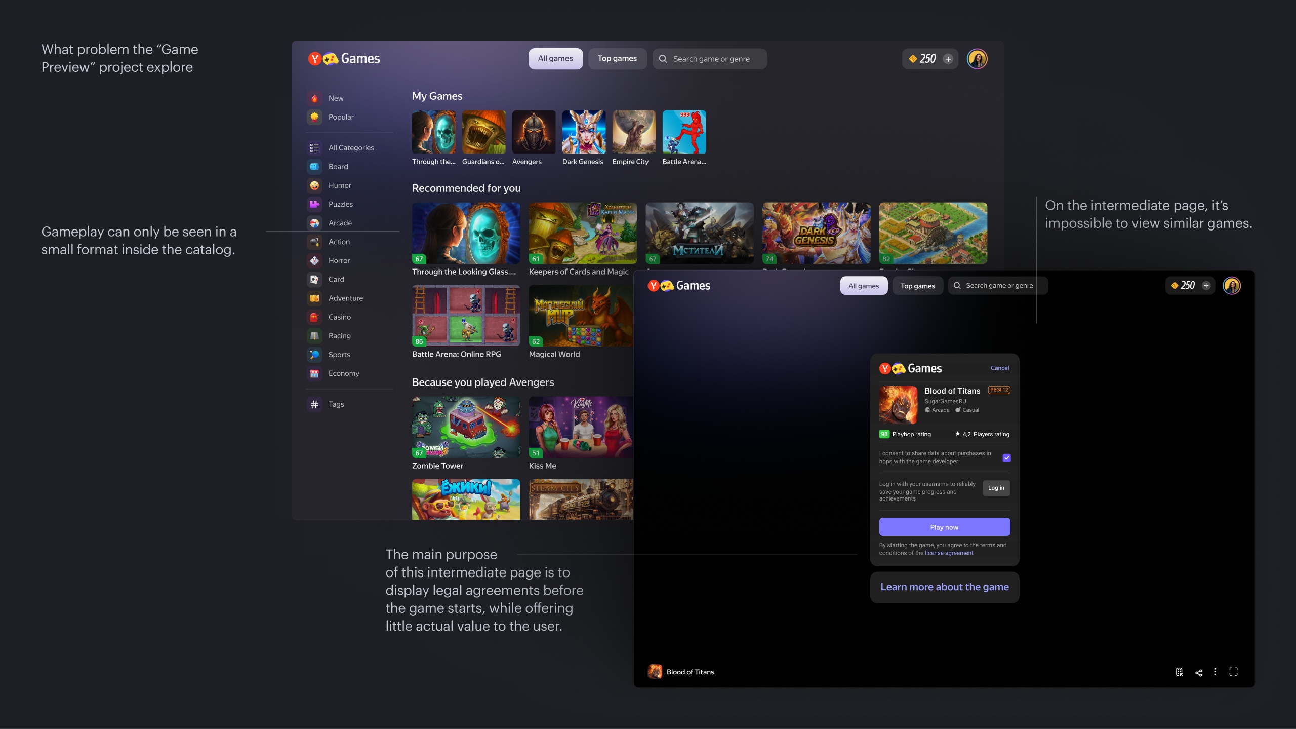
What problem the “Game Preview” project explore
Below, I’ll describe several hypotheses and experiments we ran. Early in the project, we decided to explore multiple directions at once so we could later compare their effects.
I’ll summarize the results briefly, but within each experiment we tested different sub-variants — usually 2–4 options. Some experiments were repeated several times with small iterations.
In this overview, I’ll also mention a few key metrics. However, when analyzing experiments, we evaluated the overall impact across various product and business metrics correlated with the hypothesis: retention, average gameplay time, time-to-play, effects on catalog performance, and other analytics calculations specific to each experiment.
Hypothesis 1
If we provide users with a large gameplay video and all essential information in one click, without forcing them to navigate away from the catalog, we will increase both conversion to gameplay and high-quality sessions (10+ minutes) by simplifying and improving the selection process.
Solution
Create an inline expansion inside the catalog that shows all basic game details on click. To save resources, we decided to test only the horizontal version.
Result
Short and medium sessions dropped sharply by 13–15%, while long sessions did not grow as expected — they stayed roughly the same. Total time spent in games did not increase. Conversion to gameplay decreased by 4%. The experiment was closed in favor of the control group.
Interpretation
People did become more deliberate in choosing games, but because our main catalog consists of simple games, we unintentionally made the selection process more complicated. Users spent more time choosing and watching, and less time trying to play.
From a UX perspective, this could be seen as a positive — fewer unsuccessful gameplay attempts (fewer short sessions). But from a business perspective, we were hurting a large number of revenue metrics, since gameplay is directly tied to ad impressions.
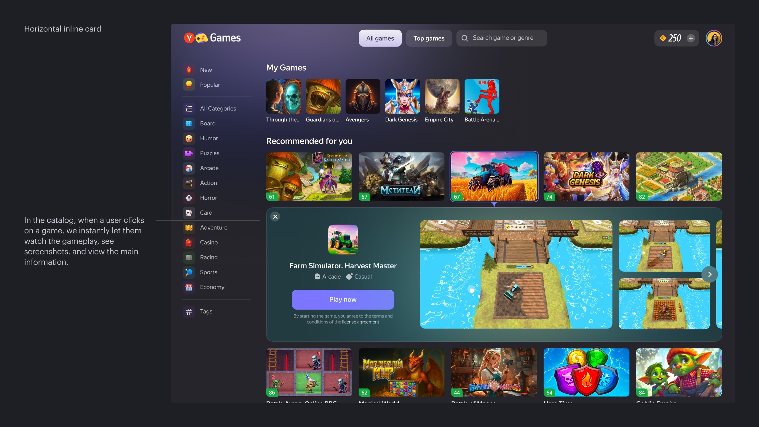
Inline cards
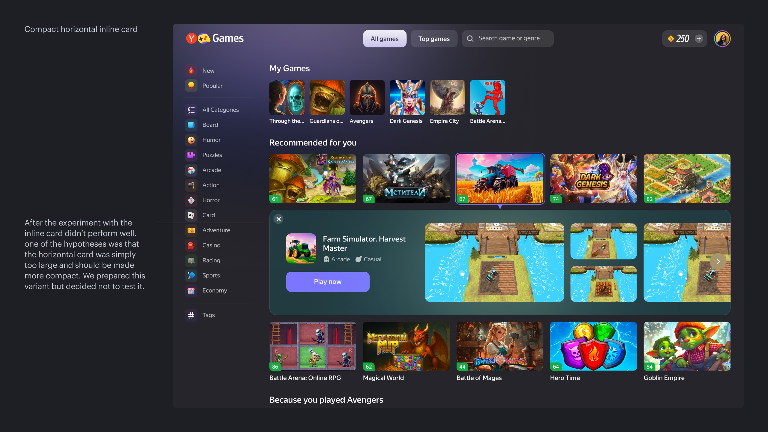
Hypothesis 2
If the inline card is too aggressive a format and radically changes the grid and user behavior on the page, then maybe we can keep showing gameplay but in a more compact way. This could help balance the drop in short sessions with an increase in time spent in long ones, while also avoiding such a dramatic decrease in conversion and, as a result, cushioning the revenue decline.
Solution
Show a compact game block on hover
Result
This solution was more successful. The number of short and medium sessions went down, and long sessions remained unchanged. As expected, conversion to gameplay dropped by 2%. However, average gameplay time showed a statistically significant increase of 2%. The experiment was closed in favor of the control.
Interpretation
The effect was similar to the inline card. People clicked less on random games, but when they did choose a game, they tended to play longer on average. From a UX point of view, these are good signals, but business metrics were negative, as the increased time in-game couldn’t compensate for the decrease in the number of sessions.
We could have kept the experiment running longer to see its impact on retention. But since the solution turned out to be technically complex to maintain and evolve, the experiment was closed in favor of the control despite the positive result.

Compact game block on hover
Hypothesis 3
If we remove the intermediate guard screen and stop showing any information about the game at all, immediately starting gameplay instead, then the ability to try the game faster, without evaluating it by video, should help increase time spent and the number of high-quality sessions.
Solution
The simplest approach is to remove all unnecessary clicks. In our case, this came with legal complications, because the guard originally existed for a reason — among other things, it served as a consent page for legal details.
Result
As expected, the conversion to gameplay increased. But what we were hoping for did not happen: time spent did not grow. Moreover, user churn from the game page started to increase. As a result, the experiment was closed in favor of the control.
Interpretation
Our interpretation is as follows. Each game weighs from 5–10 up to 30–50 megabytes or more. And although developers try to optimize the size, it’s still significant.
The existing guard screen, despite being somewhat meaningless, artificially “shielded” users from the waiting experience. A person could read some information about the game while it was loading in the background. Now, the encounter with the loading screen happens immediately, and we as a service cannot speed up this process. To some extent, this also explains the failures of previous experiments, because users were facing the same issue there as well.
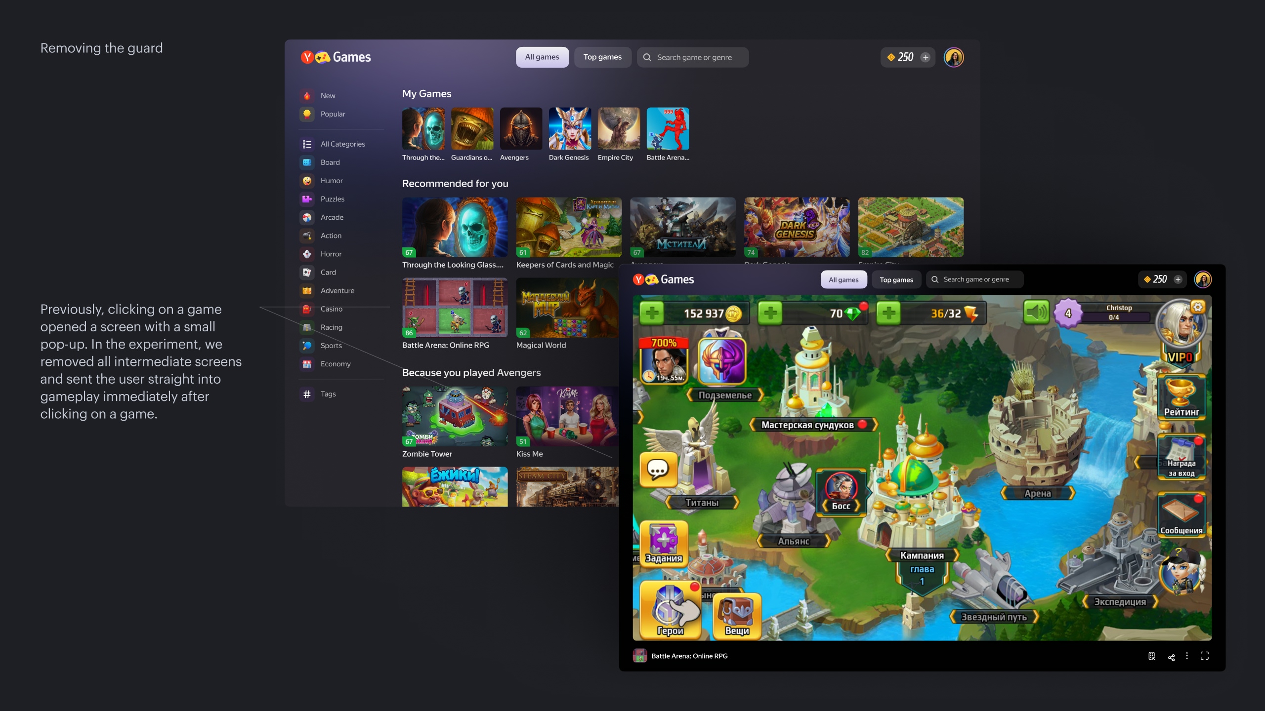
Removing the guard
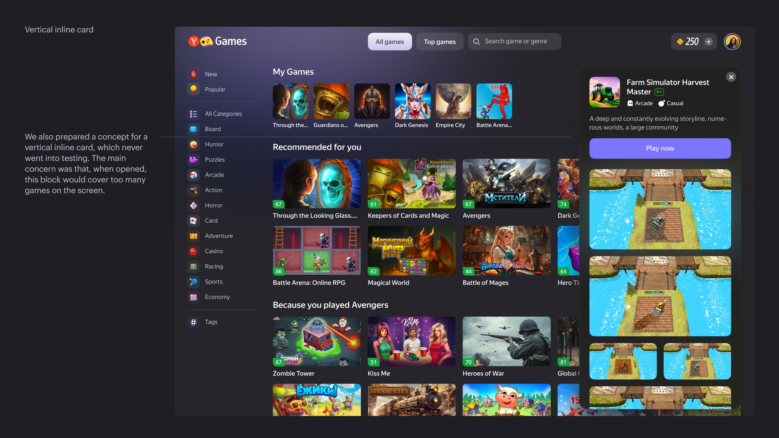
Hypothesis 4
If instead of the guard we create a regular game page with all the necessary information, it will be easier and more convenient for users to choose a game, because this format is more familiar to them. This should increase long sessions and overall time spent. As a bonus, it also solves the problem that we currently have two separate game pages: the guard and an SEO-focused game info page.
Solution
Replace the guard with a regular game page
Result
After the previous experiments, we didn’t expect that a new page would magically solve all our problems. And that’s exactly what happened. The short-, medium-, and long-session metrics reacted more or less the same way as in earlier experiments. Time spent grew slightly. However, we did not hurt business metrics, because on the game page we could show ads, unlike with other formats.
On top of that, this format could help us a lot strategically. A dedicated page gives us much more room for future experiments compared to small modal formats. So we decided to make it our primary approach and continue developing it.
The experiment was accepted.
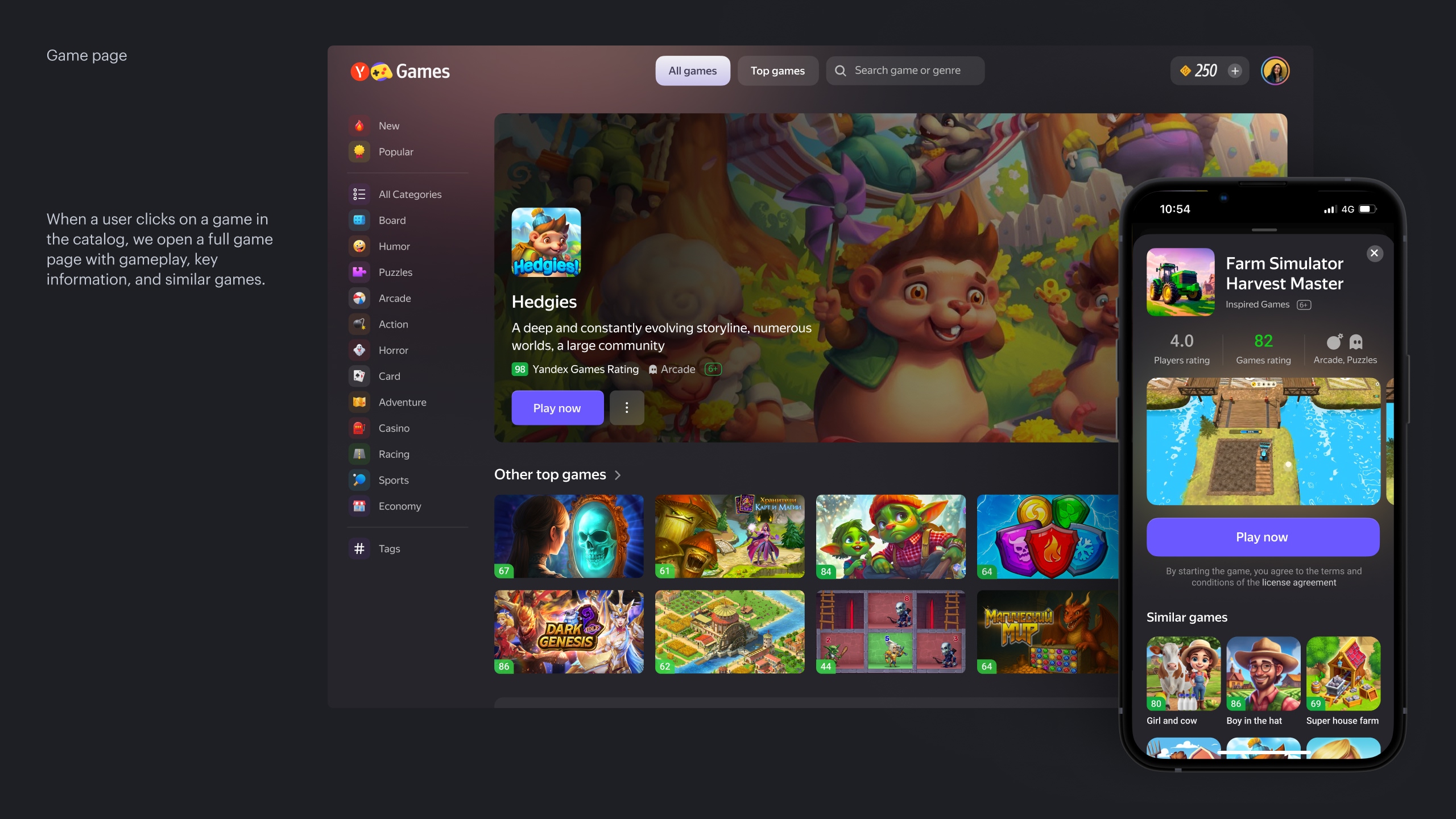
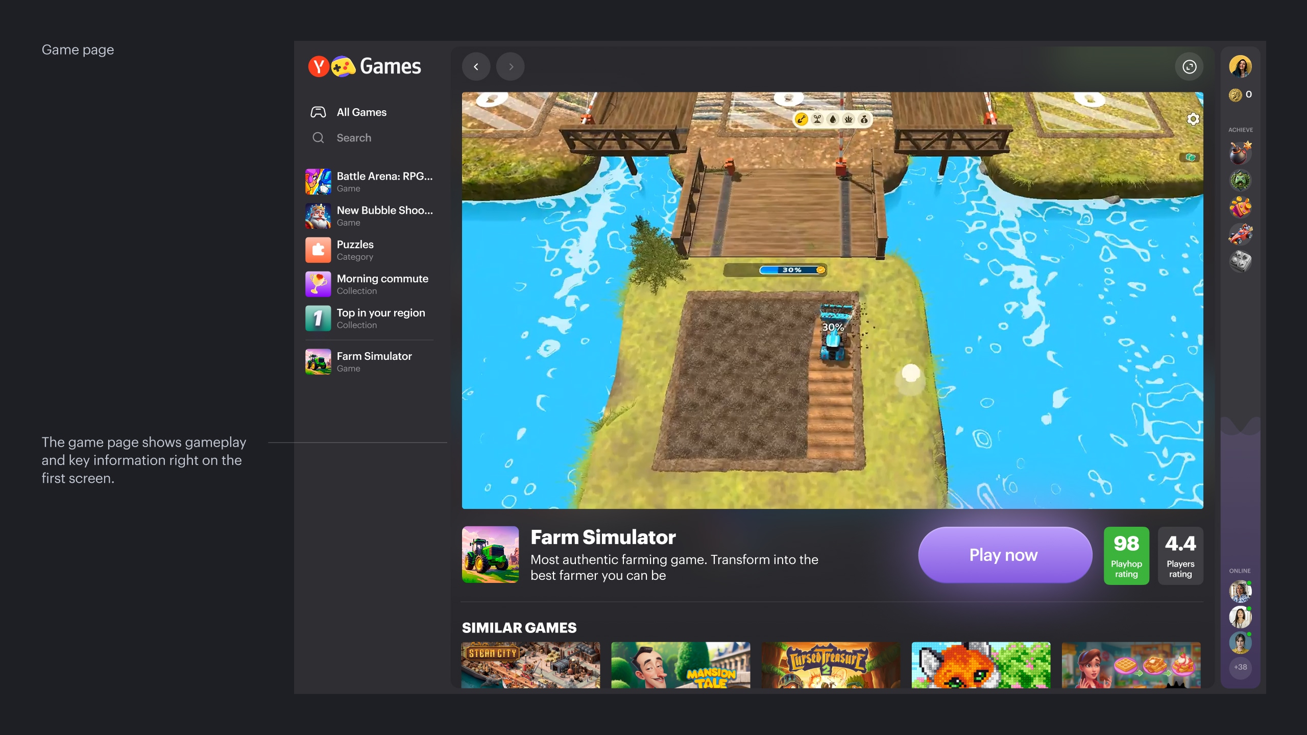
Game page
Case. II
Feed diversity
One of the goals of discovery was to use diverse collections in the catalog to help users find something interesting for themselves.
To do this, we needed to gradually narrow down the user’s choice to a limited set of “interesting” picks.
Work in this direction is still ongoing.
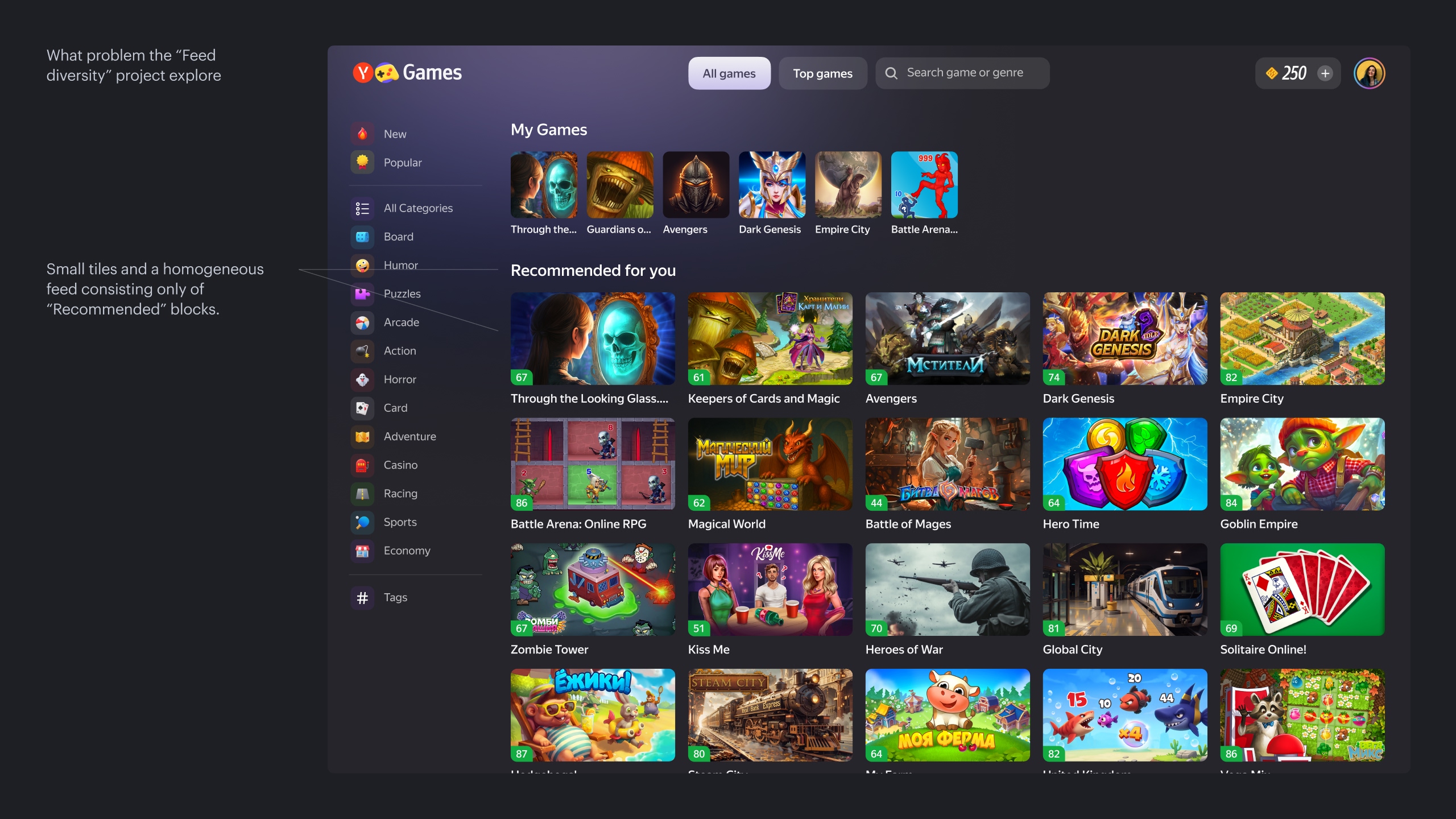
What problem the “Feed diversity” project explore
Problem 1
Users can only choose a game based on its cover, title, and a small gameplay video.
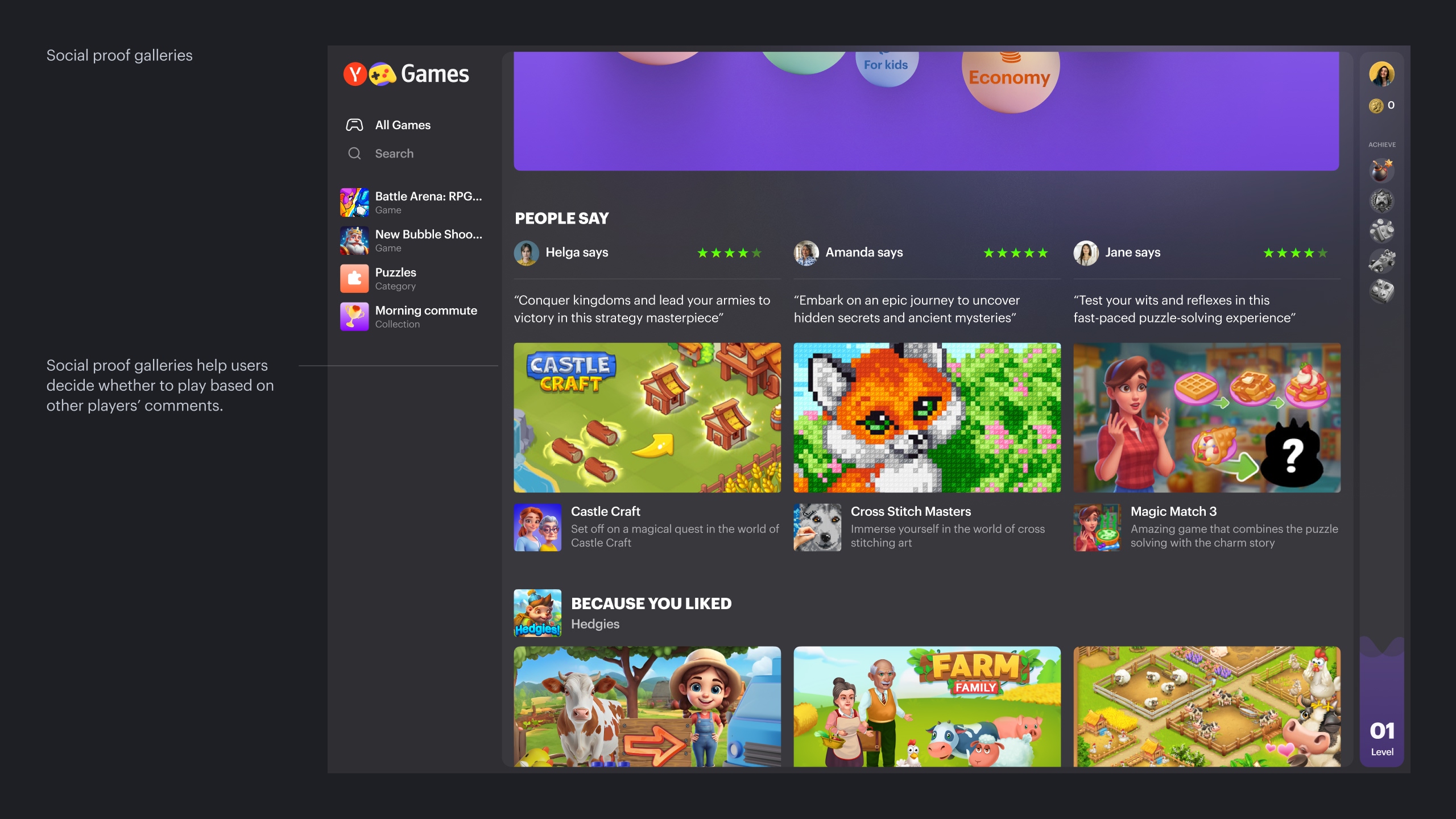
Solution
Instead of the current identical recommendation rows, we created a more diverse feed and added a game gallery with summarized user comments. This can simplify game selection for people who care about others’ opinions.
Result
Playtime per user increased by 4%, and total playtime grew by 1.15%.
Social proof gallery
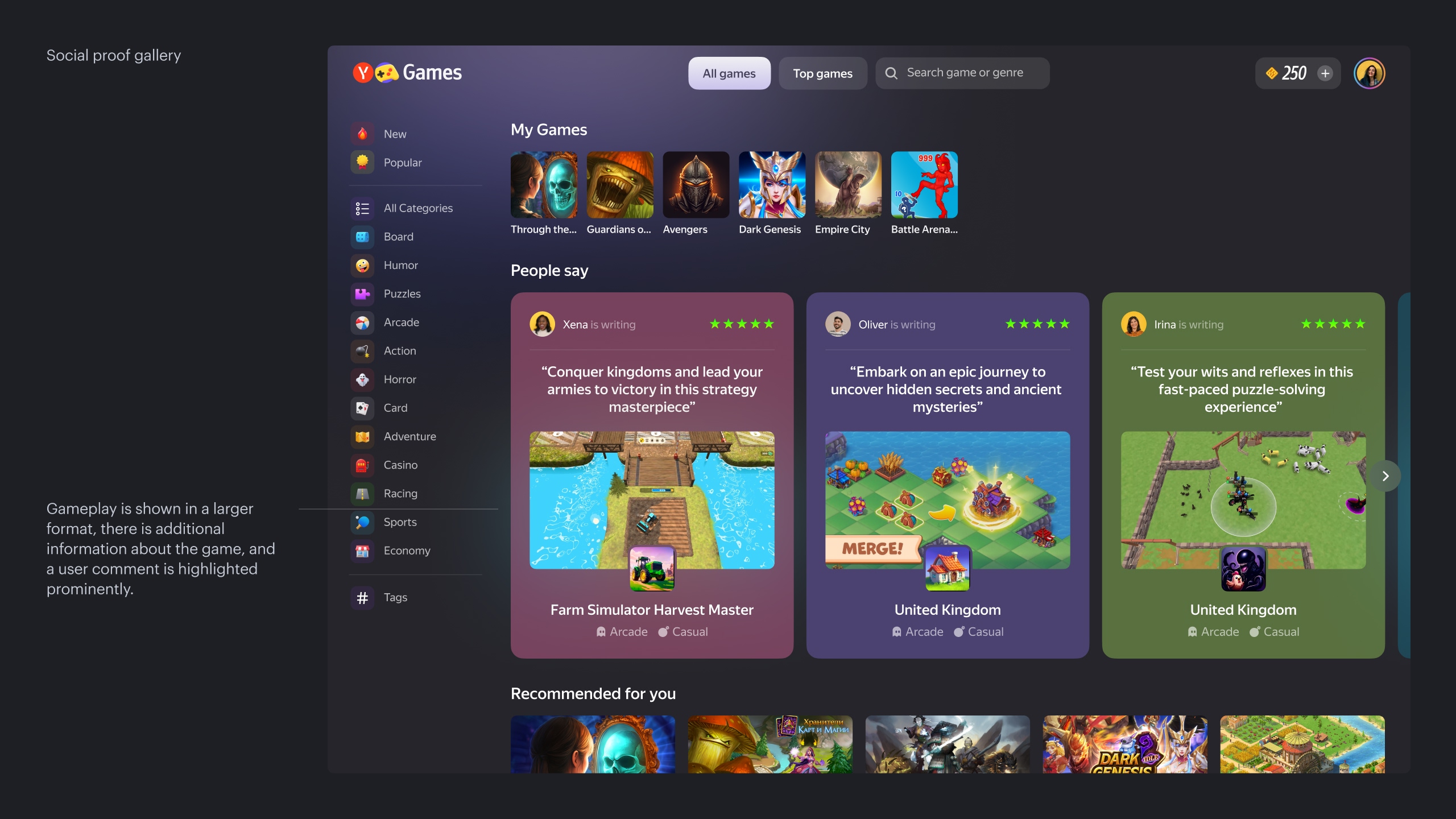
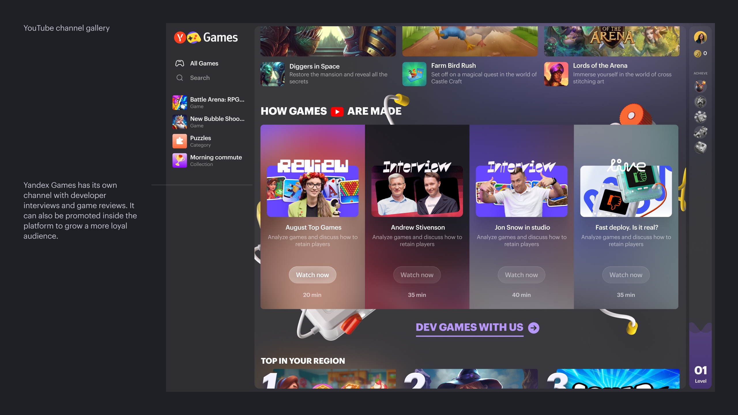
Problem 2
Users can only choose a game based on its cover, title, and a small gameplay video.
Solution
We created collections with large gameplay videos in different formats: vertical and horizontal. This lets users’ eyes “catch” on games and explore them more closely.
Result
Horizontal gallery: +0.91% playtime.

Shorts-like gallery
Problem 3
Current covers are very small — 6 per row and 12 per row on large screens. It’s hard to pick something interesting when the whole screen is filled with tiny images.
Solution
We increased the tile size to 4 and 8 items per row on standard and large screens, respectively.
Result
+1.4% playtime, +0.6% gaming days.
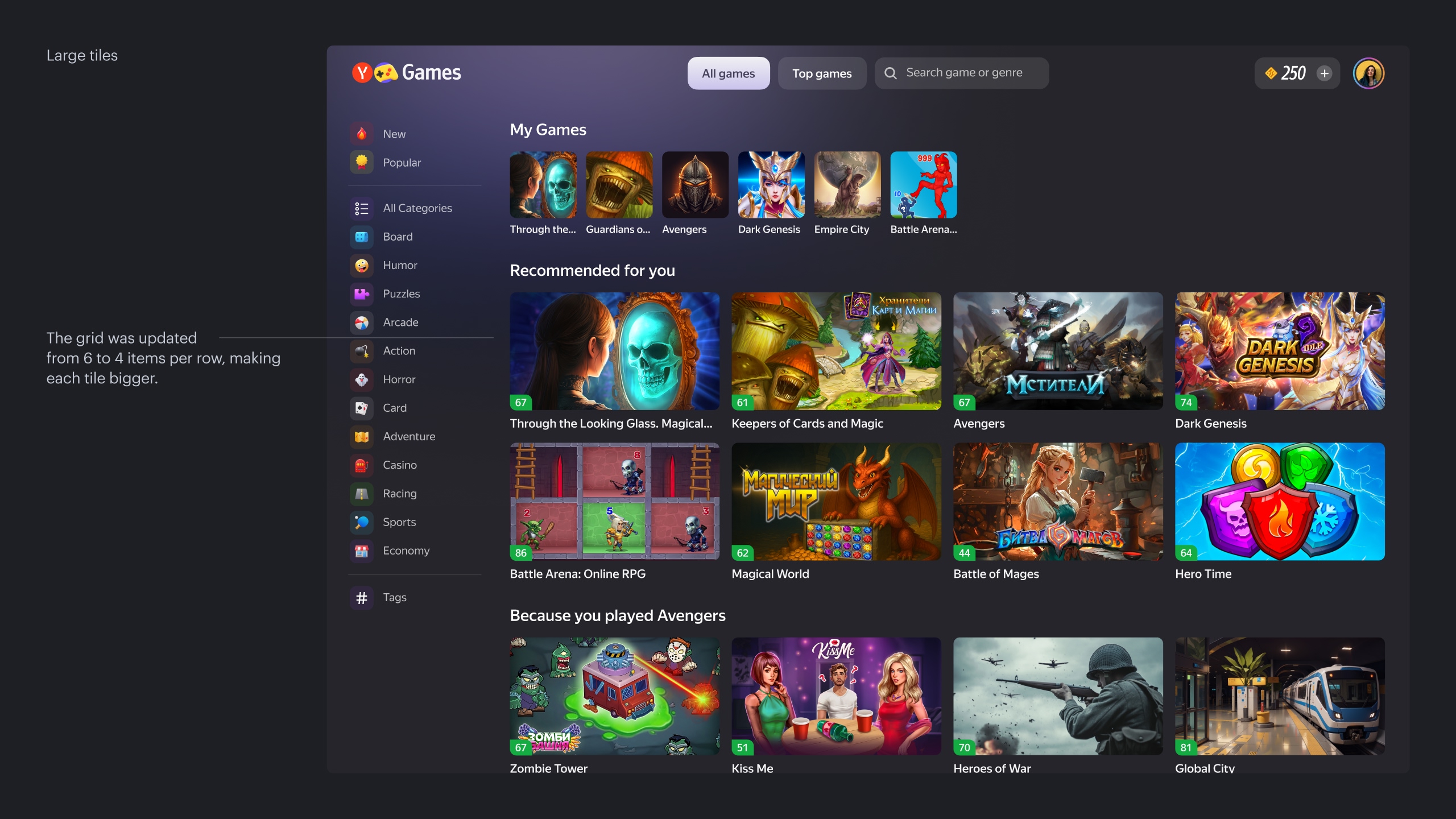
Large tiles
Problem 4
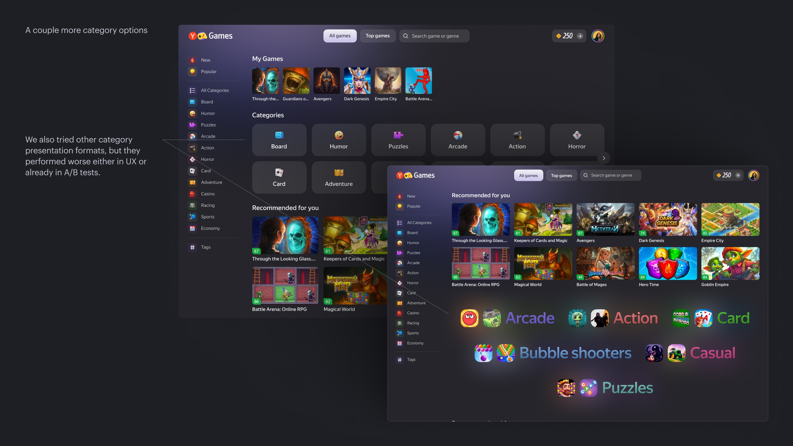
Categories are currently shown in the left-hand menu as a long, uniform list with names that are not always clear for new users.
Solution
We decided to highlight categories more prominently in the feed, showing them with example games and a short description of what these games are about.
Result
The experiment was not accepted. As expected, we strongly shifted traffic into categories — playtime from category pages grew by 40%. However, the category pages were not ready to convert users well, and the number of daily players decreased by 2%. Further experiments and improvements are needed.
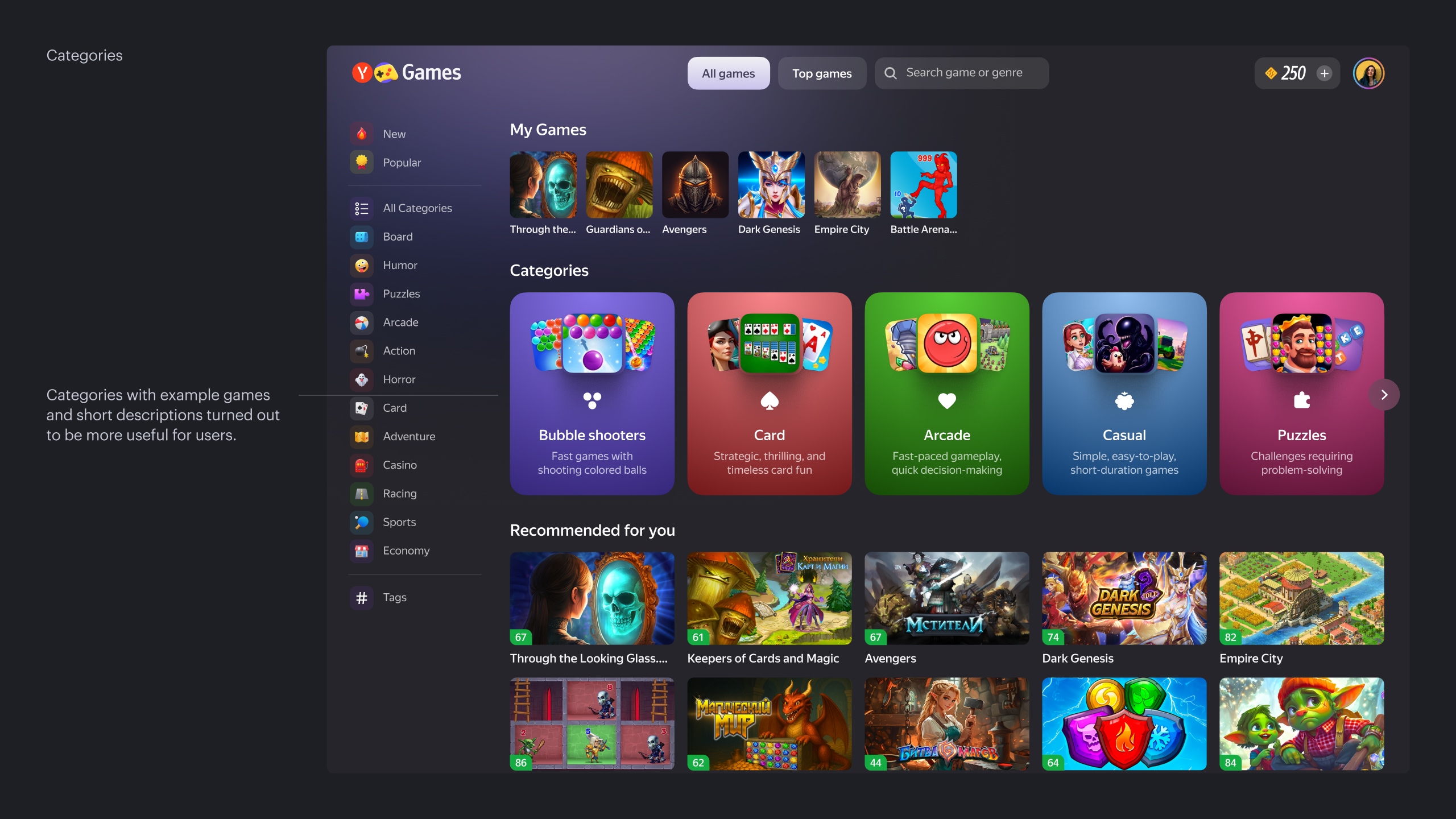
Categories
Problem 5
The first row can take up six rows of games. We need to test collections in the 2nd–3rd positions, but because the first collection is so tall, users won’t scroll down far enough to see the second one.
Solution
Split the collection into parts
Result
+1% daily players, +4% daily players for top games
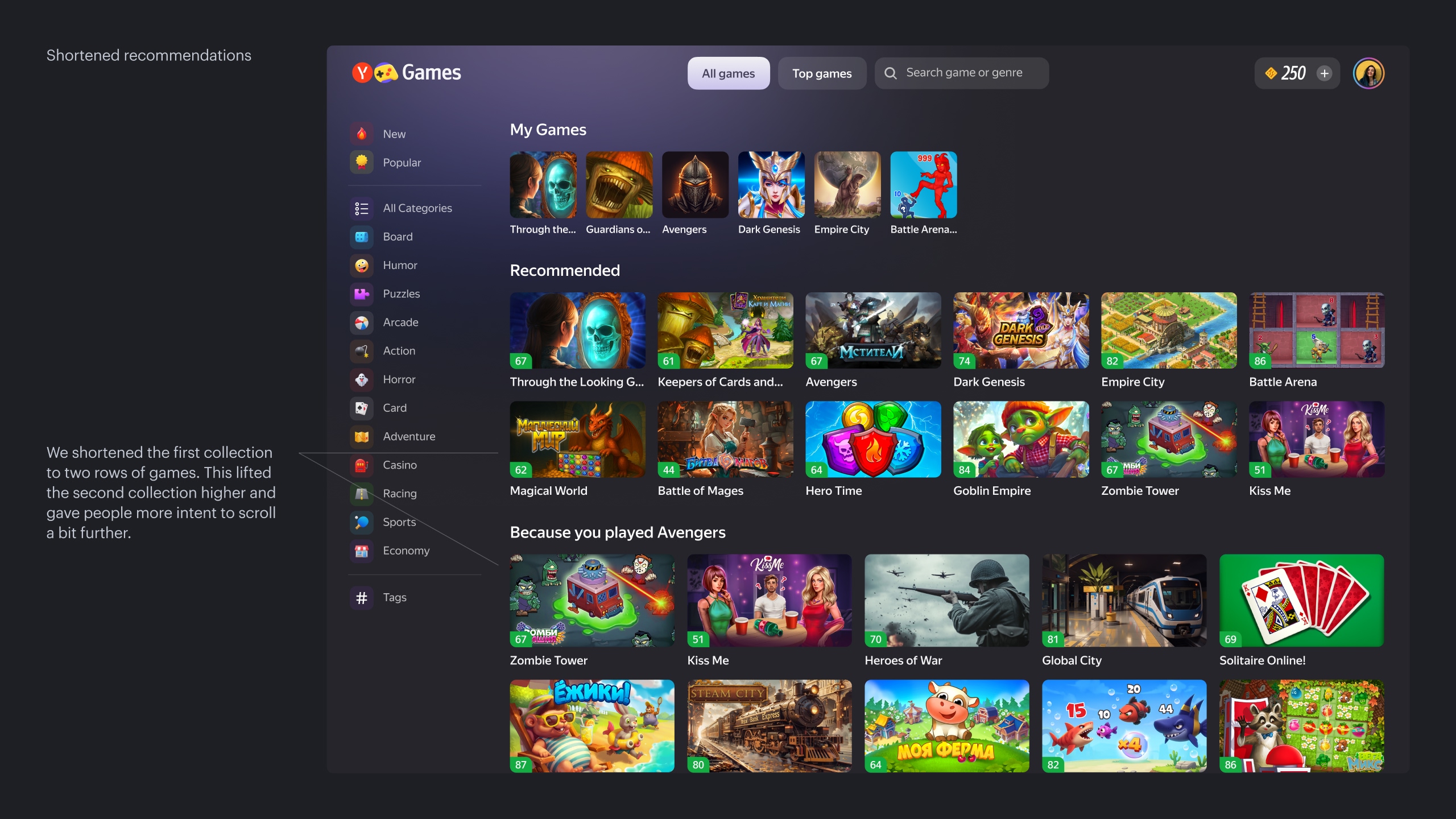

Shortened recommendations
Case. III
In-app growth
In our service, most revenue comes from ad monetization. However, ad revenue is highly dependent on the market and therefore unstable. That’s why we decided to grow in-app monetization. We defined three workstreams for this: in-app discovery, live ops, and monetization. We’re still at the beginning of this journey and haven’t yet run many experiments, but we already have some early results.
Problem 1
Previously, we hadn’t seriously worked in this direction, so there was no roadmap or analytics in place.
Solution
We started with a brainstorm to figure out how we could make in-app games more visible in the service, and which of their characteristics we could use to promote them. At the same time, we ran a visual exploration of what this could look like in the future.
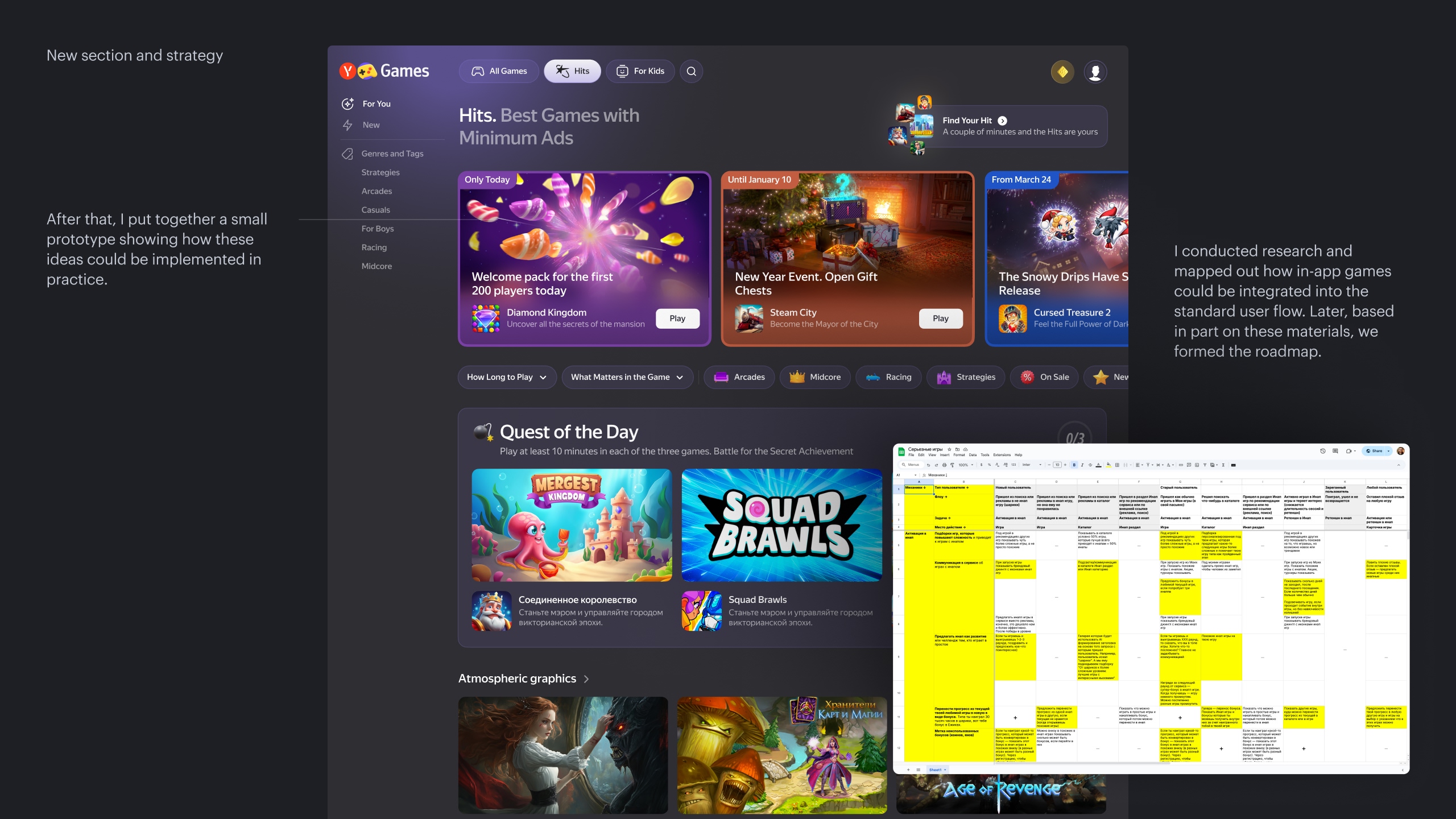
New section and strategy
Problem 2
To kick off the strategy, we needed simple and straightforward tools to drive traffic to in-app games.
Solution
Create an eye-catching block in the catalog
Result
+15% daily high-quality players in top catalog games (60+ seconds) and +20% on mobile. Total playtime also grew by +6% on desktop and +8% on mobile.
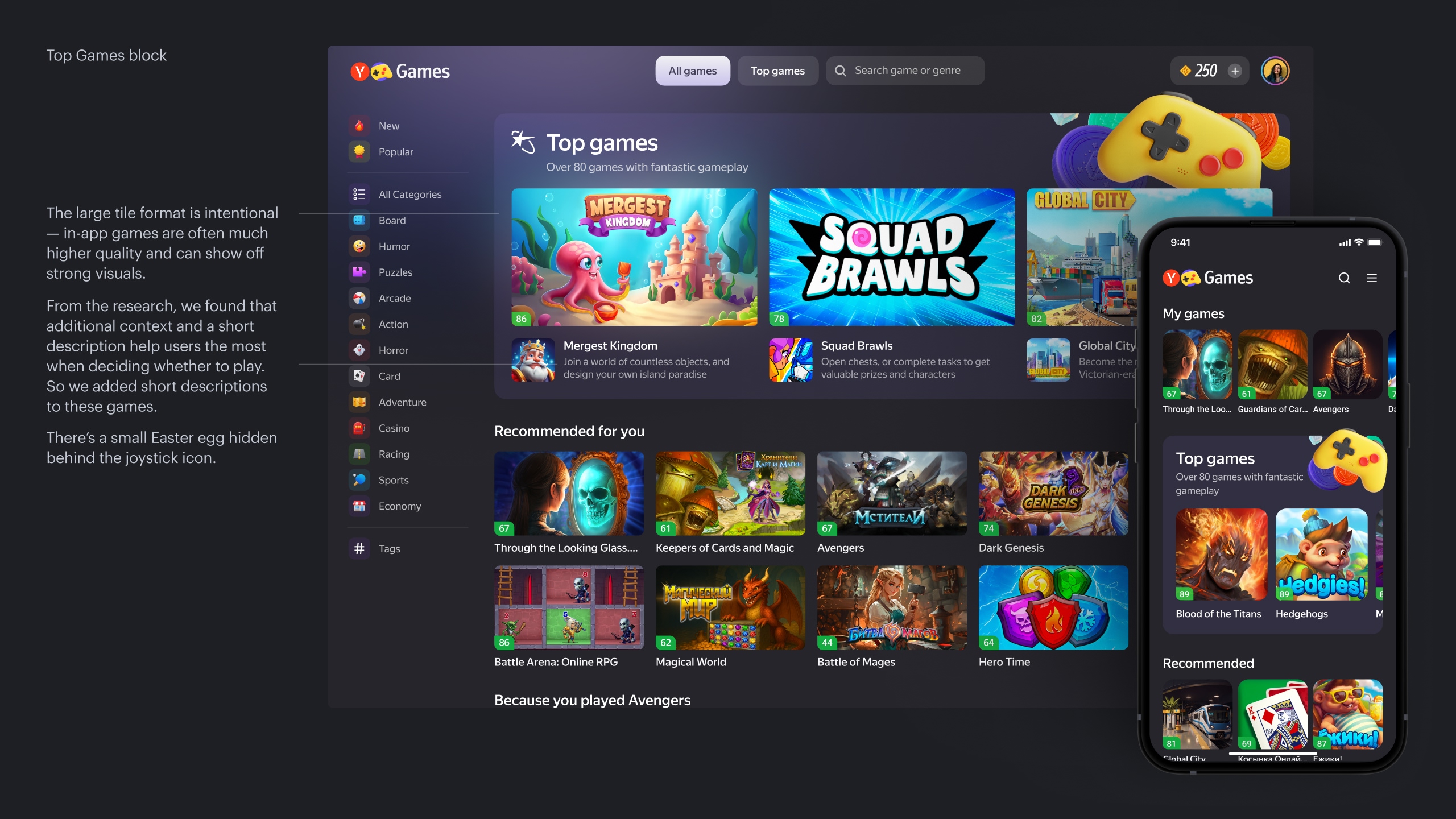
Top Games block
Problem 3
People don’t really like scrolling galleries left and right. While this pattern is familiar on mobile, it’s much less convenient on desktop.
Solution
Replace the gallery with an expandable list of games going downward
Result
Even though users opened the block more often than they scrolled the gallery, this actually led to a 6% drop in daily players for top games. The number of daily high-quality players in top games on desktop decreased by 2%. As a result, total playtime in top games fell by 7%. The experiment was closed in favor of the control, and we’re planning further iterations.
Interpretation
Our hypothesis is that the number of games in the expanded list is too large and pushes recommendation blocks too far down. Because of this, playtime from recommended blocks drops and is not compensated by playtime from the Top Games block.
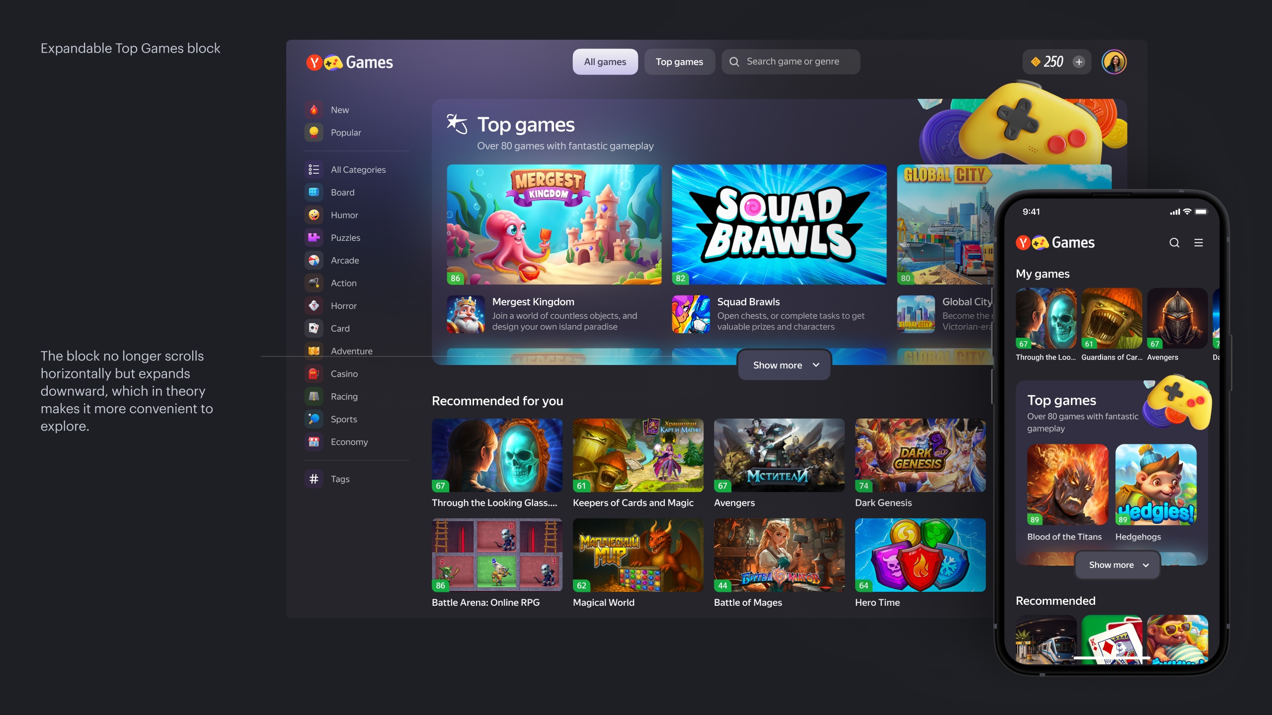
Expandable Top Games block
Problem 4
Some games require additional promotion as agreed with their developers.
Solution
Introduce internal promotion inside the Top Games block
Result
We increased launches and players by 15–40%, depending on the game.

Badges in the Top Games block
We’re now working on deeper integration of in-app games into the user flow and on significant changes in the service navigation, which I’ll describe later.
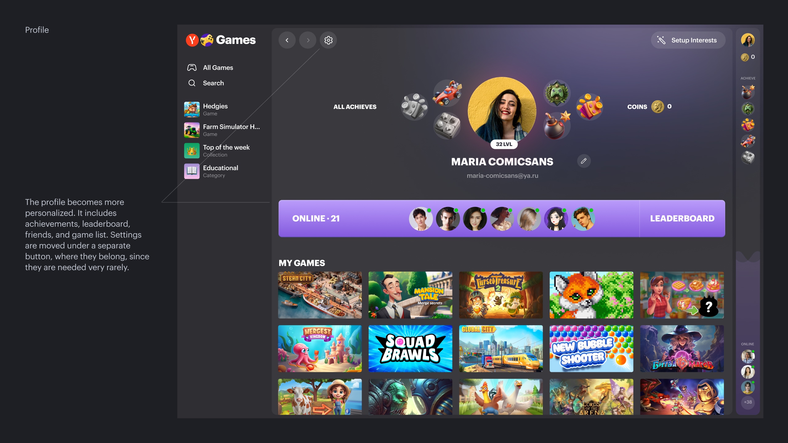
Yandex Games development concept.
Outro
Results
During my time at Yandex Games, I focused on how players discover, choose, and return to web games — and how this behavior affects the business. Together with the team, we tested different discovery formats, redesigned catalog and game pages, and launched the first in-app growth experiments.
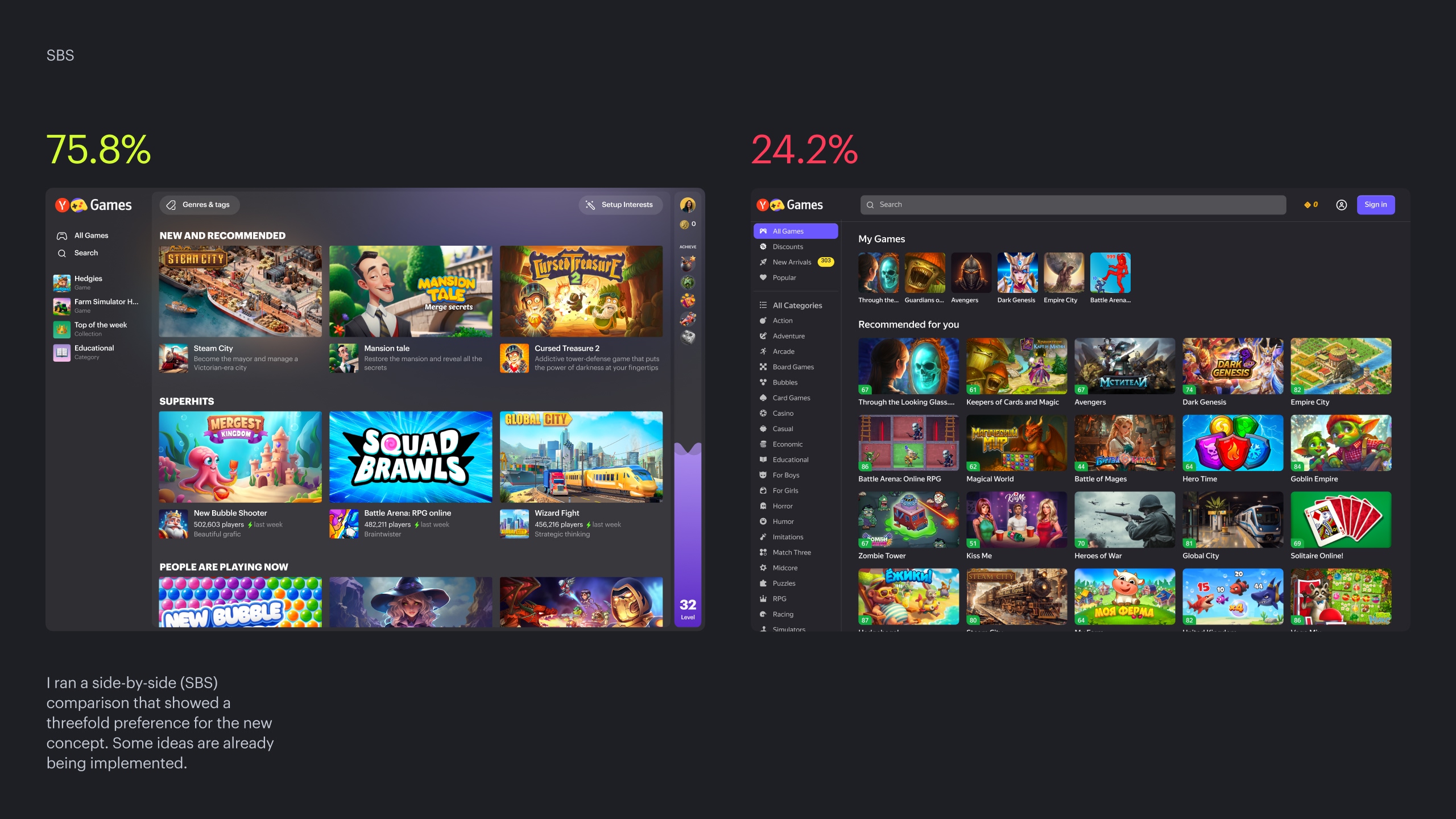
Across these iterations, we managed to consistently move core engagement and monetization metrics: from small but stable gains in playtime and daily players in the catalog to double-digit growth for top in-app titles. On top of that, I proposed a future product concept for Yandex Games that tested three times better in side-by-side comparisons and is now partly being implemented by the team.
More selected projects
Drop me a line
skorobogatkonn@gmail.com