IVI is the leading streaming service in Russia. Like Netflix, but smaller. The monthly audience of the service is more than 40 million people. The service works on a variety of devices: web, smartphones, Smart TV, Android TV, Apple TV, and game consoles.
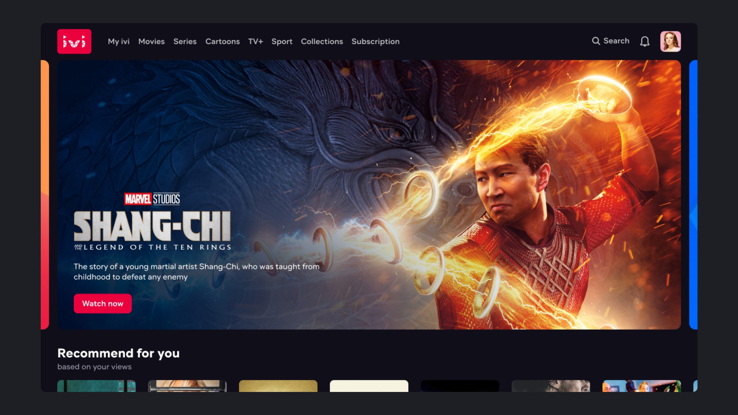
The Central Promotional Block (CPB) is the main gallery of the application's main page. It is placed in the first place in the application. The gallery is highly important for business, as it is one of the main tools for promoting new products in the service.
Ch. I
Context and first iteration
In this project, my colleague made the first iteration. I created initial concepts and minor updates for all platforms after launch. Also, I created the second iteration for mobile applications.
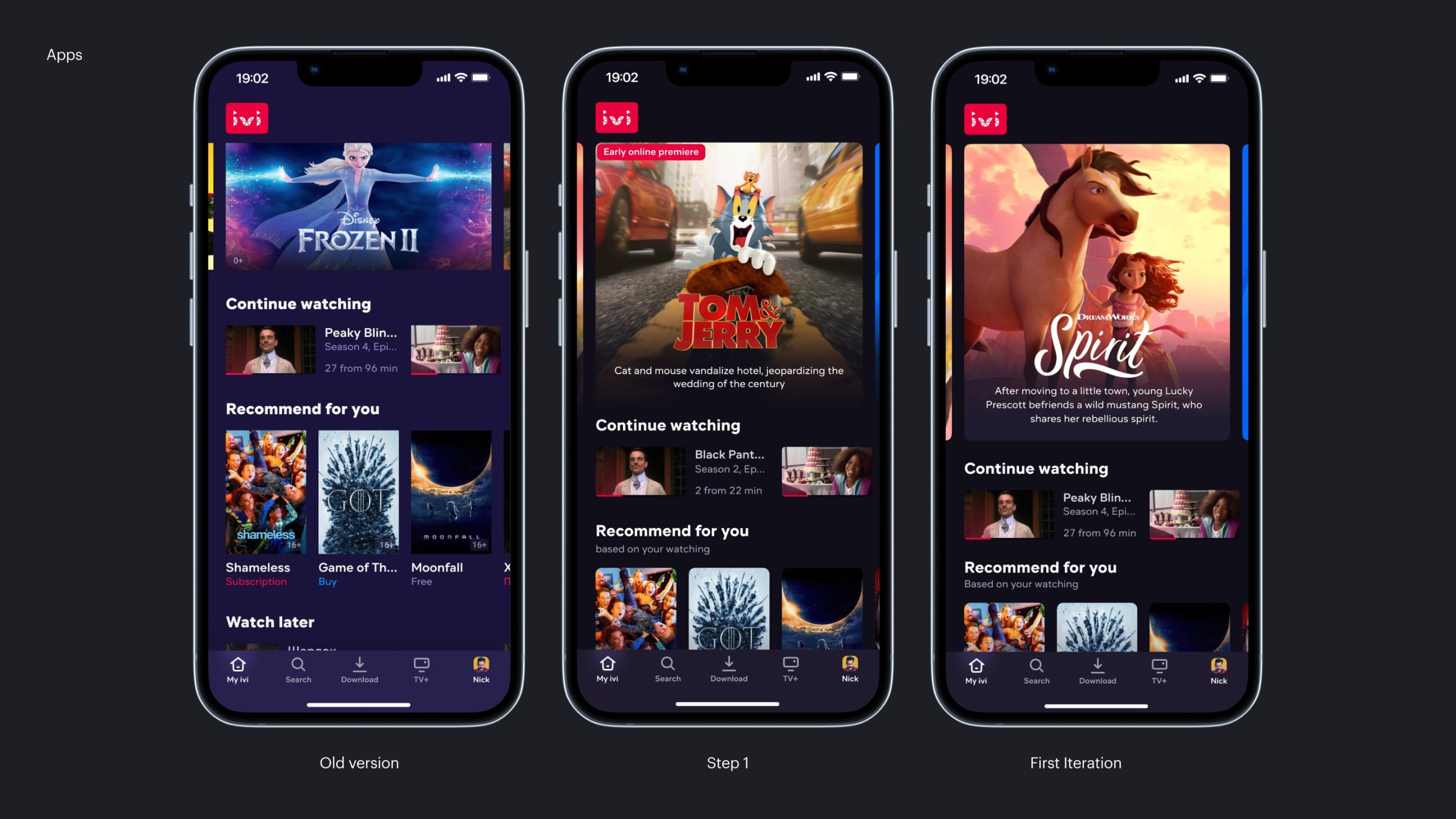
Initially, the CPB was a gallery of small static images with the same format on all platforms. Because of this, it looked best on smart TV and the desktop web, while the mobile web and mobile apps suffered. We decided to fix it.
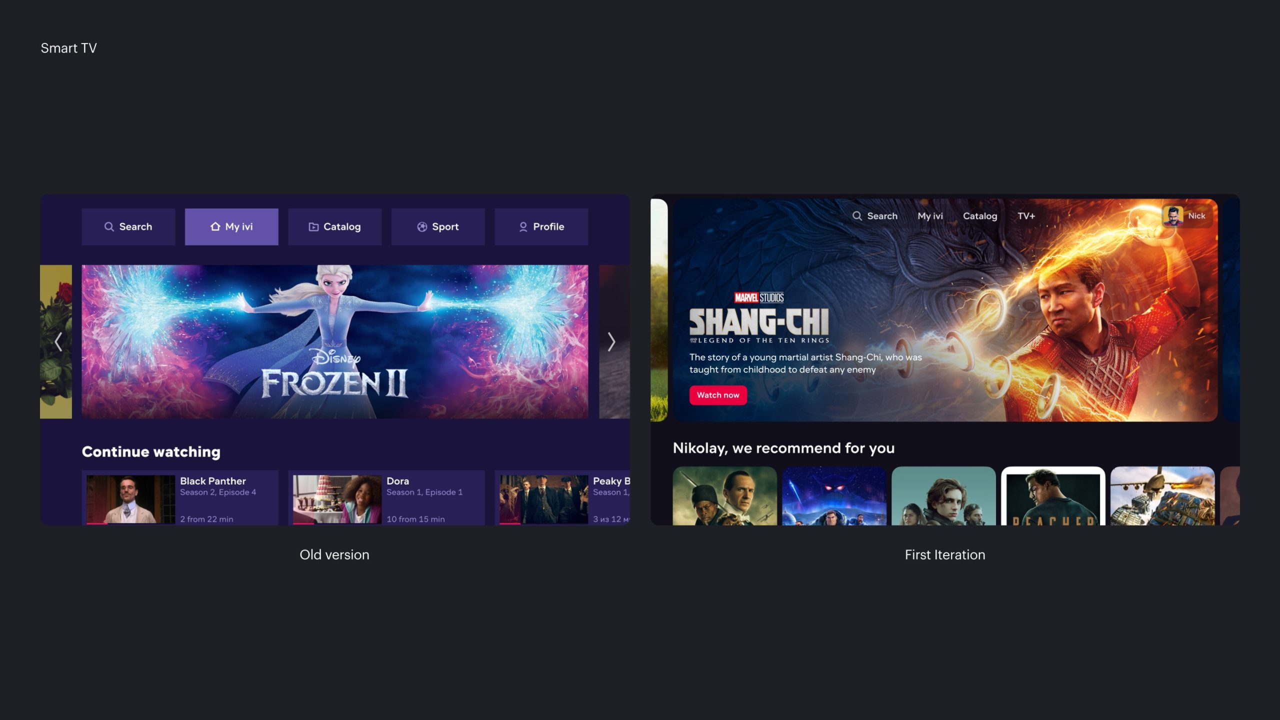
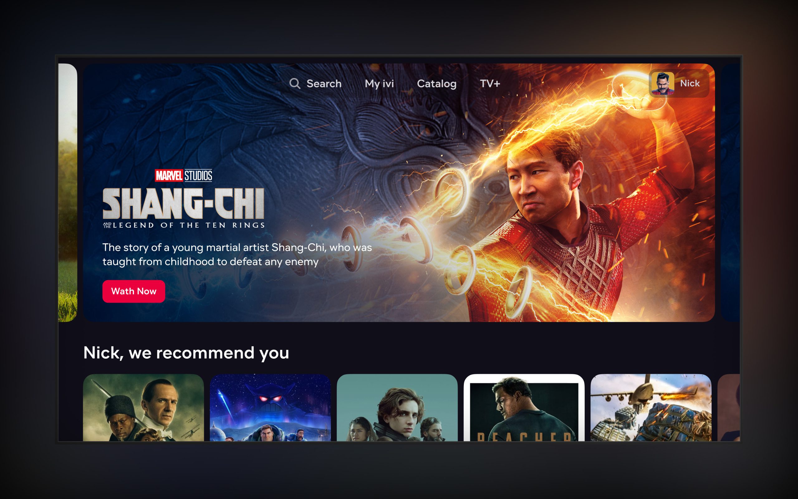
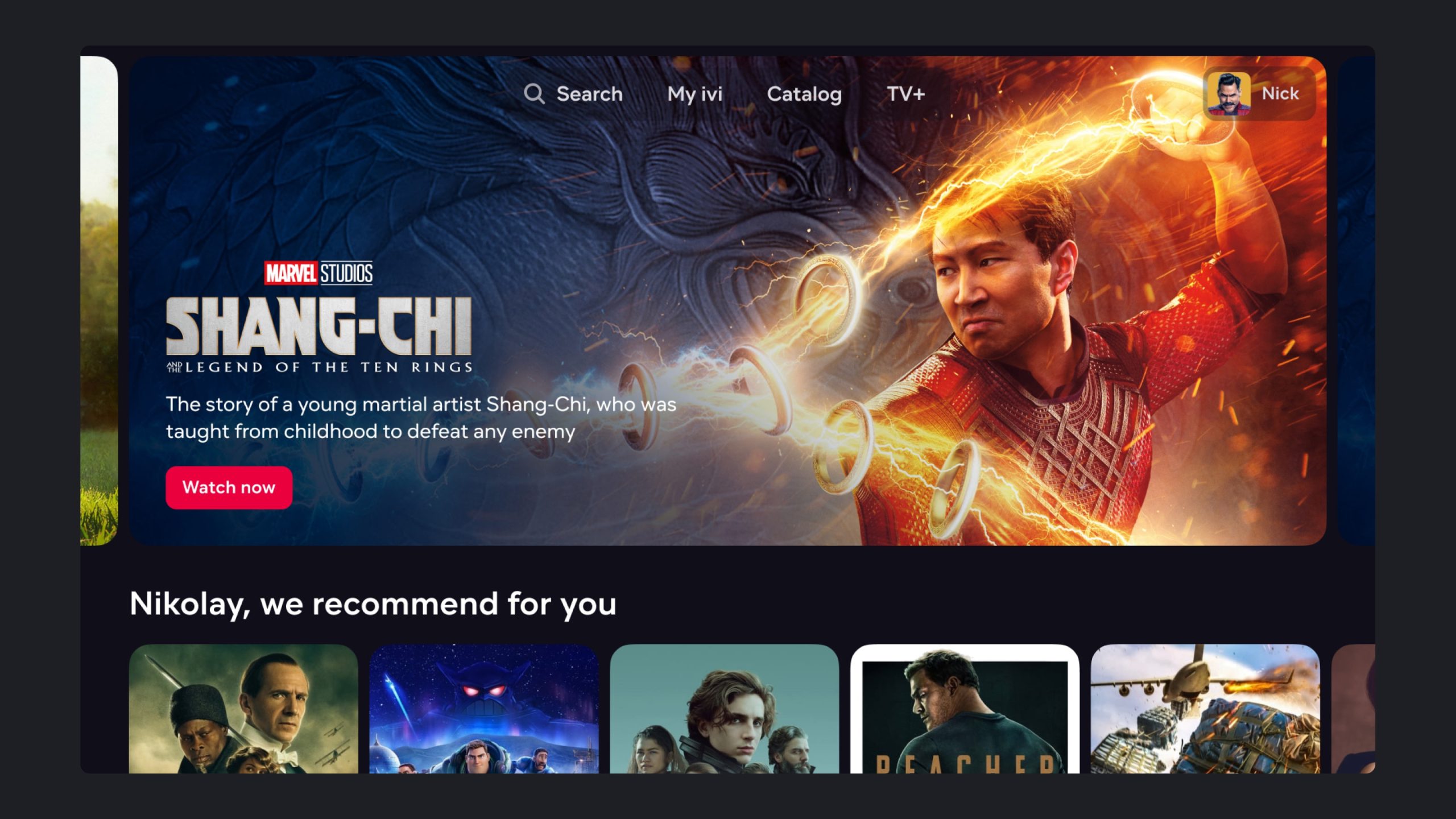
On the web and on Smart TV, we left the image format almost the same as it was originally. However, the structure has been redesigned. We added a synopsis to the content, and began to display the title logo systemically, and not as part of the image. We have also prepared a place for posting additional information: content release dates, content shields, and other information.
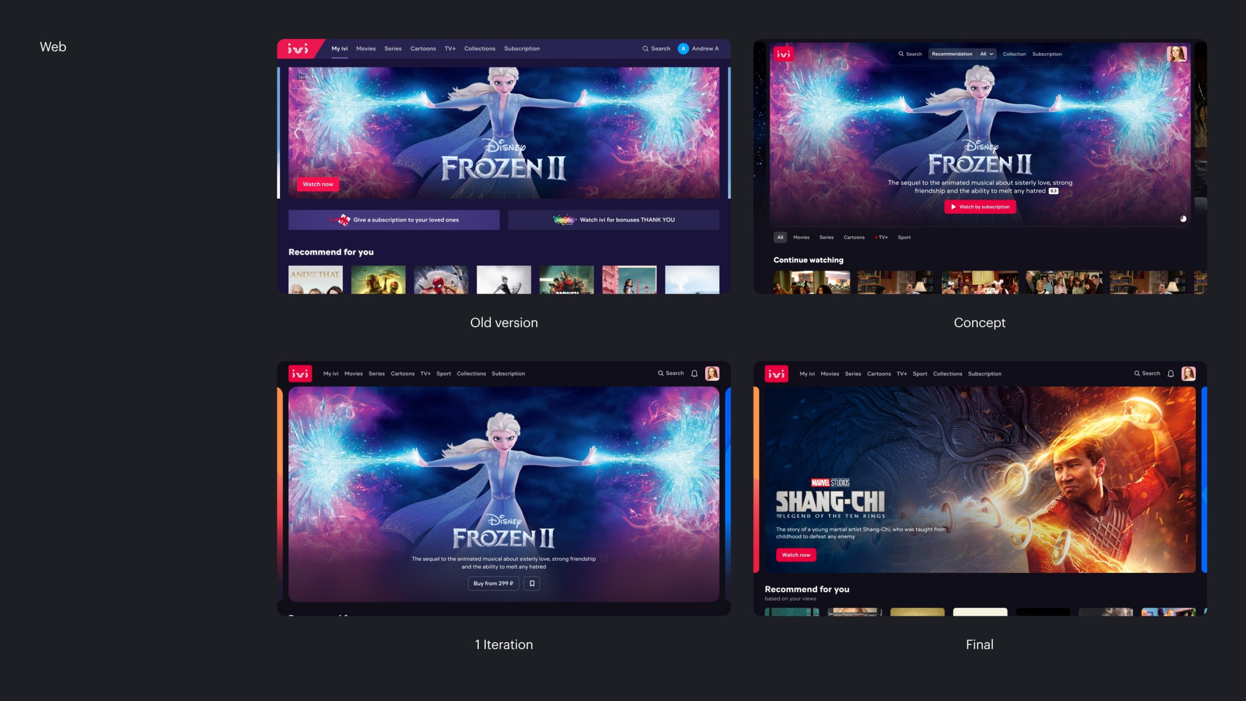
On the web, we thought about redesigning the navigation in the product at the concept stage. However, in the end, the navigation was left the same, so it was decided to slightly change the promo block format and make it similar to Smart TV.
Ch. II
Second iteration for mobile apps
Problem
After running the experiment, we found that the hypothesis of changing the block format in mobile applications worked perfectly. The CTR of the block has obviously grown, but not enough to compensate for the decrease in the reach of the lower blocks.
Because of this, we did not see an increase in global metrics. Therefore, we decided to take on the second iteration for mobile applications.
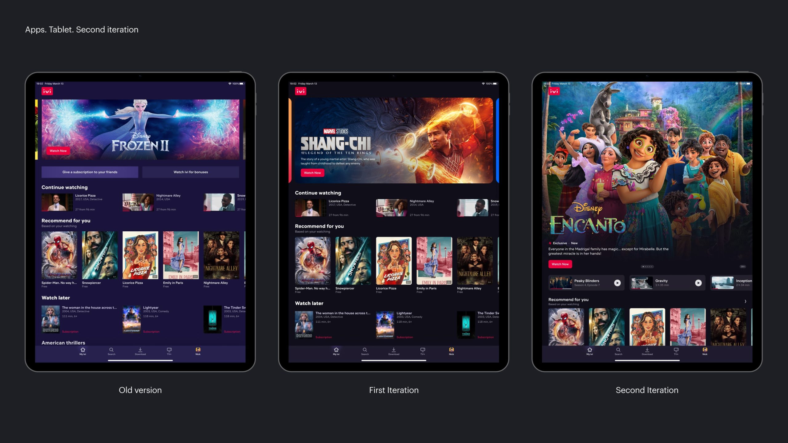
It was necessary to increase the size of the Central Promo Block, but at the same time show the same number of galleries on the first screen as in the original version.
Second iteration for App
Luckily, our previous version of the app had fairly generous padding between galleries, so I was able to make the layout of the elements more compact.
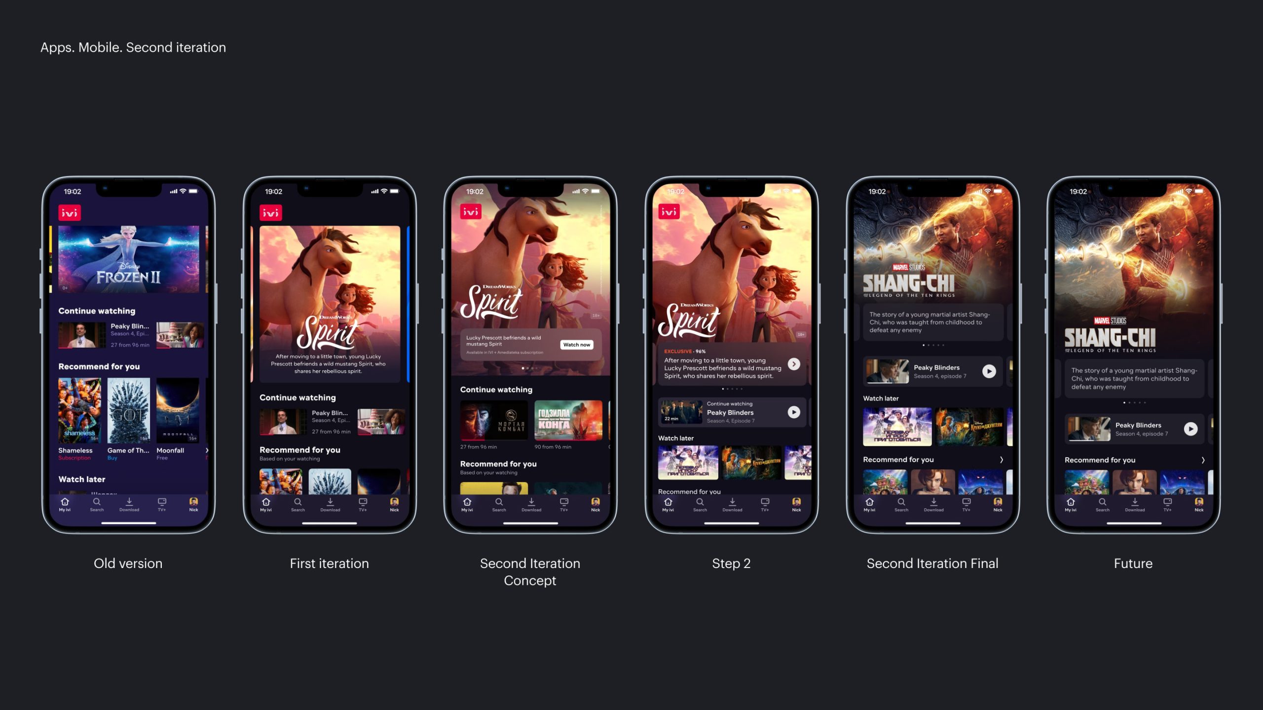
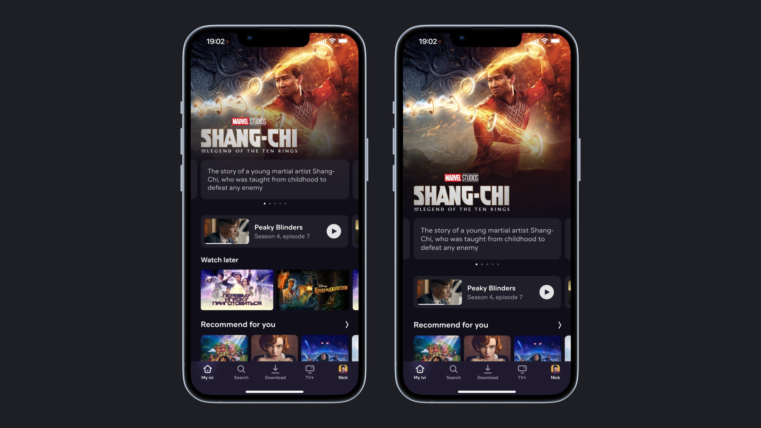
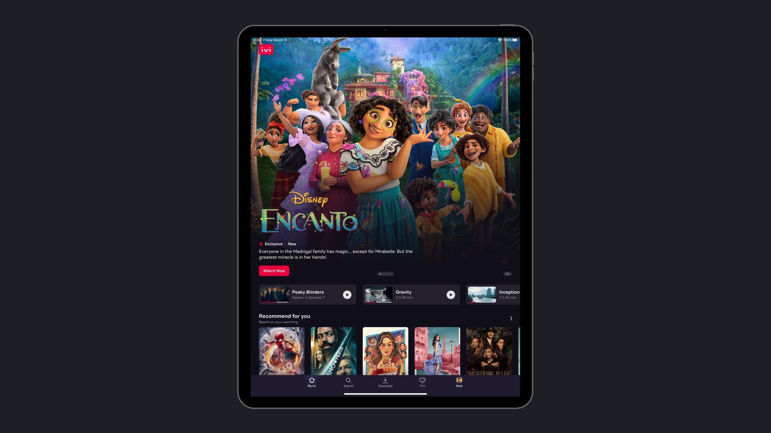
In addition, I corrected the way the block was displayed on wide screens in tablets in portrait mode. The adaptive logic was rebuilt based on screen proportions, which radically improved the display of the block on large screens.
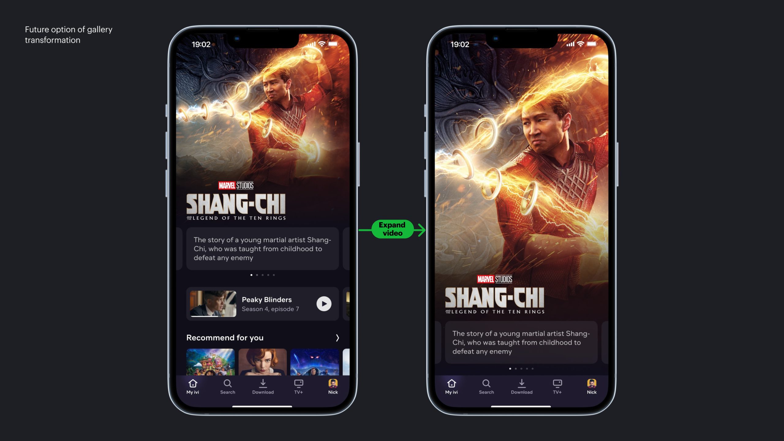
In the future, we want to make a convenient transition from the CPB to a full-screen view of the gallery, which will consist entirely of videos tailored for the mobile format.
Ch. III
Process details
Guidelines and tester
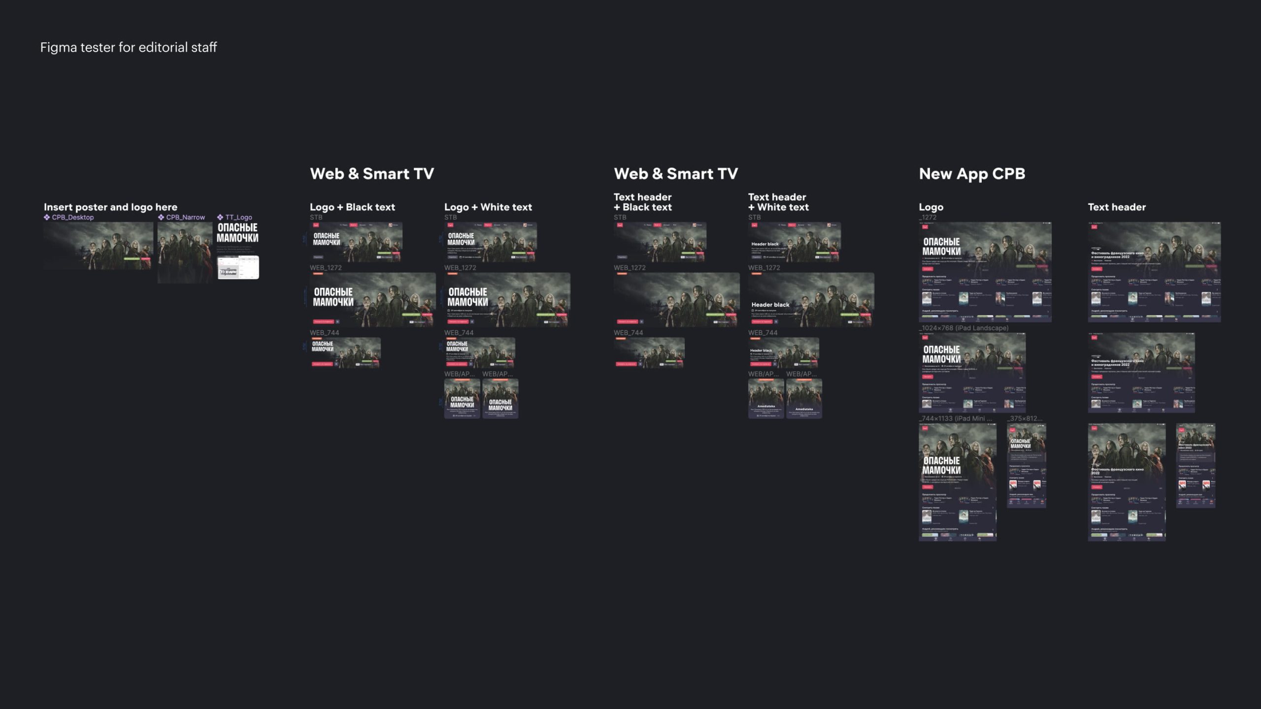
The text has been added to the central promo block, and since the background under the text can be different, we made two text color options.
To avoid editorial errors, I created a simple tester in Figma, which allows editors to preview the image and choose the correct text color in advance.
Change log
We often faced situations where design changes were made after development had already started, and the information did not always reach all participants.
To solve this, I introduced a Change Log in Figma — essentially a lightweight analogue of a Git commit history for design.
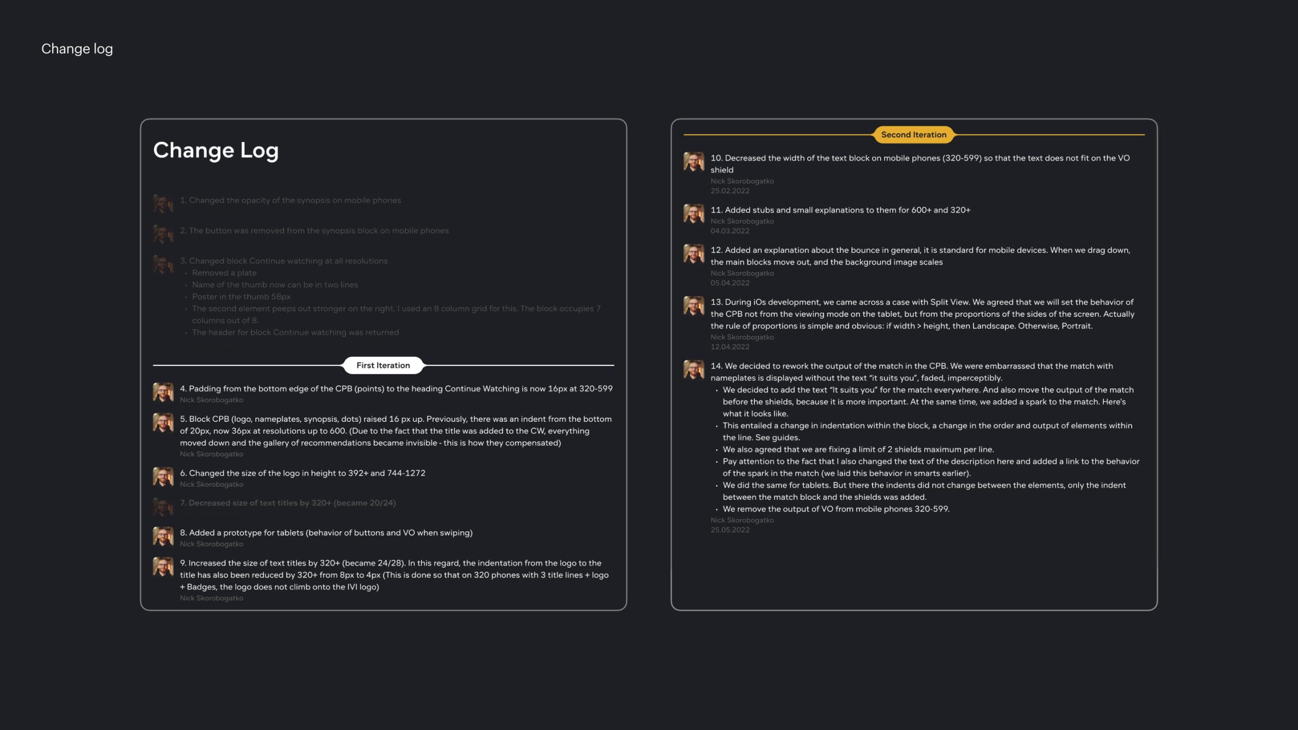
This allowed developers to always understand what had changed since the last version and helped preserve the history of decisions.
Ch. IV
Results
According to the results:
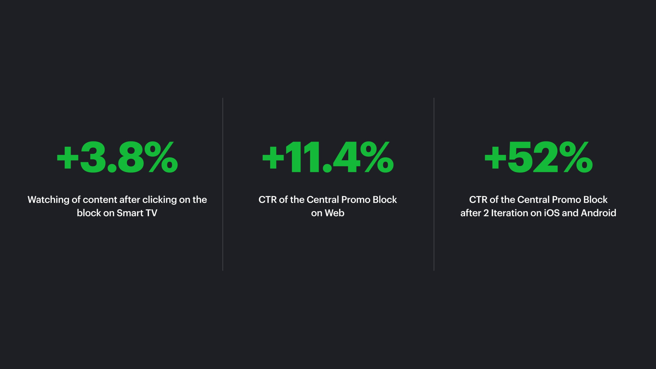
- Smart TV: +3.8% watching after click
- Desktop web: CTR +11.4% and Watching after click +13.6%
- Mobile web: CTR +20.1% and Watching after click +29.4%
- Mobile apps (2nd iteration): CTR +47% (Android) and CTR +52% (iOS)
At the same time, the coverage of the lower blocks did not change, and overall conversion returned to its original values.
In addition, we slightly improved the process of working with development in the later stages of the feature. The changelog helped us keep all developers informed and maintain a clear record of design changes.