IVI Identity
2020—2021, Brand
Like most of these stories, this one also started with a problem. IVI, of course, already had an identity. In general, it wasn't bad. It was slender, ideological. Inside we called it "Sector" and it looked like this.
Examples of using the old identity “Sector”
By itself, the method is logical and convenient. It seems to be put everywhere and it will be fine. But besides this, there were restrictions in the "sector". First, it is not applicable everywhere. And secondly, problems got out, due to our specific working conditions and the use of identity.
Conditions and restrictions
IVI is a large company and a streaming service, which means a large number of identity carriers and a lot of nuances. Let me tell you in order what we wanted to achieve and cover with this update:
- Product. We would like the identity to somehow penetrate the product. I must say right away that this is the Achilles heel of almost all identities. I can’t say that we managed to solve this problem, but we came up with a funny hack.
- Things. Understand how to design all the things of a large company: merch, gifts, badges, onboarding packs, pencil notebooks, and everything.
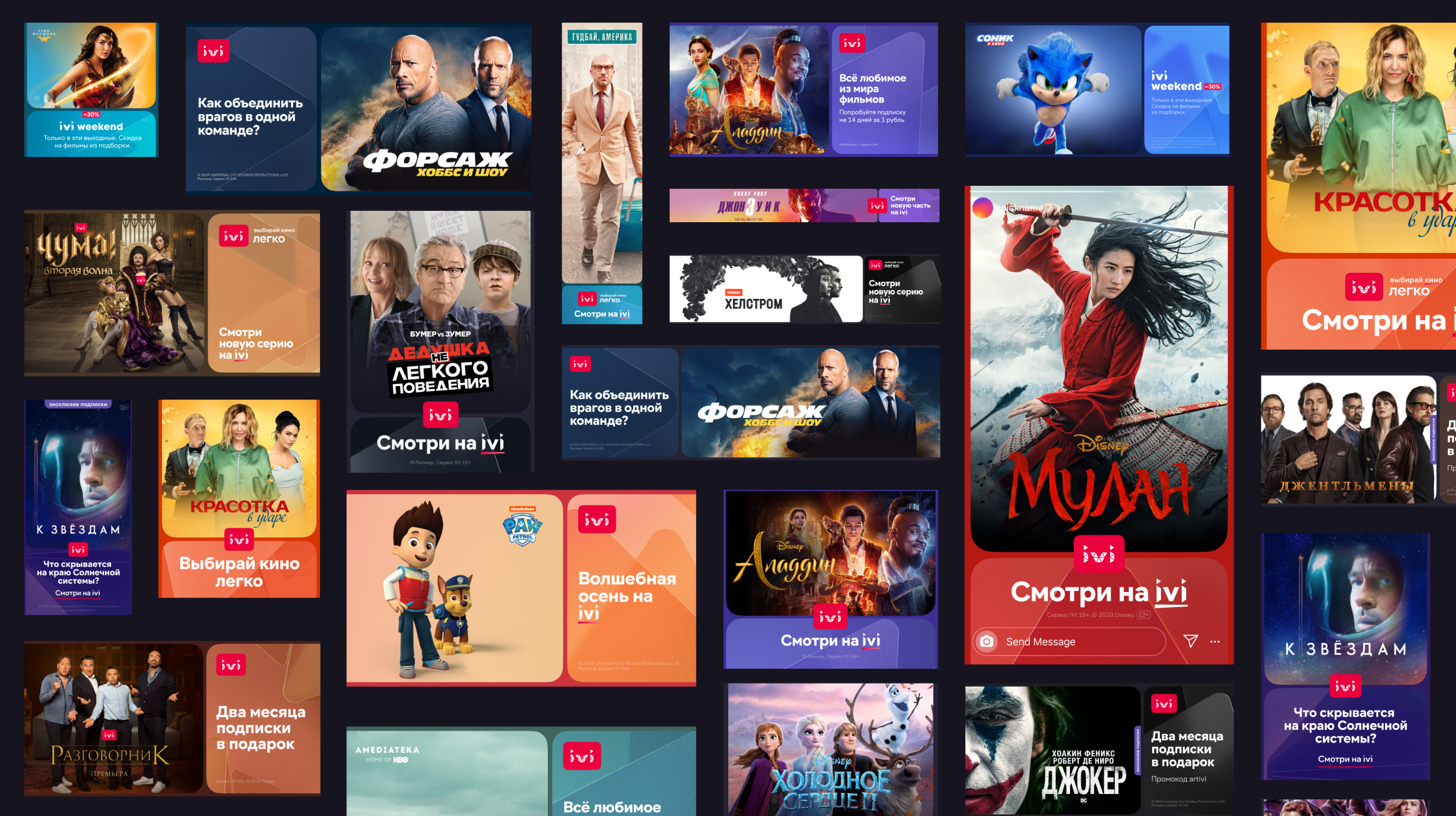
- Formats. Find a systematic approach to a huge set of motley banners, certificates, flyers and posters for all occasions. No kidding, the set is really impressive.
- Copyright holders. Something that greatly complicates point three. Most of the materials are created using images and logos of films and series. And their use is accompanied by a set of restrictions and requirements of copyright holders. They all need to match.
- Brand character. IVI has changed a lot in recent years and the company needed a graphic story to match the new spirit.
Points 3, 4, and 5 turned out to be the biggest pain for everyone. And in this article, I will focus on them the most. To begin with, I will dwell on each of these points in more detail.
Ch. I
Problem
The problem with formats
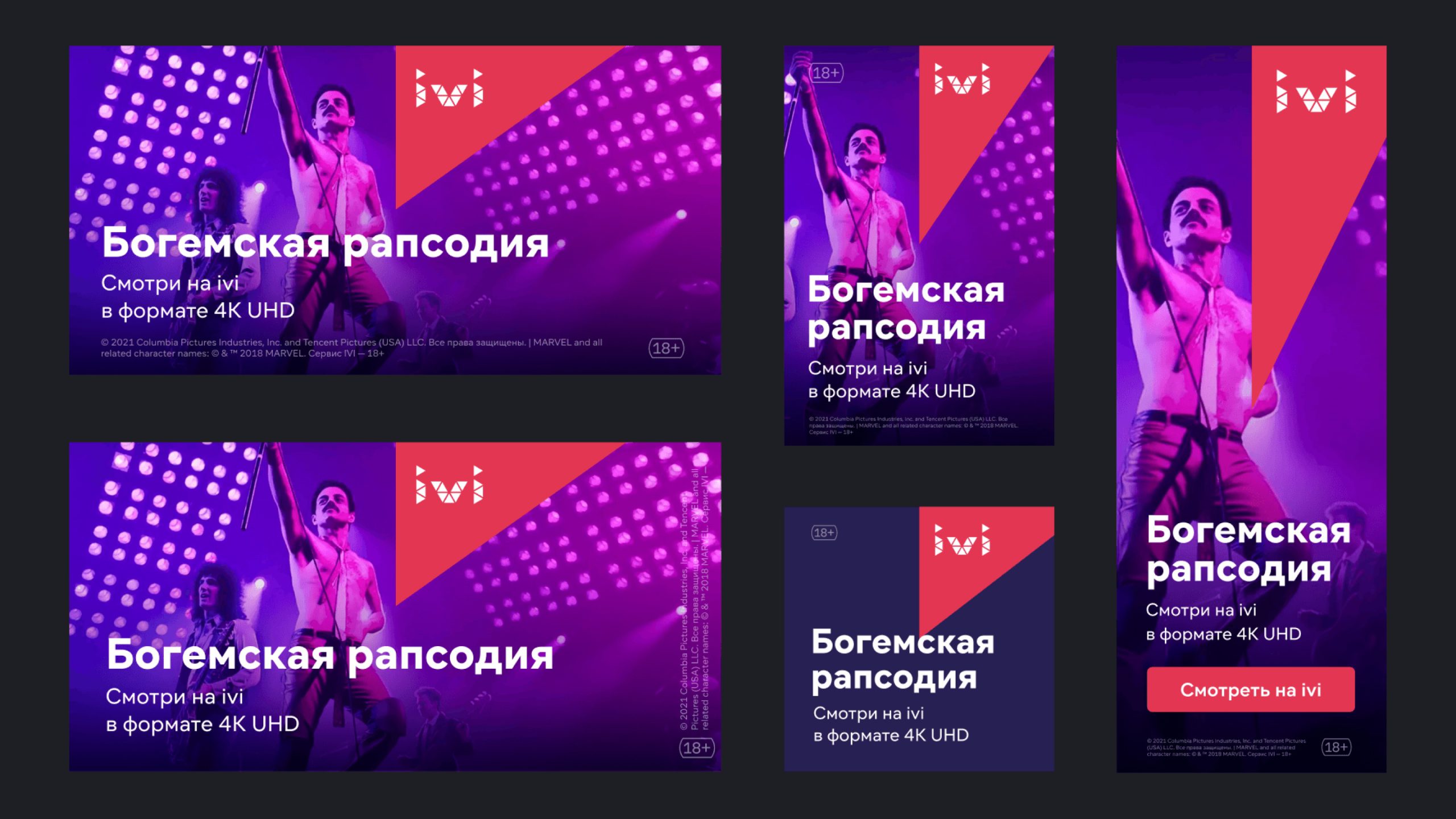
Banners come in a wide variety of sizes, including very narrow or very long ones. They have little space for text. The sector is a line with a slope, which means it does not use this space optimally. And here compromises, deviations from the rules, and the search for solutions begin. In addition, new conditions and formats appear from time to time that did not exist before.
The problem with the approval of the copyright holders
Each promotional material about a movie or series in IVI, and in any other streaming service, must be approved by the copyright holder. There are 6 majors and a lot of smaller ones. Their offices are located in different countries and time zones, so the interaction is not easy. Approval of one banner can take more than two weeks.
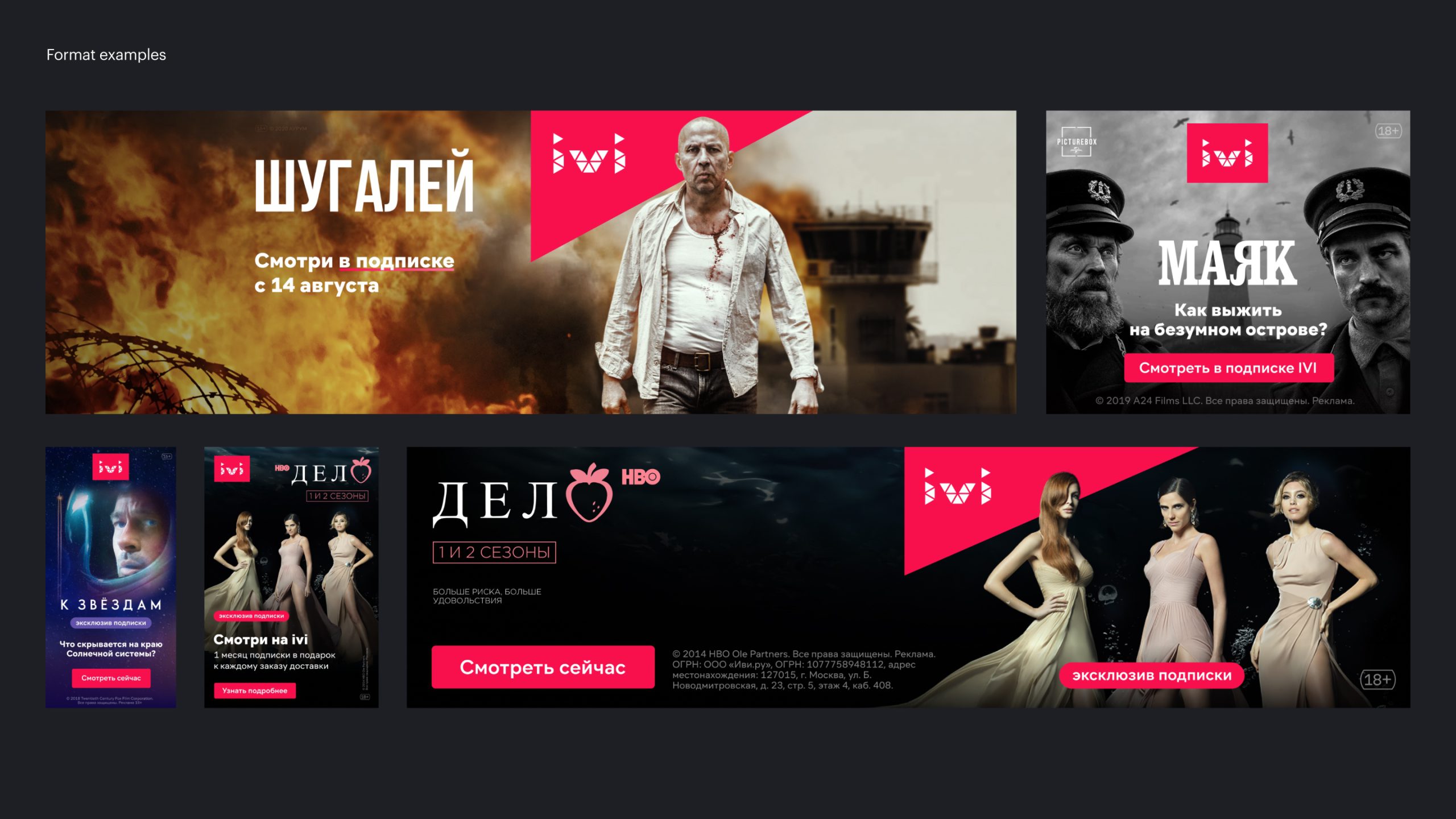
In such conditions, any complex identity is a headache for the whole team and an unnecessary inconvenience during approvals. Our old "sector" tried, but in some places did not cope with the task. Sometimes the "sector" cuts off the head of the main character, sometimes it doesn’t fit into the format and you have to put a logo, and sometimes it was generally forbidden to use the IVI style over the key art.
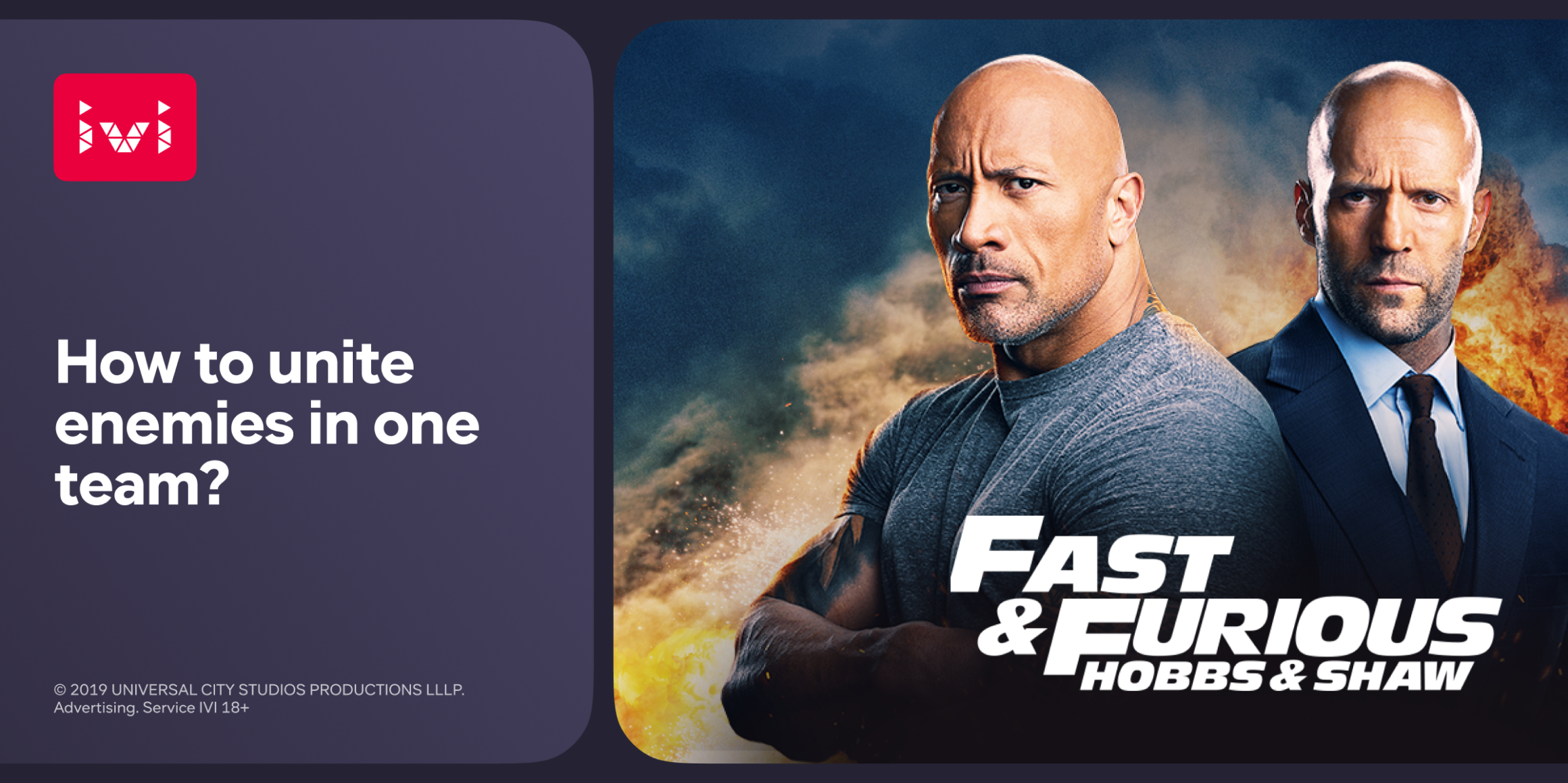
Format examples
The owner is easy to understand. Keyart is the identity of a movie or series. During the advertising campaign, the combination of a poster with a logo becomes a recognizable brand. It brings the audience to the cinemas. Therefore, images cannot be changed, cut, enclose with your background, and so on.
Brand mismatch problem
The fact that it was difficult to work with the sector is important. But besides that, there was another problem. The style was not neutral. It was aggressive, sharp, and brutal. Because of this, it literally crashed into the material, argued with the posters, and drew all the attention to himself. We needed a friendlier perception. IVI is a service that the whole family watches. We are clear, simple, and technological.
Ch. II
Process
Logotype, Logo in font, Palette
Preparation
So, we decided to change our identity. We tried to take into account all the restrictions that we encounter. We also decided to create an identity inside. We are for an evolutionary approach. And it is easier to evolve within a team than with a contractor. And it also simplifies the support and promotion within the team and the company. Third-party materials submitted once would not survive in this zoo of formats and restrictions. Any brand book compiled would immediately begin to fall apart. Or, it should be the constant support of the agency, which would be very expensive.
Before starting work on the identity, the guys from the creative team slightly updated the logo. We rounded the corners, softened them, and corrected the location of the triangles a bit. The logo became an independent bearer of the identity. And for the use of the logo in the text, in marketing materials, and in the product, a logo in the font was developed.
Probably, when you read this, you think: “Why don't they change the logo?!”. I asked Andrey Tarasov, Design Director of IVI, to answer this question
“WE MOVE, WE THINK. BUT WE BELIEVE THAT FOR THE PURPOSE WE SET, IT WAS NOT NECESSARY TO CHANGE THE LOGO”
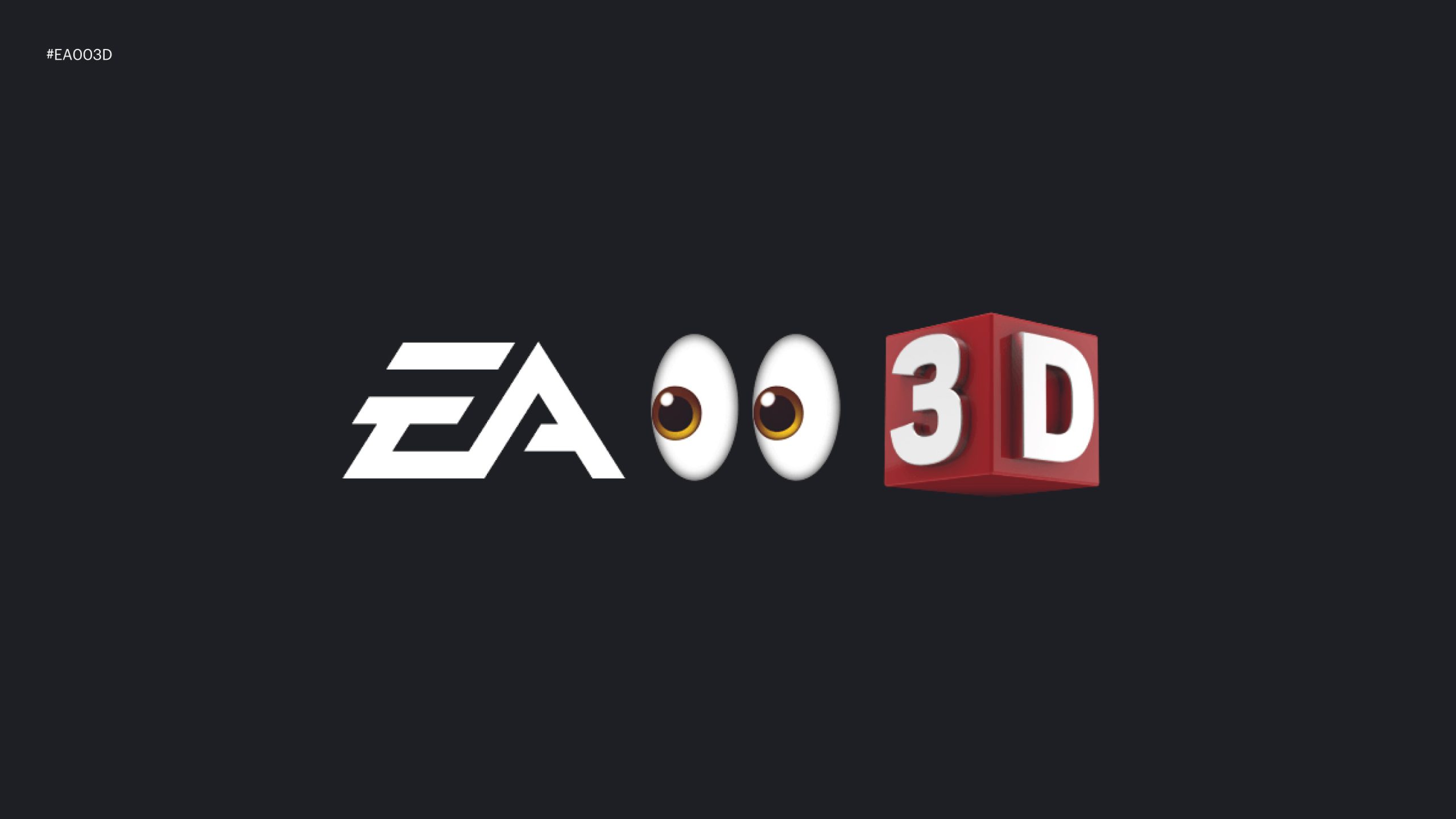
We have also edited the product palette. The main color has also undergone a change — the most important part of IVI's identity. I will show a picture that Andrey once threw to us in a chat, and you, perhaps, will forever remember the color of IVI — #EA003D.
Brand color
This is an important digression for understanding the context in which we were. Work on the logo, product palette, and logo in the font is worthy of a separate article or even separate articles. Now I will not dwell on this in detail, but I will continue the story about identity.
Beginning of work
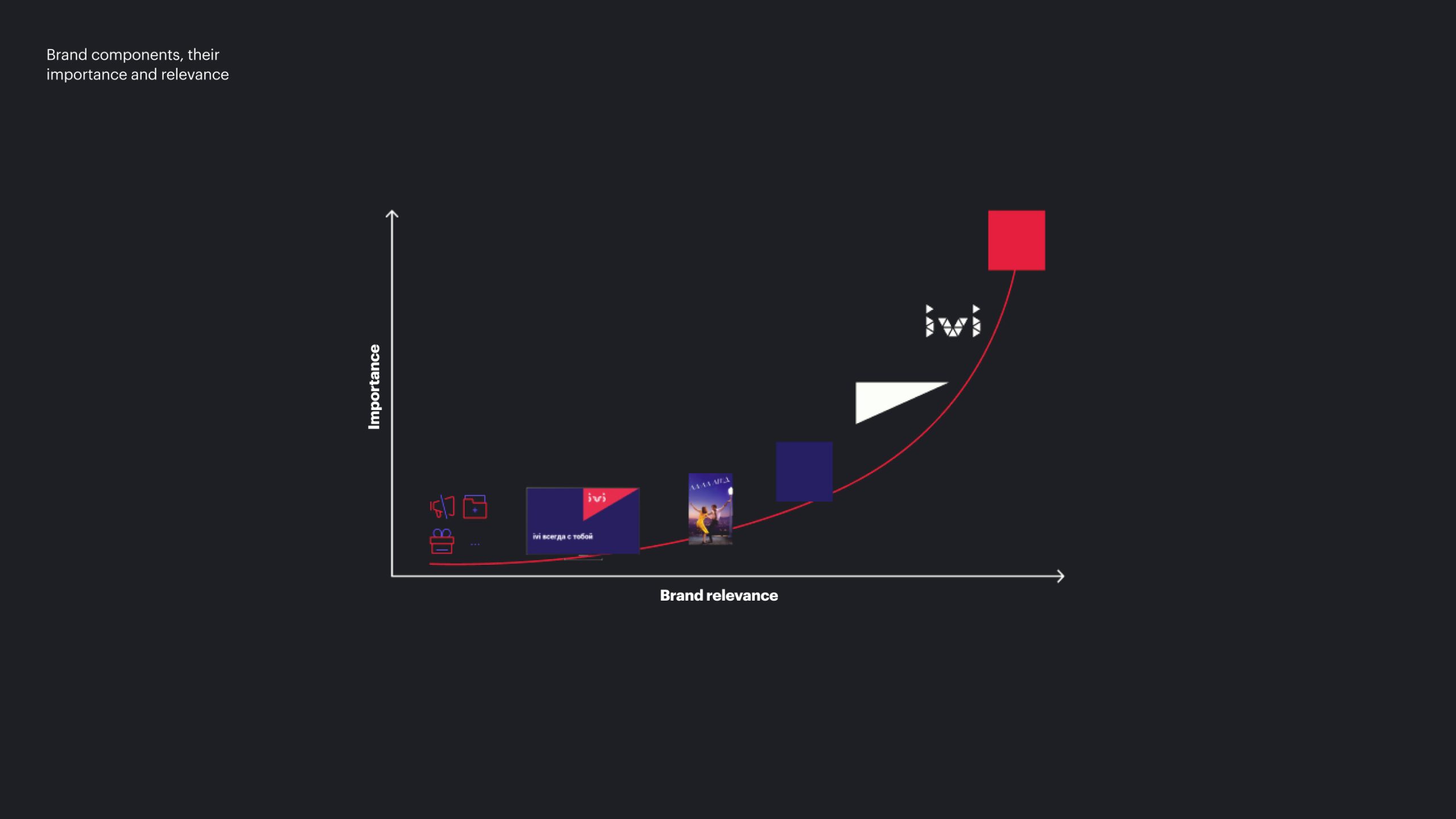
At the beginning of August 2020, we held a workshop with Interbrand. The guys told us how they work on such tasks. We decomposed IVI's identity into components and analyzed all the parts. This helped us understand which details are more important than others, what must be left, and what can be discarded. Useful exercise. The limitations became clear to us, and we went to work.
Brand components, their importance and relevance
During the workshop, one idea constantly came through - you need to start working on an identity with a Big idea. The entire visual is built around this idea. By themselves, techniques do not make sense if they do not have a strict justification for themselves. I have come across the fact that my thinking does not work that way.
In my opinion, an idea is not only a foundation, but also an umbrella, a superstructure over something. On the one hand, it can be used as a source of further development. But on the other hand, you can take almost any image and, with proper argumentation, “adjust” it to the idea. I'm exaggerating a little, but if you look at how brands argue symbols in the identity, I think it will become clear what I'm talking about.
Therefore, I went first of all from the visual and began to search. Other guys worked in parallel. If we try to briefly convey the entire process of research that we went through, then everything will clearly come down to divergence and convergence. We generated, chose, then left to generate again, and this went on several times.
We have generated a lot of different things. In the final presentation that we were preparing, we even made a slide where we showed some of the ideas. Of course, some solutions look very promising from a visual point of view, but they failed to resolve all the restrictions that I talked about above.
Various ideas that came to our mind
Ch. III
Process
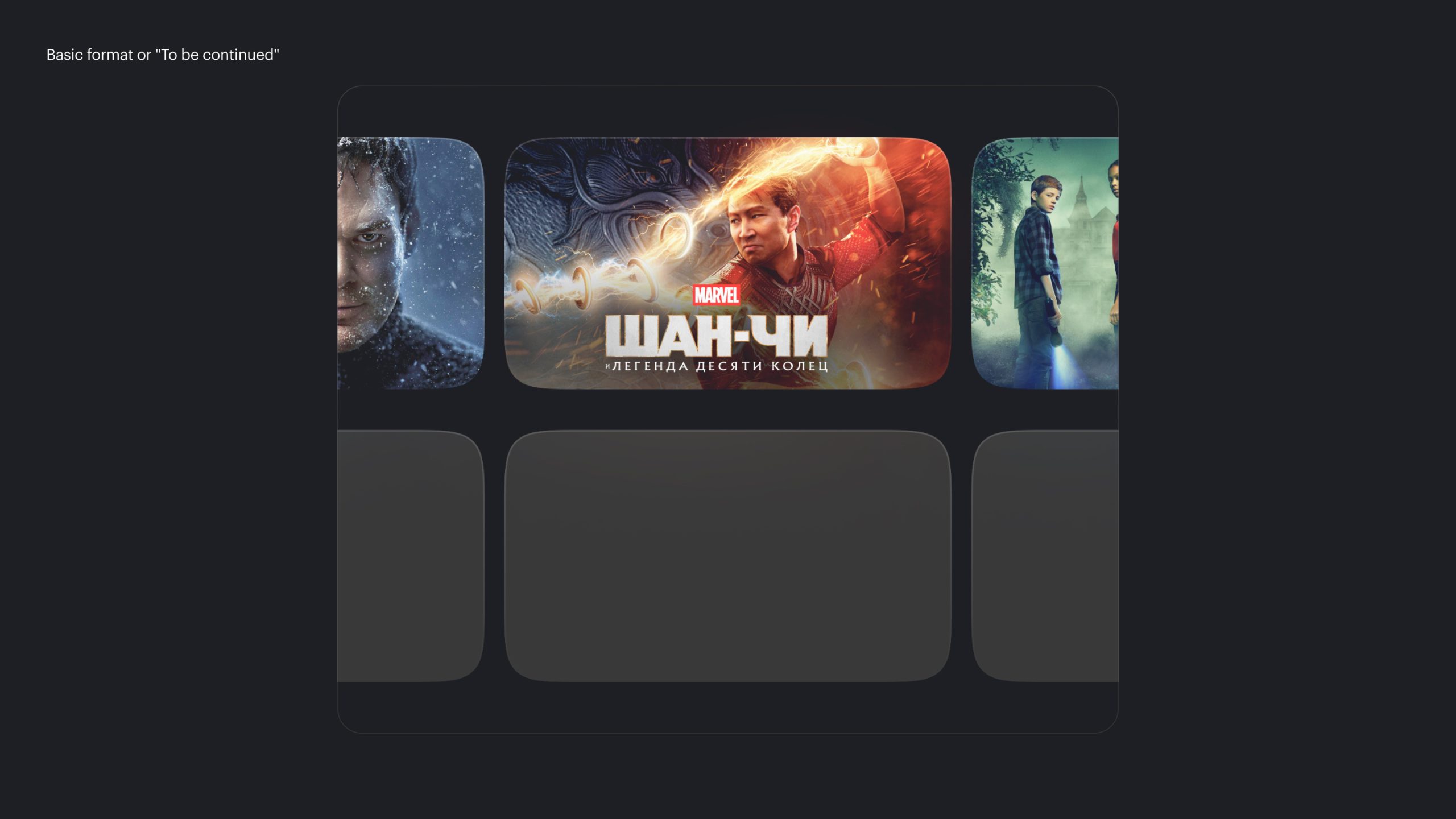
Basic format or "To be continued"
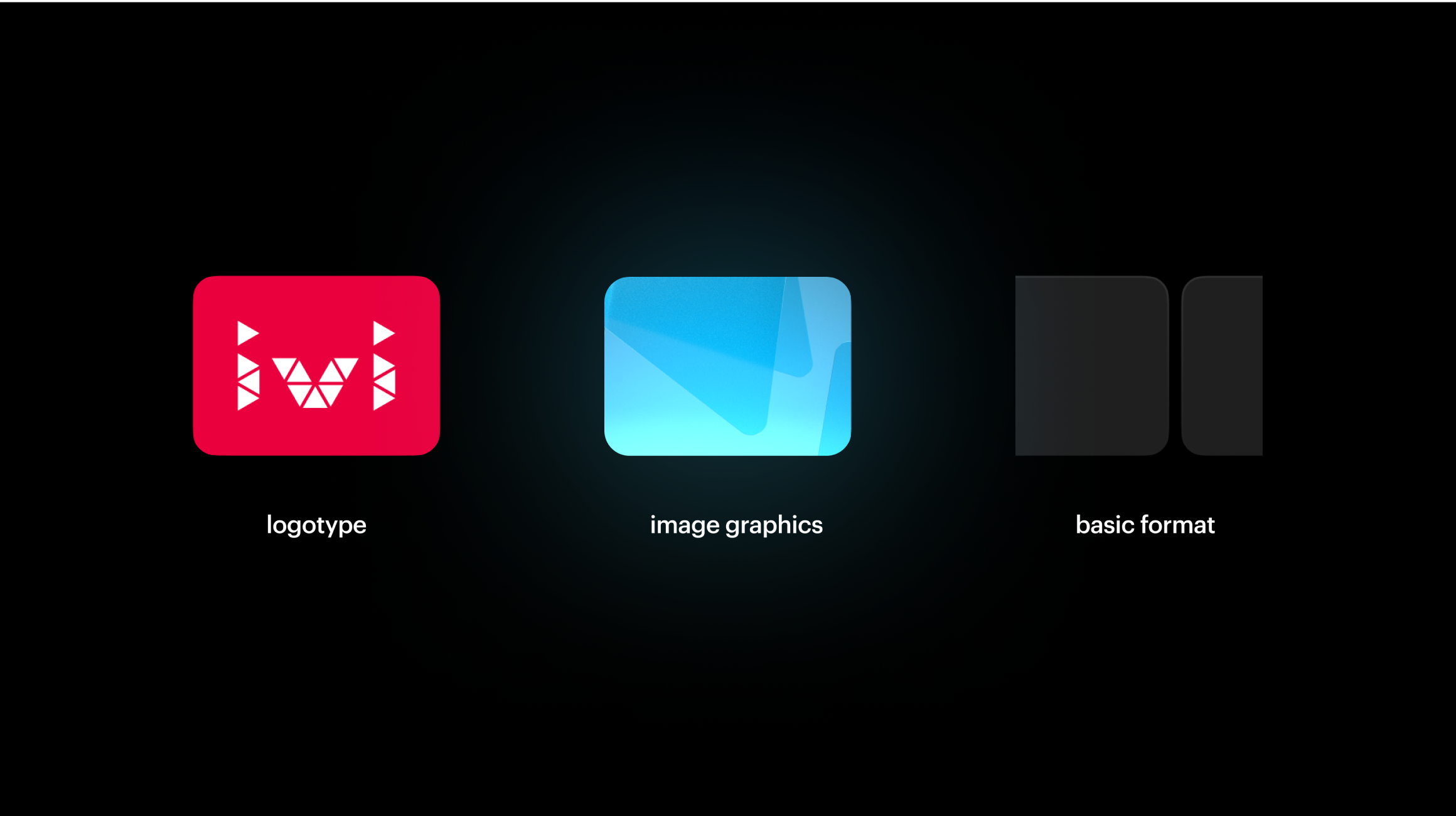
The solution in the end was a very simple one. Every movie or series is made up of frames. Our memories are also frames. Every moment is followed by another moment. Behind each film — a new film, after a series — a new series. This is an endless feed of events and images. Just like IVI. There is always something else in it. To be continued.
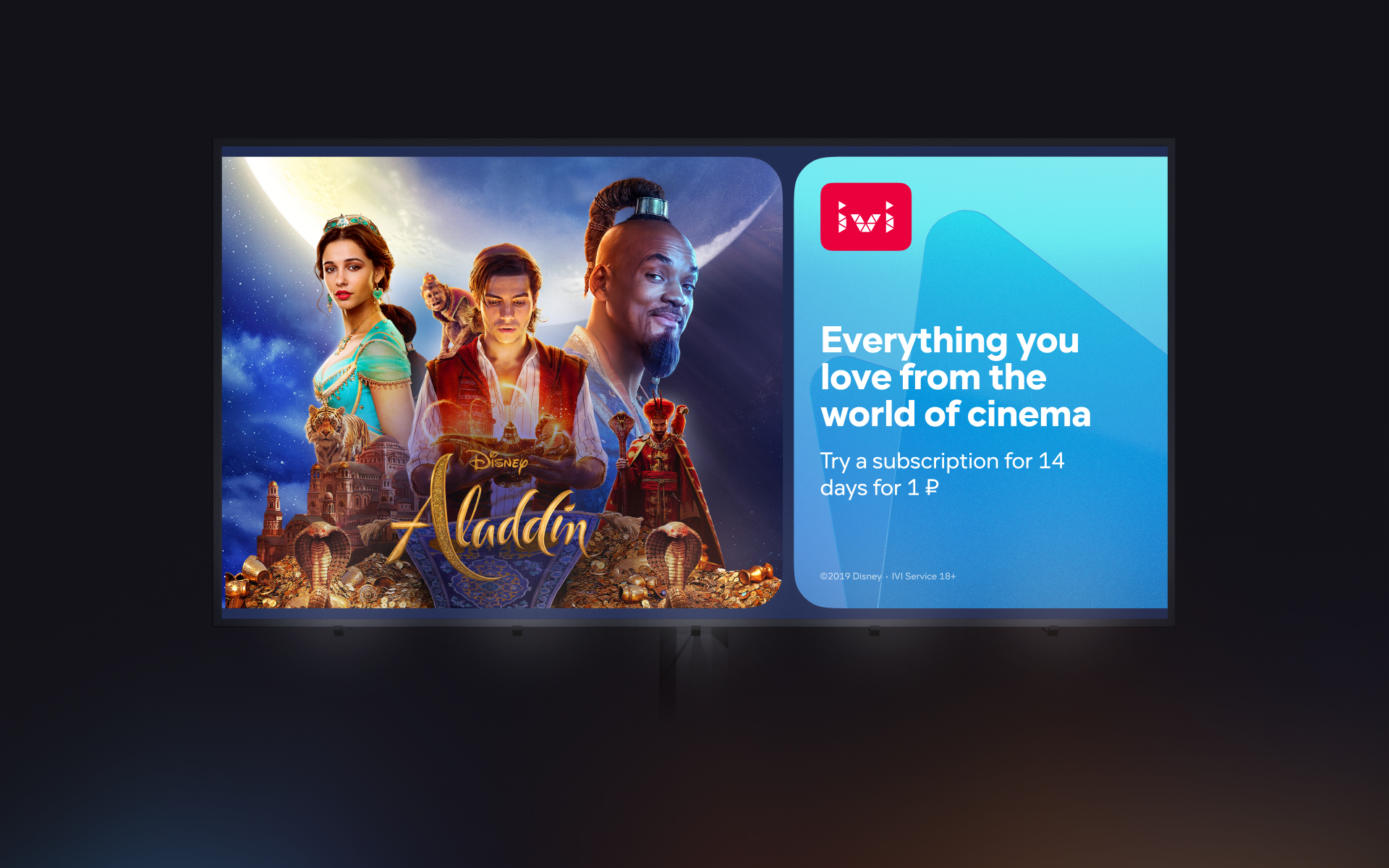
Basic layout format
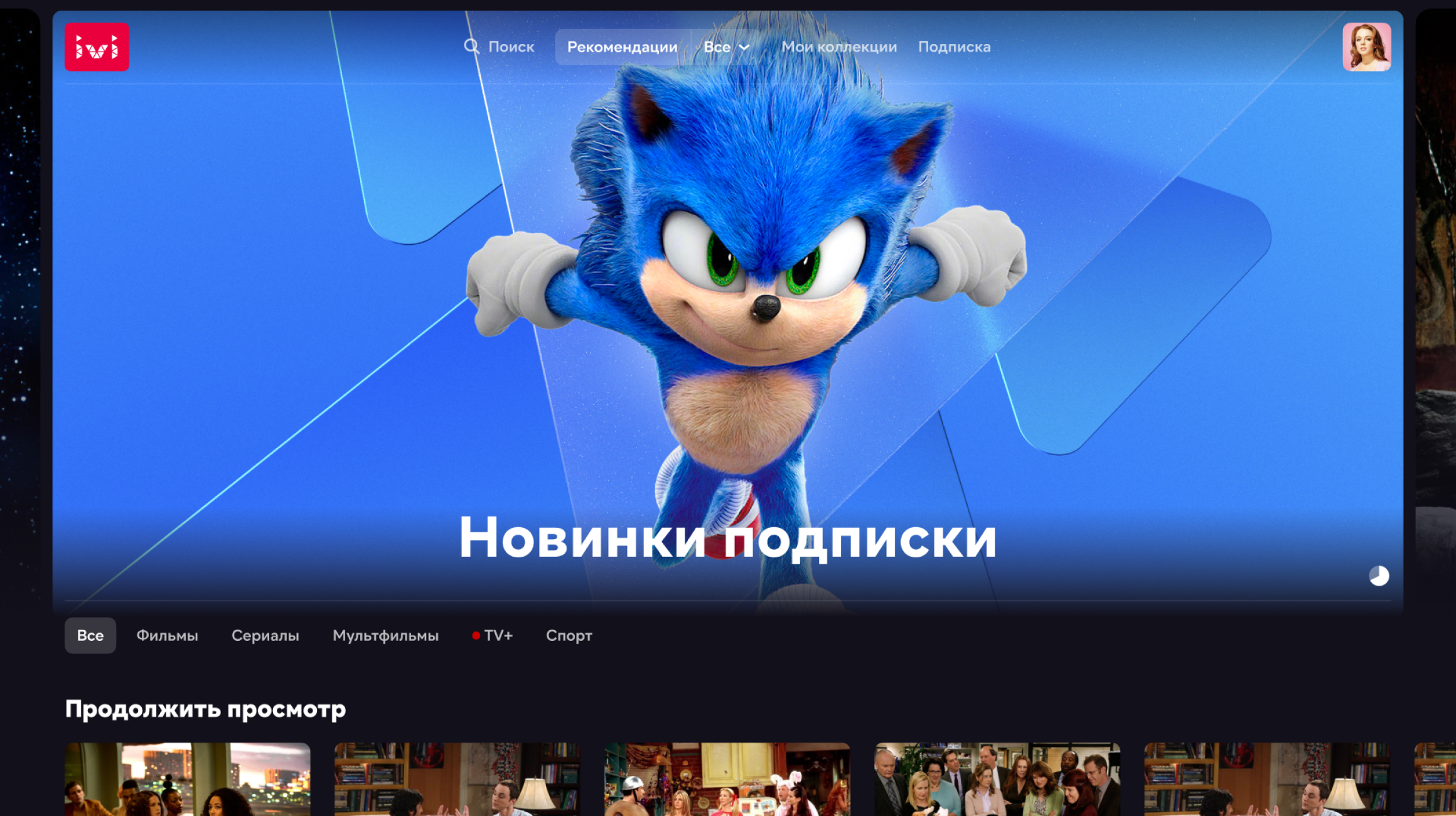
The format was easily scaled to different media. From this technique, various methods of presentation and animation follow. And for the product, we came up with an explanation add-on. What is now in the product is, in essence, already a new identity. Any gallery in the service broadcasts a new identity. This is the same hack that I wrote about earlier.
Basic format or "To be continued"
Of course, the solution itself does not look new. Well, you actually divided the rectangle into two parts. But here it’s not only about separation but also about rounding, and indenting. For a very long time, I tried to convince myself and everyone that these slightly annoying indents inside are a feature, not a bug. It just makes a format within a format. Frame inside the banner.
Ch. IV
Process
Image graphics
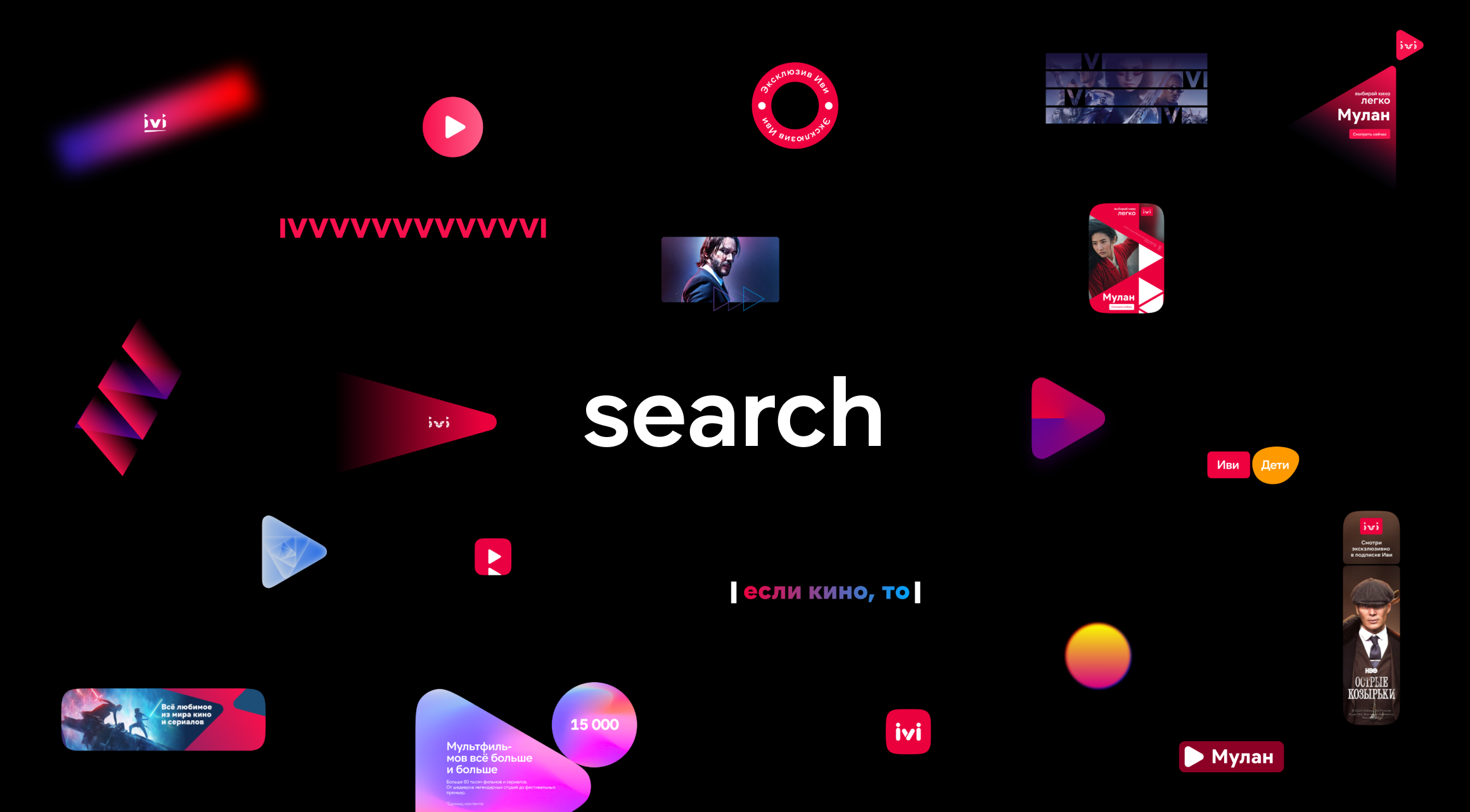
This, of course, was not enough. We began to think further and came up with such an idea. The technique that we came up with is the basic format. This is the layout that we use as part of the identity. The second part of the identity is image graphics.
Example of image graphics
The beauty of the solution is that the basic format can remain unchanged or recognizably transform. But the background graphics can be anything. We can change and supplement it at least every month. Of course, some styles must be pursued, but that style can be transformed. At the same time, being within the framework of the basic format, it will still be recognizable. The recognition of the format will feed and assimilate new backgrounds. And then they will work for the brand. This is how we will live.
Components of the identity
We showed our solution to Interbrand, received approval, and comments, and moved on. We started carefully. We drew background images, but without spraying using triangles. I'll be honest, the triangles are a tribute to the IVI tradition. We tried to ensure that the background graphics and the basic format were distributed throughout the company, for all banners, animation, and splash screens.
Ch. IV
Results
It's been more than a year since we started using the new identity and it's still alive. We are just thinking about taking the next step and updating the image graphics. With the format, we managed to take root and even make something similar to an automatic constructor.
Well, okay, not quite automatic and not quite a constructor. This is something like a calculator in Excel, which, according to the given banner sizes, determines what size the logo, typography, rounding, and indentation of the plates should be. But the idea of making a truly automatic banner generator based on the entered data has been up in the air since last year.
We have started working on a plug-in in Figma for these purposes. I describe the structure of the plugin and make an algorithm for calculating all the elements inside. These are, of course, rather primitive calculations based on ordinary linear functions. The sections are not always gilded and in some places, the hand of the designer may still be required to correct the jambs of the system.
However, in the context of a large design team and outsourcing, consistency seems like a good solution. It gently reminds us about the rules and makes the process accessible and easy. And it's good when it's easier to do right than wrong. In addition, it removes the routine, allowing the designer to focus more on the creative part, on the image and meaning, and not on how to put together a banner.
Of course, such a constructor at the start will not cover all the formats that we use. But we are a technology company. We are talking about metrics, agile, about the product. We'll move iteratively and see what happens. Maybe I will talk about this some other time. To be continued.
Drop me a line
skorobogatkonn@gmail.com


