
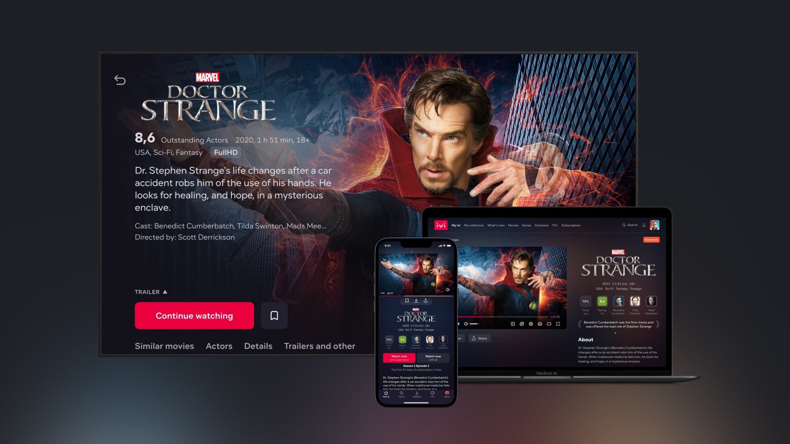
Content card
2021, Product Design
IVI is the leading streaming service in Russia. Like Netflix, but smaller. The monthly audience of the service is more than 40 million people. The service works on a variety of devices: web, smartphones, Smart TV, Android TV, Apple TV and game consoles.
A content card is the internal name of a movie, TV series or cartoon page in the service. I redesigned the page, solved some old problems, improved the visual and prepared the page for the further development and new experiments. In the project, I was the only product designer.
Ch. I
Problem Formulation
IVI takes regular UX research of our product and competitors. We test the main scenarios and compare the usability with competitors.
Based on the results, our content card was scoring progressively lower scores compared to its competitors. In addition to this the number of complaints to support and technical debt was growing.
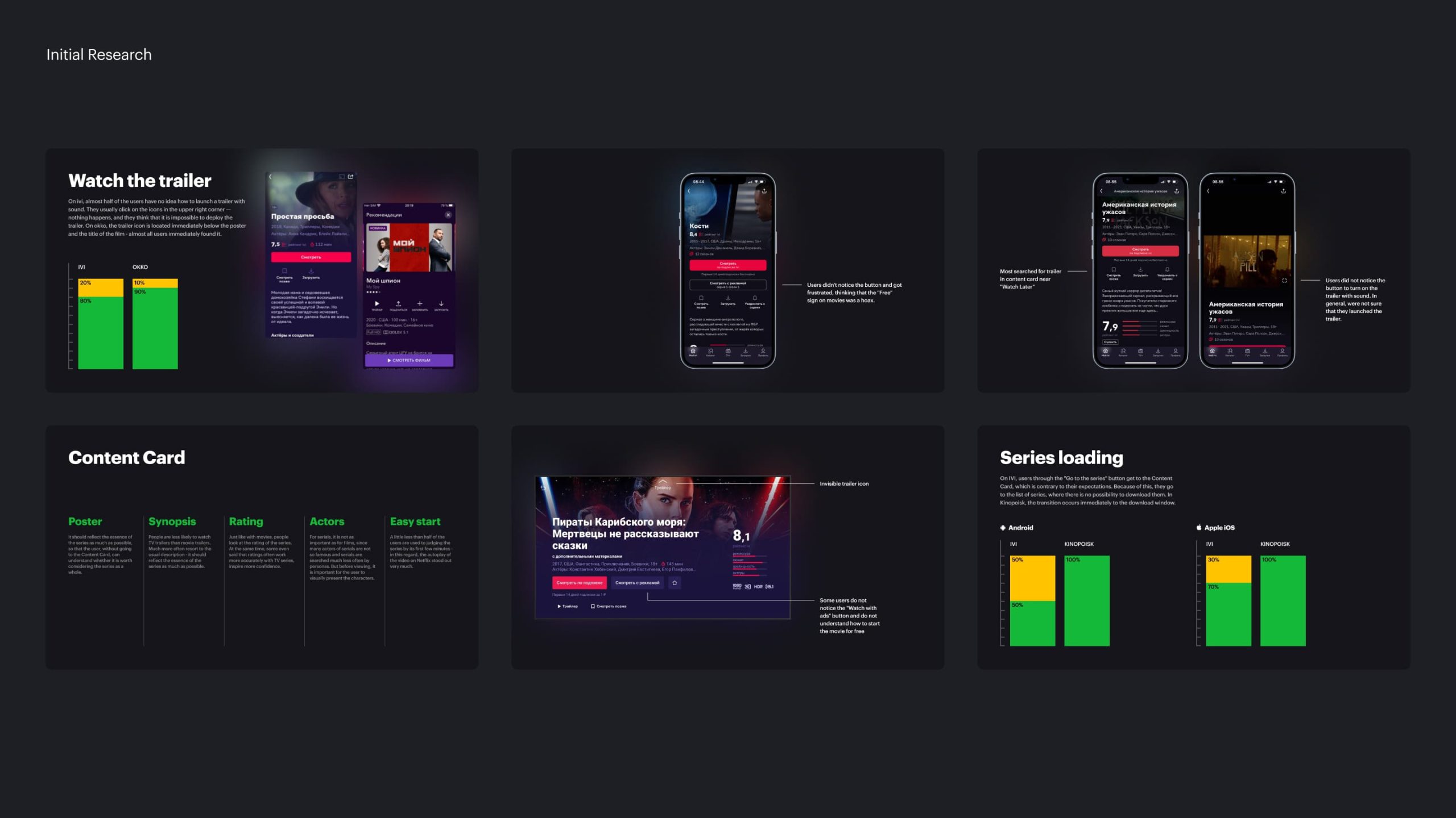
Screenshots of researches with problems related to the content card
We started collecting information about the issues and in the process took into account the latest UX and competitor research, support requests, current and new potential features, platform and stakeholder limitations, and of course our own hypotheses.
As a result, we have accumulated about 20 problems and hypotheses with different levels of complexity. If we sum them up, we get three main categories.
1. Trailer and visual design
We knew from our research that the trailer was interesting, but on the old content card, the trailer was either covered by information and text or only accessible by clicking. It was difficult to figure out how to play the trailer on a Smart TV.
In terms of visuals, we did not use title logos and the background image was covered by text.
2. New features
We have implemented a lot of new things in the product: match, title awards, and editorial descriptions of films, but they were not presented in the content card on all platforms.
3. Series and navigation
On Smart TV episodes and seasons were placed in one small gallery. On mobile phones, you constantly had to jump between catalog and content card.
Ch. II
Mobile Apps
We started with mobile apps. We kept consistency in mind, but each platform has its own limitations, audience, needs, and use cases, so the implementation differs in detail. The main problems with mobile devices:
- It's hard to switch between cards
- A lot of text and meta information
- The trailer is covered by a gradient. It's not clear how to expand it.
- Unreasonably large block with buttons
- Invisible download button

Problems related to the Mobile App Content Card
Since we were strategically moving towards video content delivery, we wanted to make it easier and more convenient to show the trailer. We considered on the concept stage the option of a static juicy cover, but since, according to research, the trailer is better involved in viewing, we decided to change the vector.
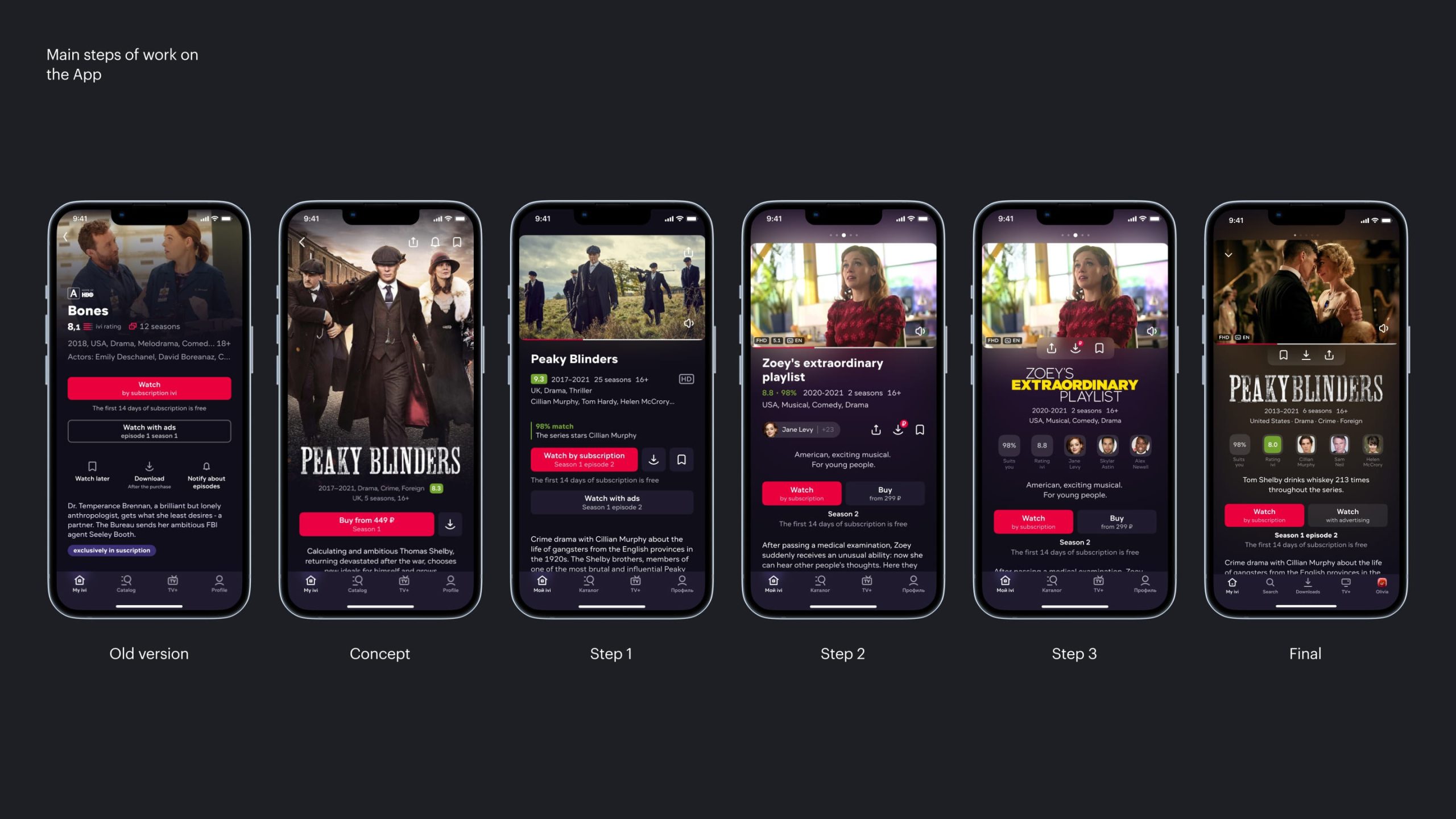
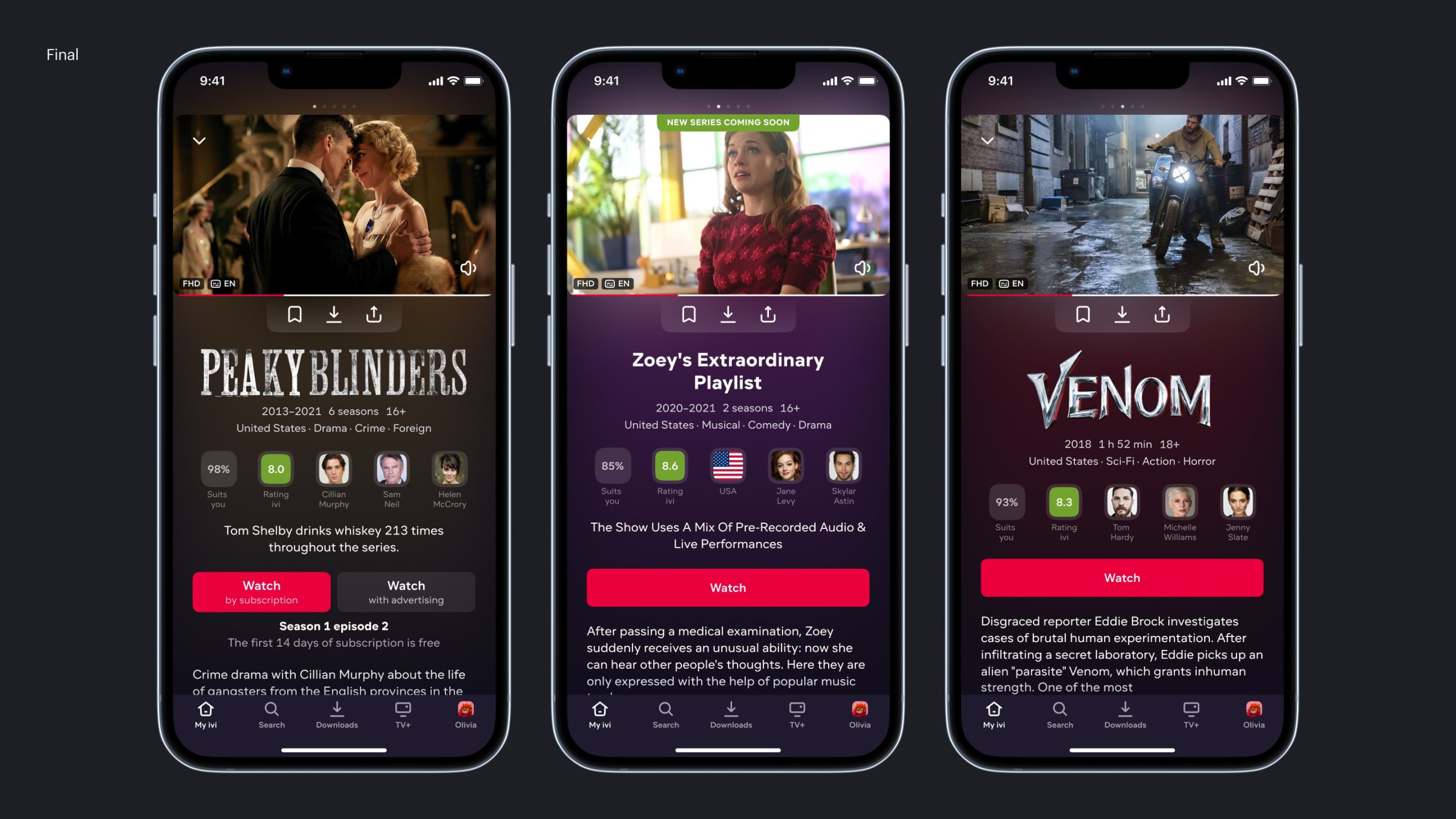
Main steps of work on the App
Meta and Medallions
We conducted a small study and analyzed the data that users use to choose a movie to watch.

User responses to the question "What do you usually pay attention to when choosing a movie?"
Based on these materials, we reassembled the metadata a little. We wanted to somehow provide information about the actors, as well as new functionality — an analogue of Netflix Match. At the same time, we did not want to present this information too dryly. So we got a new block, which we internally call "Medallions".

"Medallions" block
This is a block with the most important meta information about the content. Both with what is important in general and personally for the user.
The first is the content rating, the actors playing the main roles. The second is Match, and those characteristics of the content that are interesting to the user.
For example, if the user watches a lot of French films, then we can display this characteristic in medallions, immediately drawing attention to the fact that this film may be interesting to him.
Main buttons
The content card is complex. It has many stakeholders.
For example, the video player is a separate product unit with its own Video team. Match and explaining of content is also a separate product with a ML team. Texts, logos and graphics are the responsibility of the Editorial team. The Buttons are the unique unit as well. It is owned by the Paid Model team that works on the subscription issues.
Previously, the buttons were placed one below the other. We decided to put them in one row to save the space. We had to rebuild the buttons, and collect documentation for all possible types of buttons, for which, as it turned out, there was no documentation and no one knew all the cases.
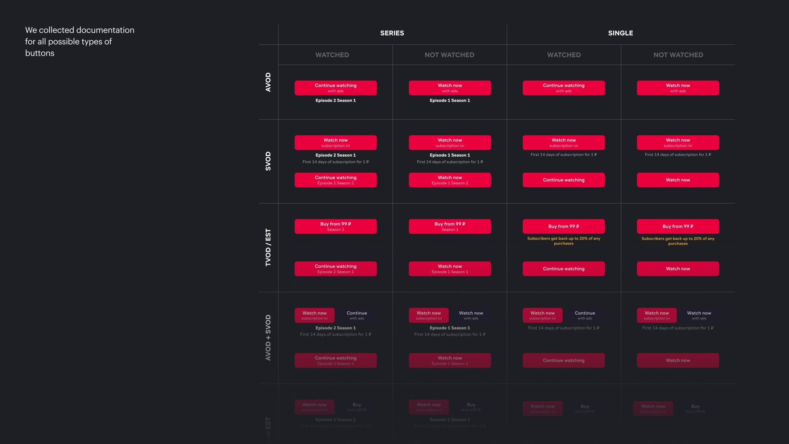
We collected documentation for all possible types of buttons
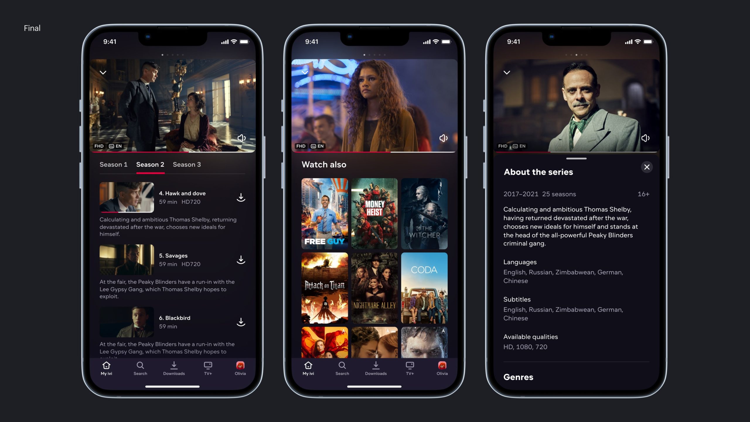
Navigation
An important point in the design was that it takes a little time to study the card itself, but after that, if the content is not suitable, the user had to return to the catalog each time and move on to the next film.
Our goal was to remove these unnecessary transitions. To make the card so that the user gets all the necessary information on the first screen, and if the title does not suit him, he can move on to the next one in one move.

Content cards can be navigated by swiping left or right
To make the card more emotional, we decided to use something similar to background lighting, such as Ambilight in Philips TVs.
Final
Final
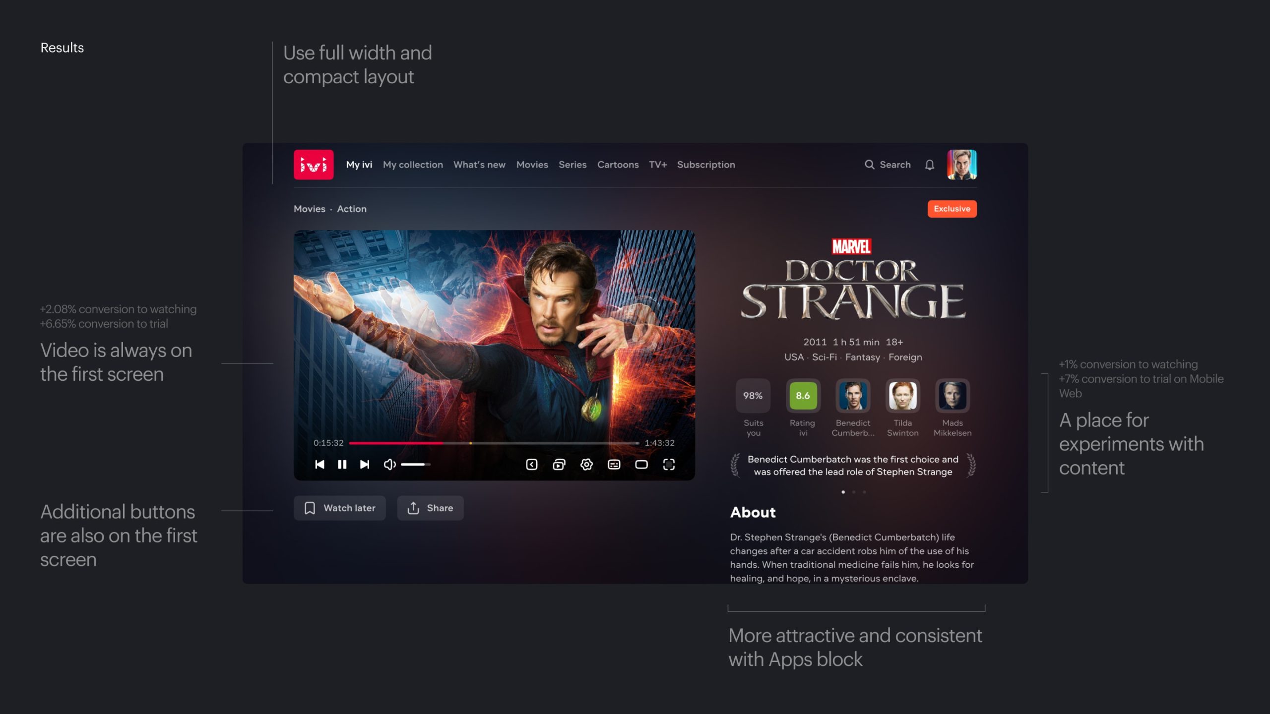
Results
Ch. III
Web
Initially, on the web, we were looking at a visual similar to Smart TV. A beautiful, large cover that then transitions into a trailer. But we encountered several obstacles that forced us to radically reconsider the decision.
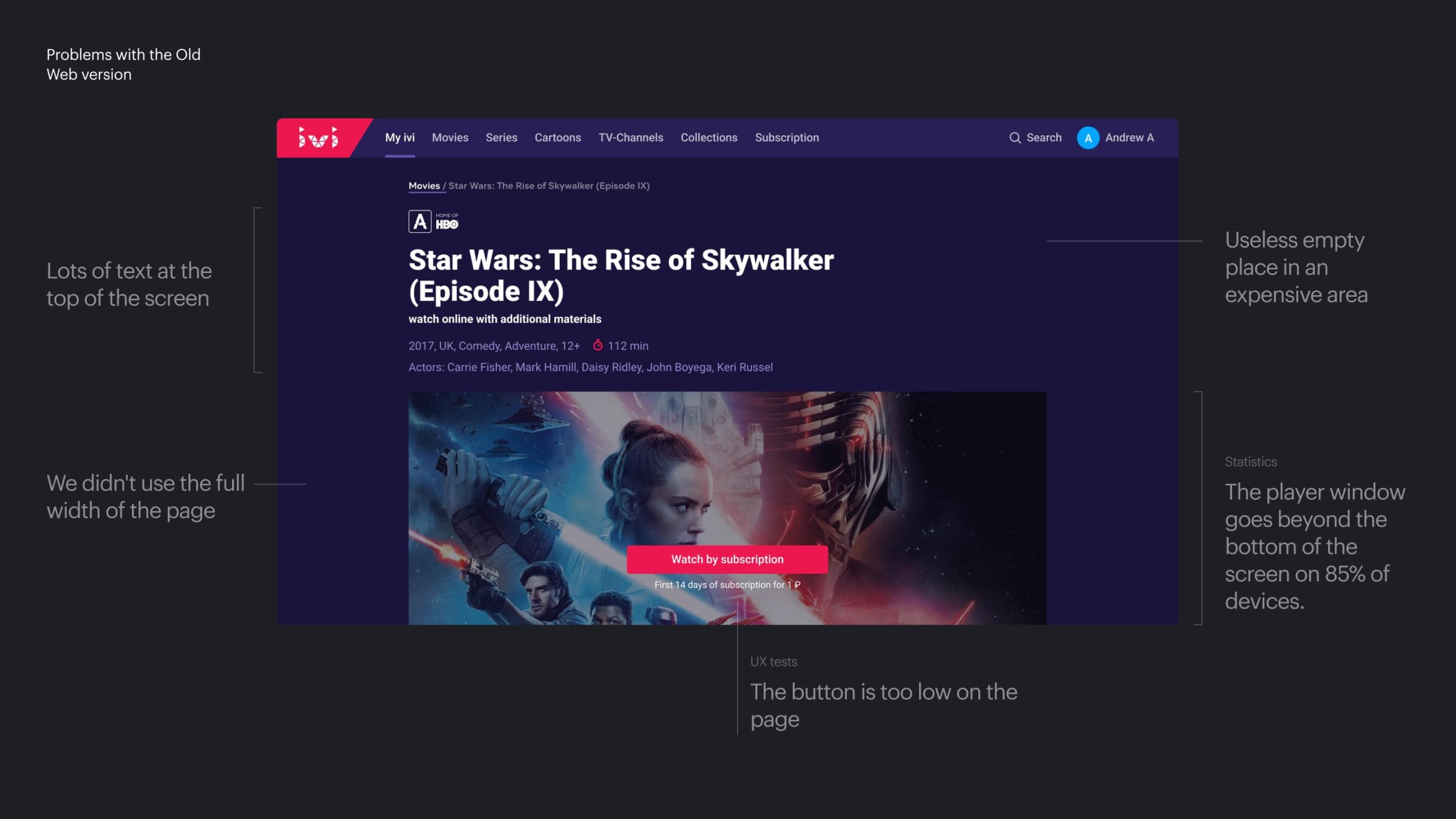
Problems with the Old Web version
Firstly, IVI works not only with a subscription monetization model, but also with advertising. This way, we allow a large audience of users to watch a limited catalog of legal content for free. In the advertising model, the player is an integral part of the advertising inventory, and these are long-term advertising contracts with documented areas. Our changes would have led to a revision of all these contracts.
Secondly, organic traffic is a significant part of attracting new subscribers and new users. Search engines have their own requirements for the page structure. Because of this, for example, we had to abandon logos for non-subscribers.
Thirdly, the video player code on the network was organized somewhat differently than in other client applications. Therefore, we ultimately decided to leave the player as a separate window. However, we improved the position of the video on the screen, only slightly reducing its size.

Main steps of work on the Web
SEO, Headlines, Visual and Ads
In addition to the standard interface that we did, it became necessary to also provide additional states. Namely: to think over ad impressions on the web, as well as to work on SEO optimization.
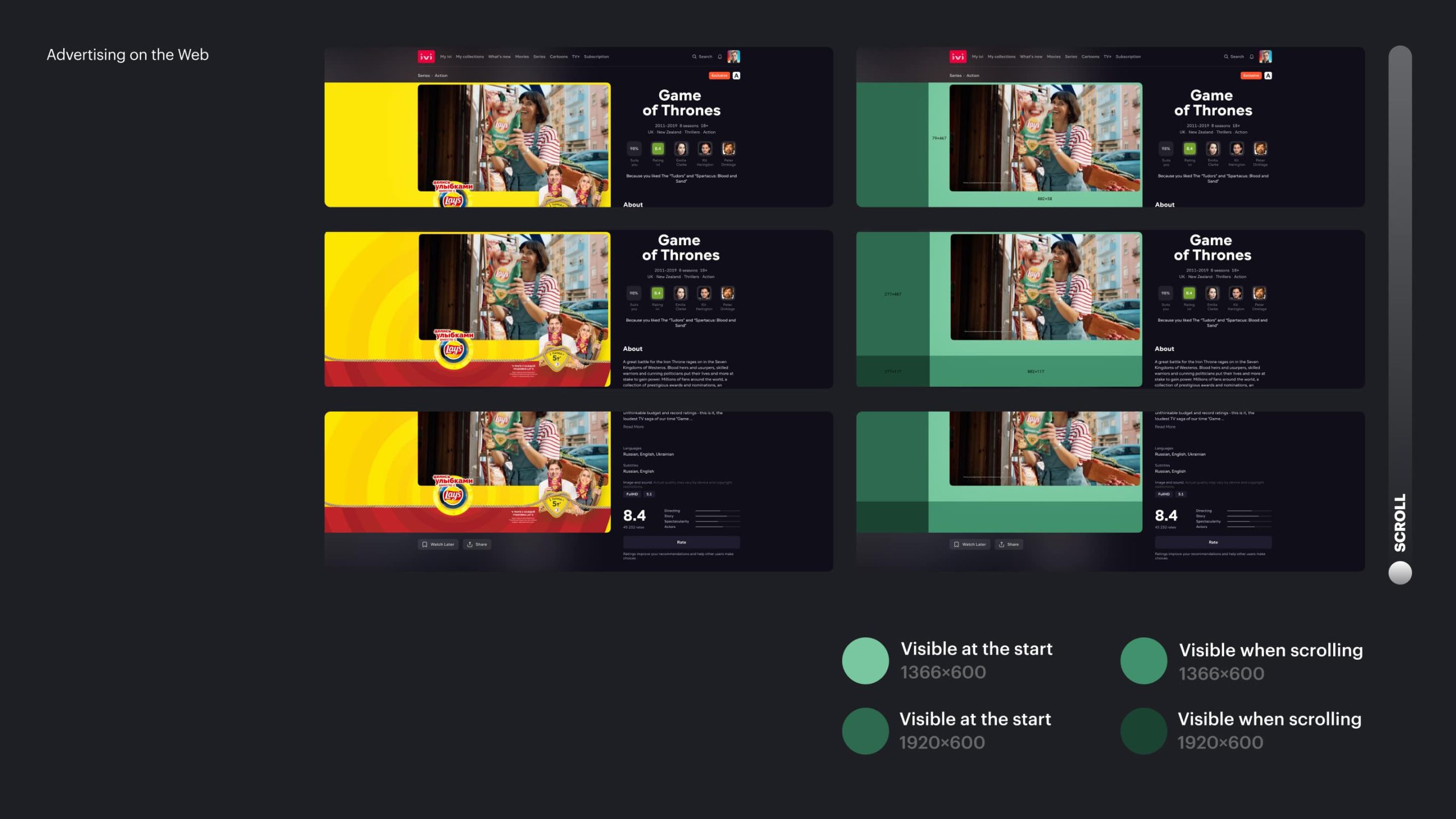
Advertising on the Web
We encountered the fact that SEO content titles often contain additional information useful for search engines. This significantly lengthened the titles. Some of them reaching truly enormous sizes.
We wanted to keep a visually pleasing card, so we had to implement an algorithm for choosing the size of the title. On mobile devices, such things are organized quite simply, but for the web, I made a scheme that determines the length of words and the number of letters in the title and, depending on these two parameters, determines what size the title should be for each text resolution.
The algorithm worked as it should, but perhaps I got a little carried away with the number of options.

SEO Text Heading Algorithm
Encyclopedic card
A separate task was the development of the so-called fake or, as we call it, an encyclopedic content card, which will contain much more information than a regular card.
This is a content card for the content which is absent on IVI. It is close to Wikipedia. It contains more meta-information about the title, there may be additional data, photos, and text descriptions for episodes. It is essential for SEO.

Encyclopedic card
Thus, after several iterations of working with stakeholders from SEO and advertising, we finalized the page.

Final
Results
Ch. IV
Smart TV
When we started working on Smart TV, we also identified the main problems of the page. Most of them were similar to other platforms, but there were also issues specific only to TV. For example, navigation problems.
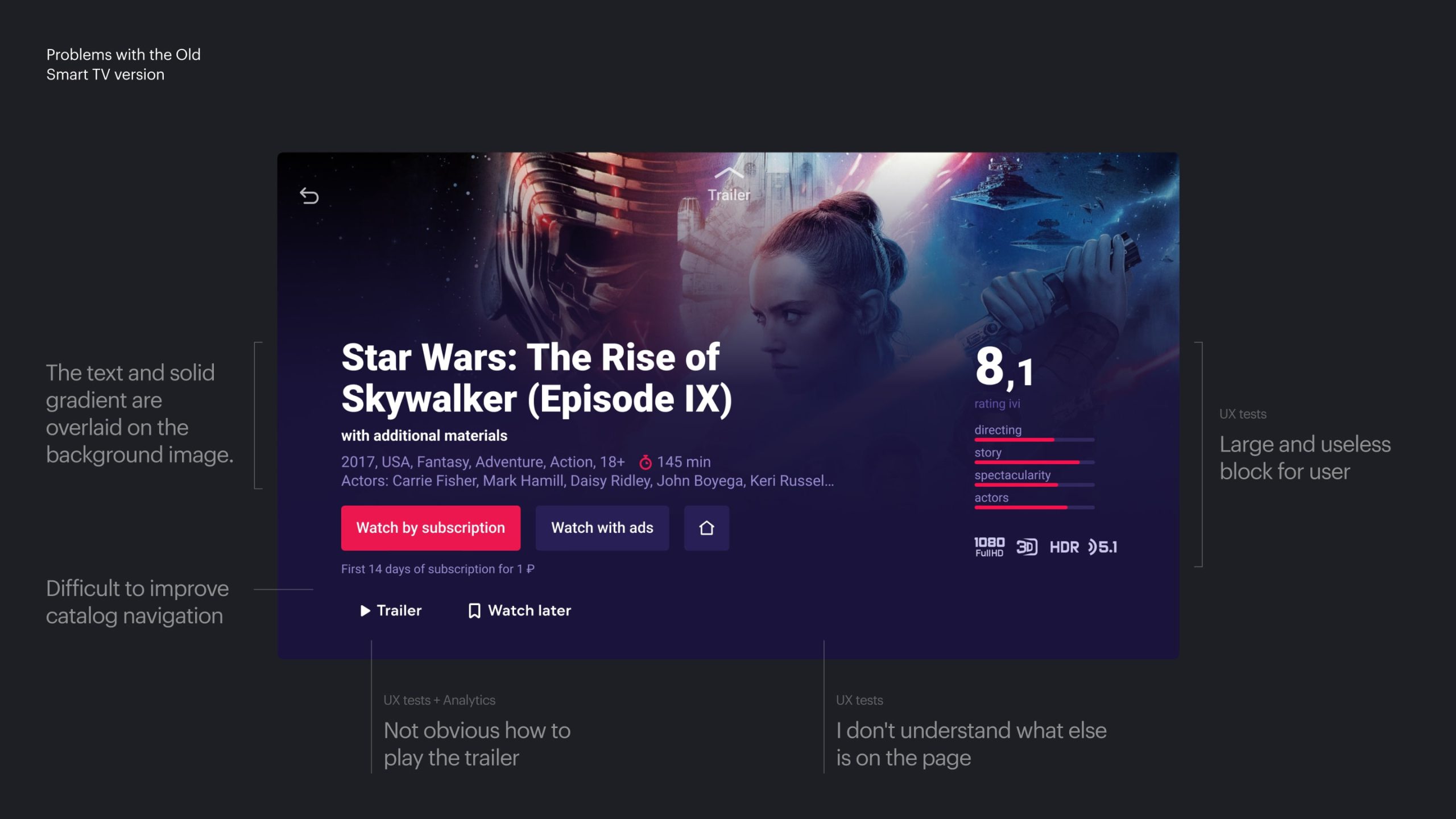
Problems with the Old Smart TV version
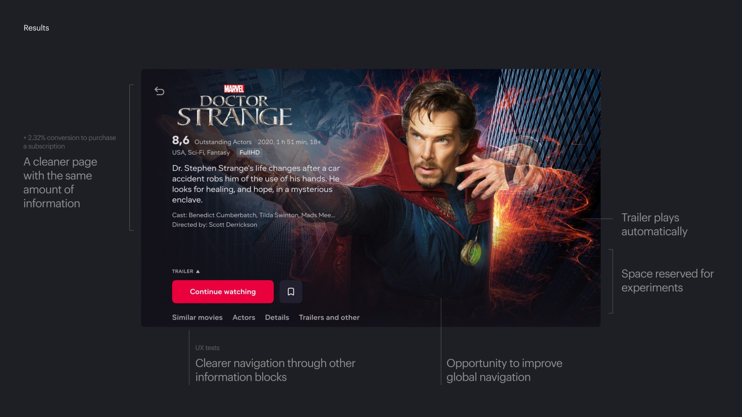
The implemented screen format on Smart TV has already become a kind of industry standard. We've repositioned the content, softened the background gradient to make the trailer more enjoyable to watch, and added a seamless transition to the trailer after a while.

Main steps of work on the Smart TV
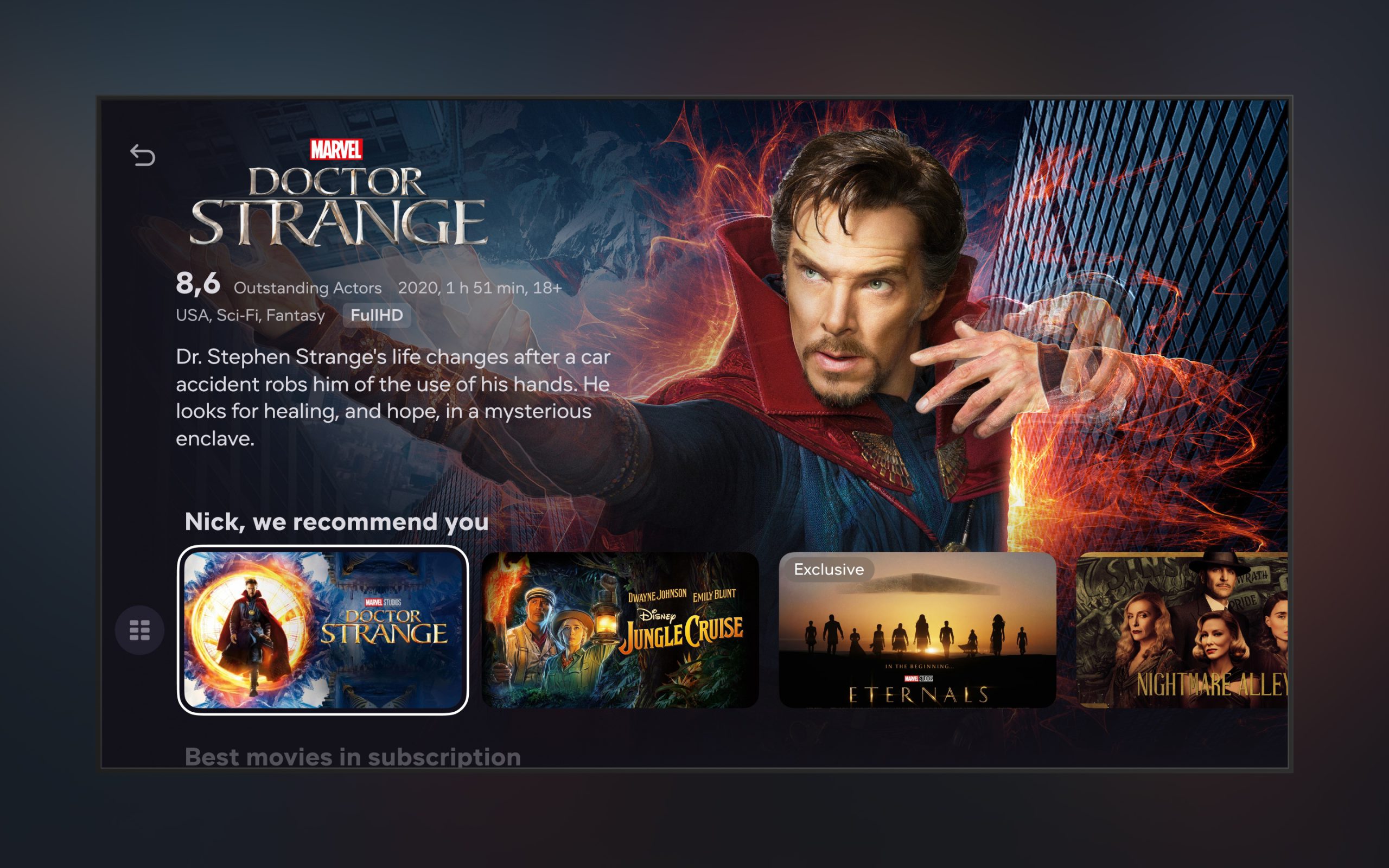
Series and Navigation
We slightly complicated the navigation, and added tabs, where we laid out the information on different shelves. We did this because it is more important for the user to navigate through episodes and seasons on the page. We are going to experiment with the position of these page subsections.
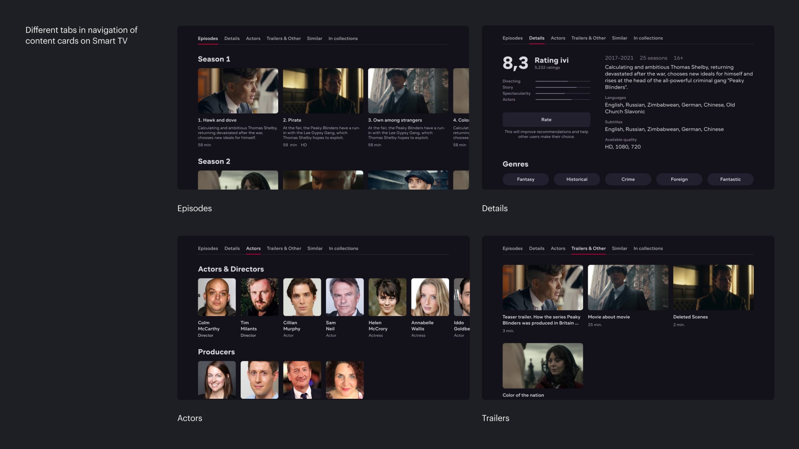
Different tabs in content card navigation on Smart TV
Block with additional information
As I said above, we had a lot of new experiments and features in progress. We decided to allocate a separate place on the content card for new features. It is suitable for secondary, additional information while deciding about watching the content. We had quite a lot of such experiments.
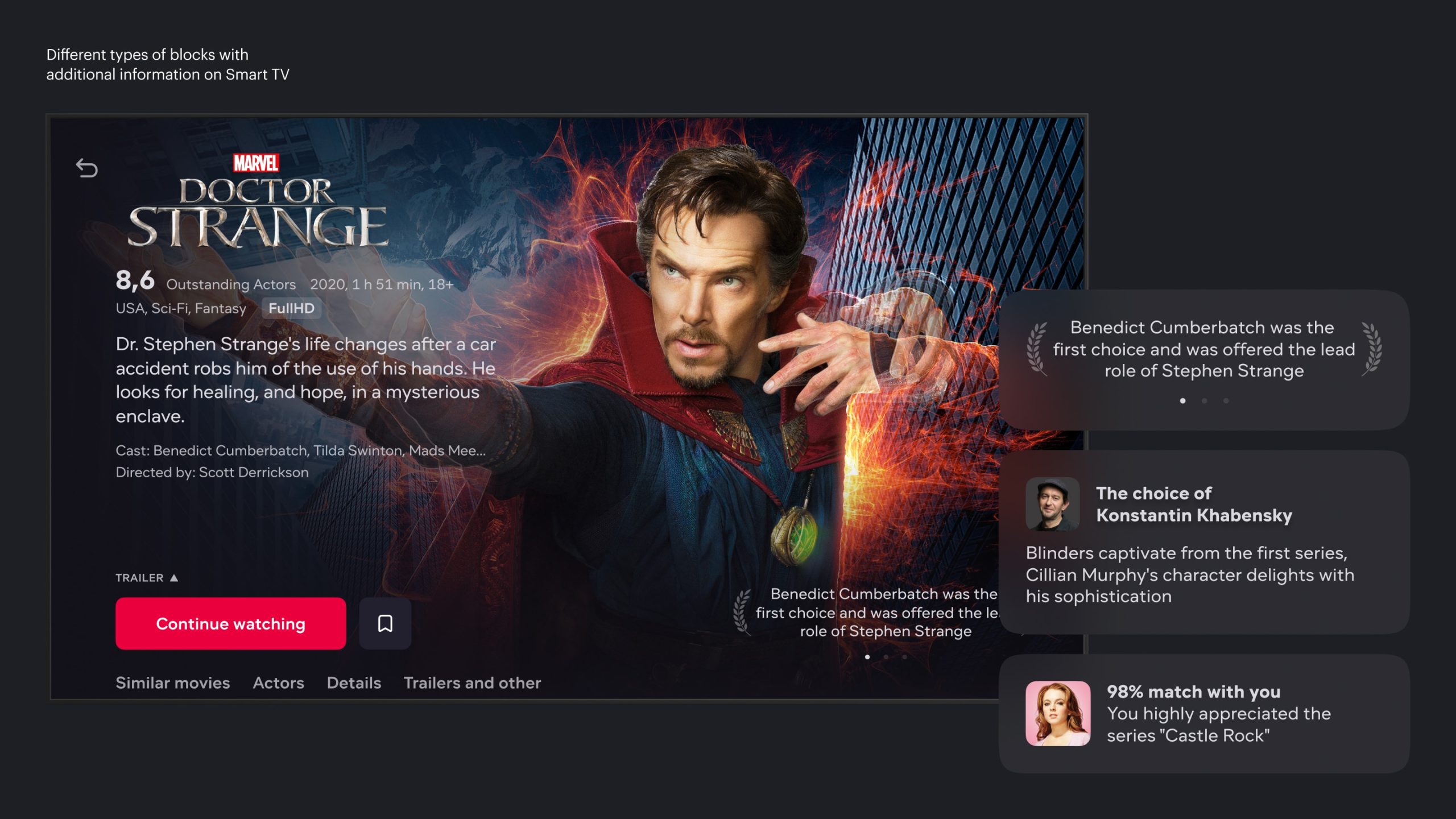
Different views of the block with additional information on Smart TV
Full Screen Gallery
It is no coincidence that we made a new content card like this. The next step in the development of the content card on Smart TV was the appearance of a full-screen gallery in the catalog. There is not much to say about this solution as it is industry standard, however, the transition to this standard became possible only after the redesign of the content card.
Full Screen Gallery on Smart TV

Final
Results
Ch. V
Handoff and Communication
It was not possible to draw different states of each page block in separate screens. But it could be done within the documentation. In the documentation I described:
- The behavior of each element, as well as all the necessary logic, a description of the algorithms
- Linked the elements of each block with variations of the Design System components
- Made adaptive blocks, including their various types
- Gathered a specification including padding between blocks and other details
We also collected technical documentation in confluence, in which the assembly of blocks was described from the side of the backend and information from requests.
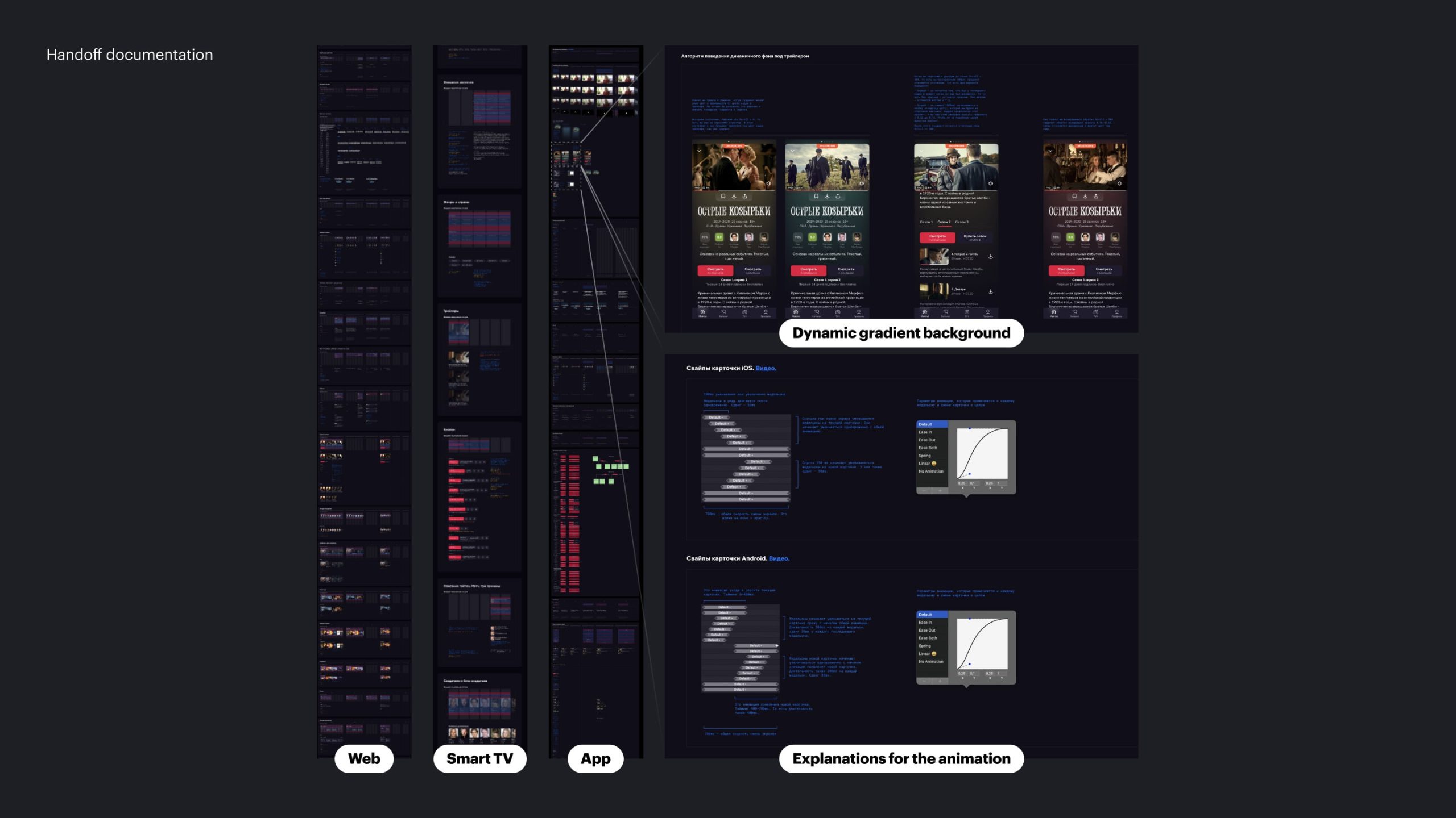
Handoff documentation
Communication
At the design stage, at the peak, we had about 12 people with whom we approved the results. In addition to colleagues and my immediate supervisor, the team also included product managers responsible for various details of the content card, as well as heads of the product department. The number of people was substantial and iterations were frequent.
It was impossible to get the whole team together every day for discussion, so I decided to use looms to record progress. The videos were a much better representation of my thought process and argumentation, and they could be viewed by all team members at any convenient time. In addition, the history of changes was saved.
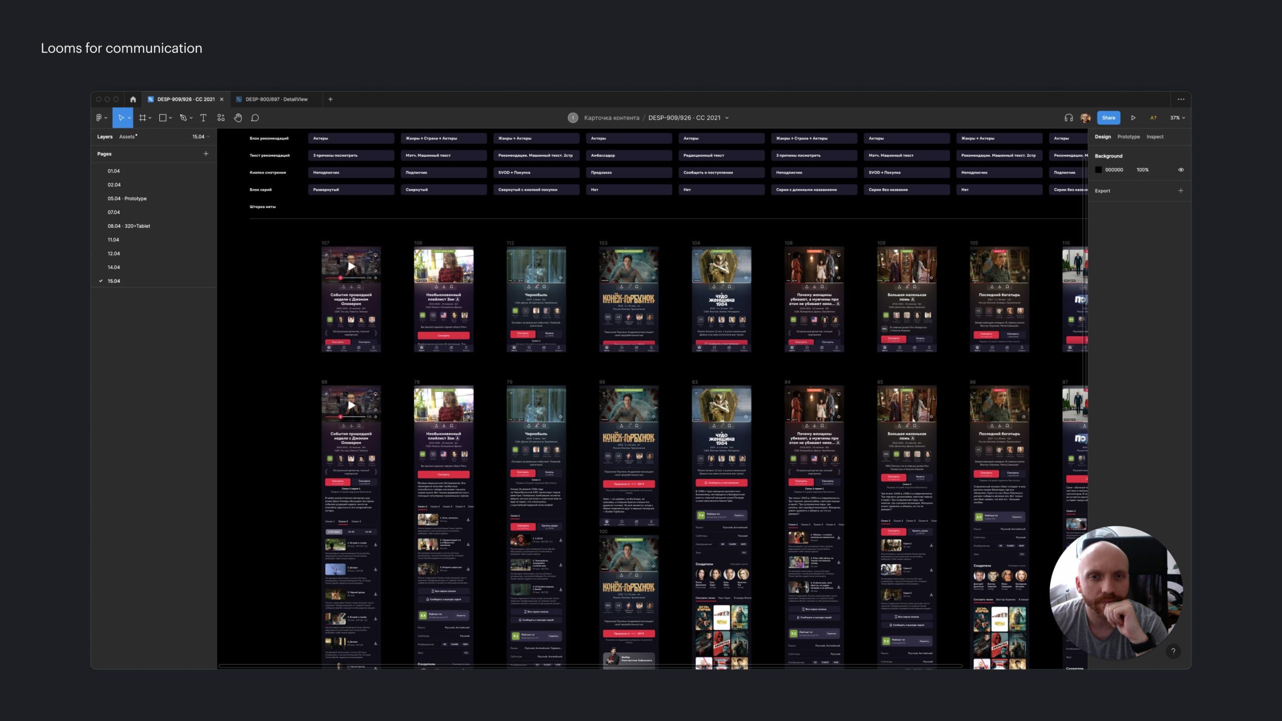
Looms for communication
I can't say that this is a suitable solution for the usual quiet work on a project with a small team or offline. But for fast iterations in a large project team in a remote environment, this turned out to be a great solution.
Ch. VI
Results
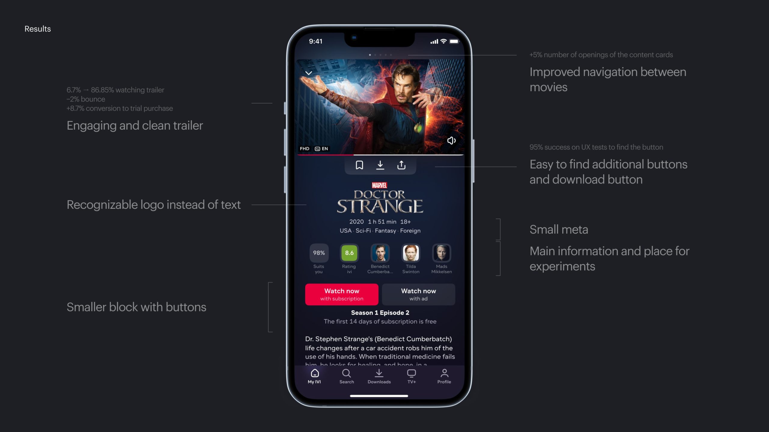
Before launching AB testing, we conducted internal Side By Side comparison and UX tests. The results were encouraging. Users went through all the main scenarios well and in direct comparison, the new card won by a large margin on all platforms.
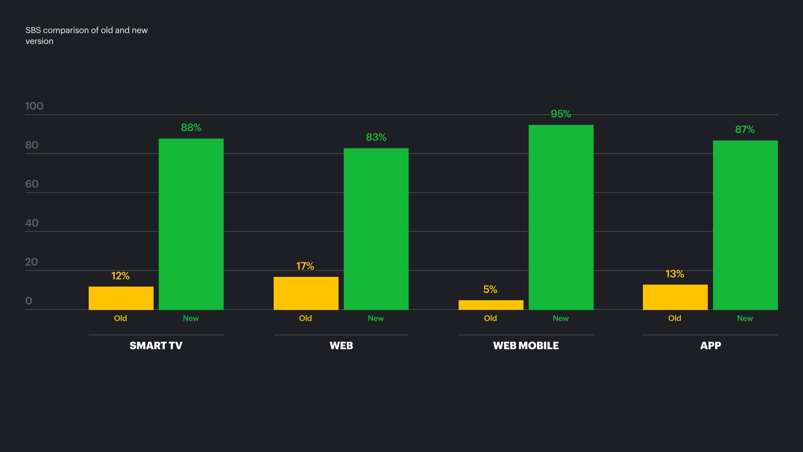
SBS comparison of old and new version
The card was rolled out 100% on all platforms. Globally, if we count all platforms together, this experiment ended with a plus for us. The new card performed best on global metrics on Smart TV, mobile web, and apps. The desktop web looked worse at the time of rolling out, but we have plans for further work on a new card and new experiments.
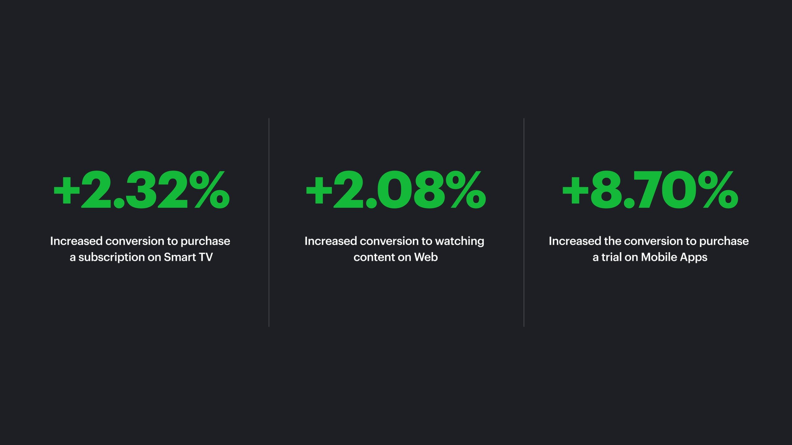
Metrics
What we have learned in the process
The obvious conclusion is that you should not try to implement everything at the same time, especially when it comes to a complex product with a large legacy:
- It's unclear what affects on what.
- Difficult to approve with a large number of stakeholders
- Long to develop
- The return is not always comparable to the effort put in.
- For every change in any block, research is needed. However, due to the large number of changes at the same time in one place, the whole flow of using the product can change. The reaction of users becomes difficult to predict.
Detailed documentation in Figma is extremely convenient for developers, however, it is necessary to allocate time for its development and possible improvements in the future, since everyone will be guided by it.
You should always set aside time and resources to review analytics and make operational adjustments. The designer's eye is useful for generating hypotheses.
More selected projects
Drop me a line
skorobogatkonn@gmail.com