In parallel with startup-critical features, we also improved everyday UX quality to compete not only through data and ML capabilities, but through usability.
Based on analytics and expert feedback, we upgraded less visible but high-frequency interaction points.
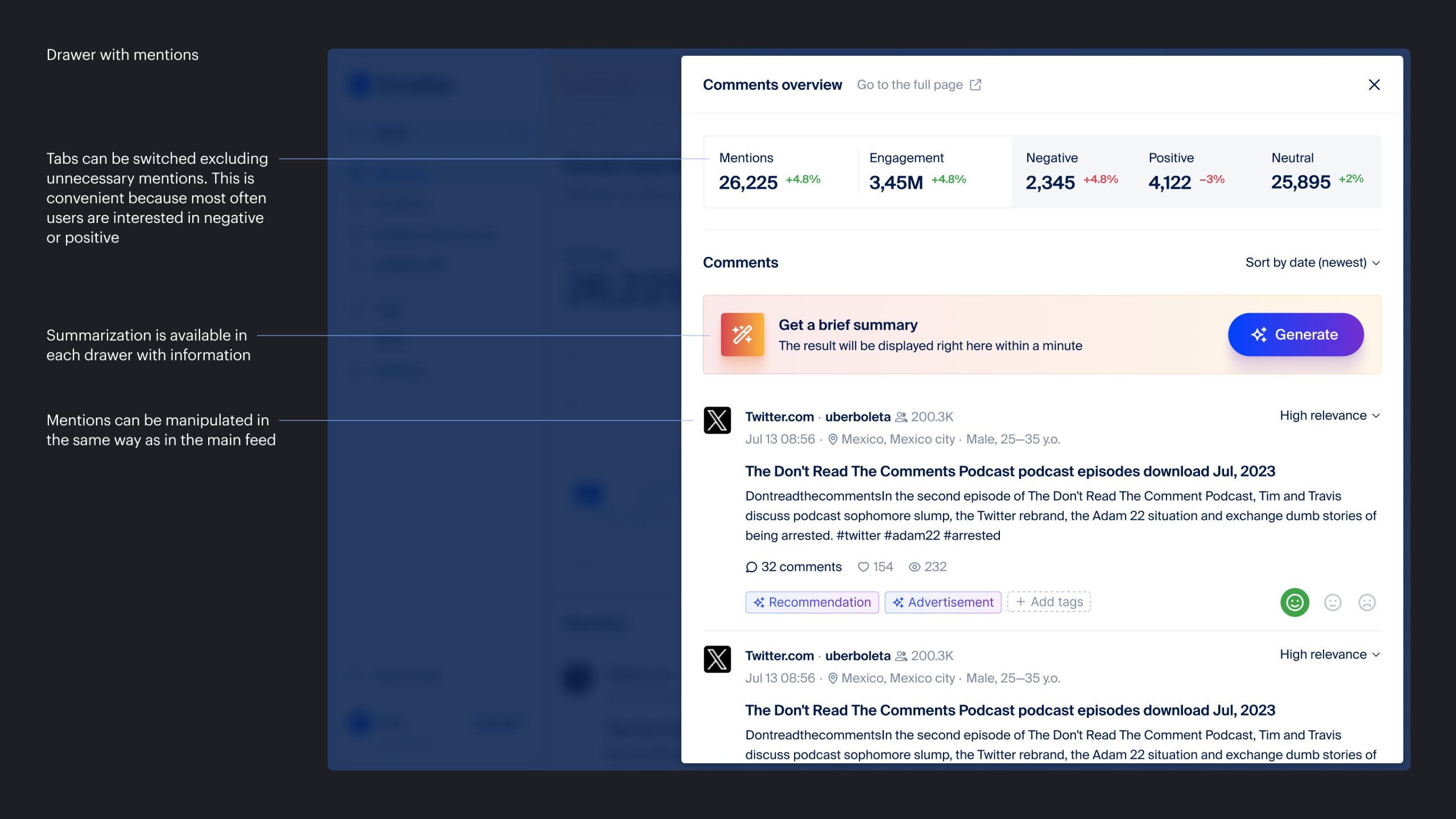
Problem 1
Expert interviews showed a repeated pattern: users wanted to click chart or table segments and immediately inspect related mentions.
Solution
Add a quick preview drawer linked to selected data points in charts and tables, so users can inspect mentions without losing context.
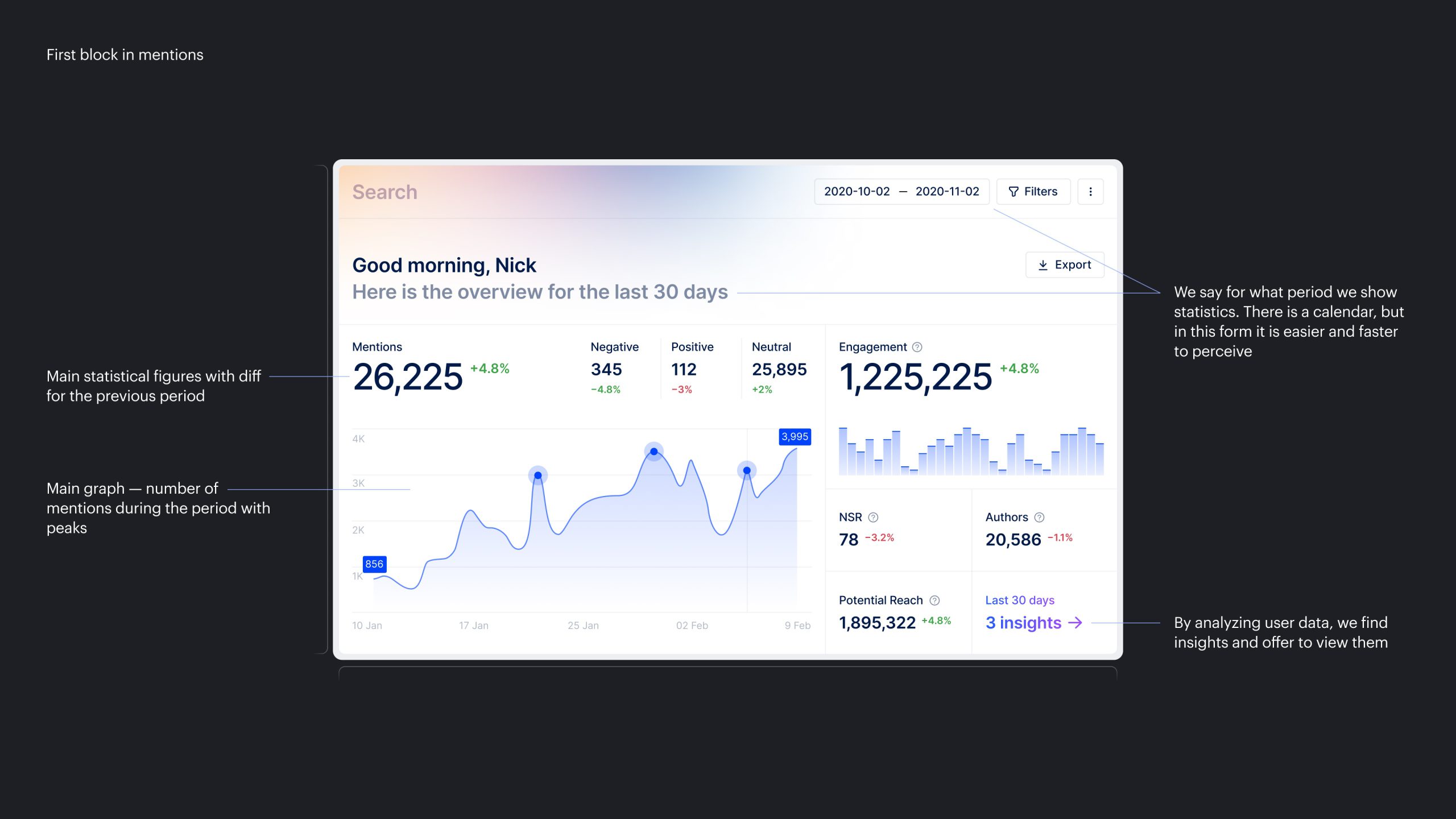
Problem 2
- To see the key metrics users care about, they had to navigate to analytics;
- Mention volume was hidden inside chart legends;
- The mentions page looked weak visually despite being a first-touch surface.
Solution
- Expose core metrics, including mention count and period-over-period difference, directly in the main mentions block;
- Redesign the block to be more compact, information-rich, and visually clearer.