As part of our work on discovery, one of our first questions was: how do we help people get to know a game in the most convenient and effective way?
Analytics showed that we had a huge number of micro-sessions under one minute. This means a large portion of users explores new games by directly trying to play them.
User research showed that people mostly choose games based on the image and the gameplay snippet we show on hover over the game card.
Overall, this is not a problem, and as we saw later, it is even beneficial for the business because every such game launch is accompanied by an ad impression. However, games load quite slowly. Having to wait for loading each time just to be disappointed is a bad experience. And strong, high-quality long sessions improve retention, which is far more valuable in the long run than short-term gains from micro-sessions.
We tried to solve this problem with a project internally called the Middle Layer. In practice, it was a way of presenting a game to users in different formats.
Below are the main hypotheses and experiments. Early in the project, we decided to explore multiple directions at once so we could later compare their effects.
In this overview, I mention several key metrics. However, when analyzing experiments, we evaluated the overall impact across product and business metrics correlated with each hypothesis: retention, average gameplay time, time-to-play, effects on catalog performance, and other analytics calculations specific to each experiment.
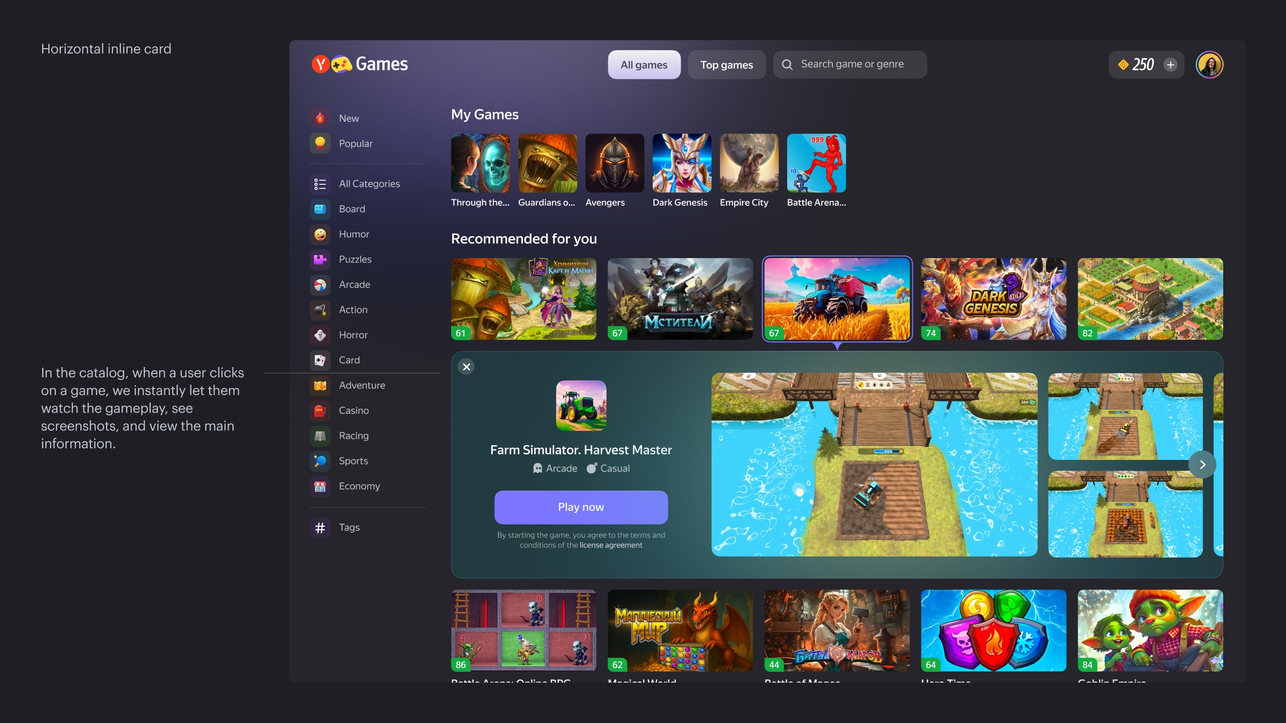
Hypothesis 1
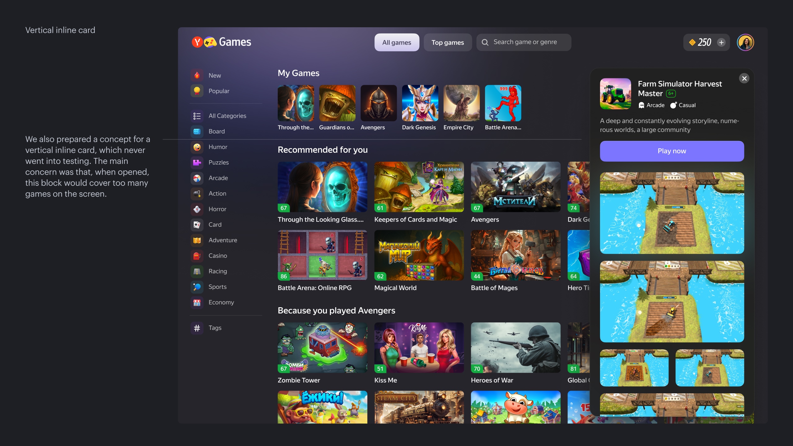
If we provide users with a large gameplay video and all essential information in one click, without forcing them to navigate away from the catalog, we will increase both conversion to gameplay and high-quality sessions (10+ minutes) by simplifying and improving the selection process.
Solution
Create an inline expansion inside the catalog that shows all basic game details on click. To save resources, we decided to test only the horizontal version.
Result
Short and medium sessions dropped sharply by 13-15%, while long sessions did not grow as expected and stayed roughly the same. Total time spent in games did not increase. Conversion to gameplay decreased by 4%. The experiment was closed in favor of the control group.
Interpretation
People did become more deliberate in choosing games, but because our main catalog consists of simple games, we unintentionally made the selection process more complicated. Users spent more time choosing and watching, and less time trying to play.
From a UX perspective, this could be seen as a positive: fewer unsuccessful gameplay attempts (fewer short sessions). But from a business perspective, we were hurting a large number of revenue metrics, since gameplay is directly tied to ad impressions.
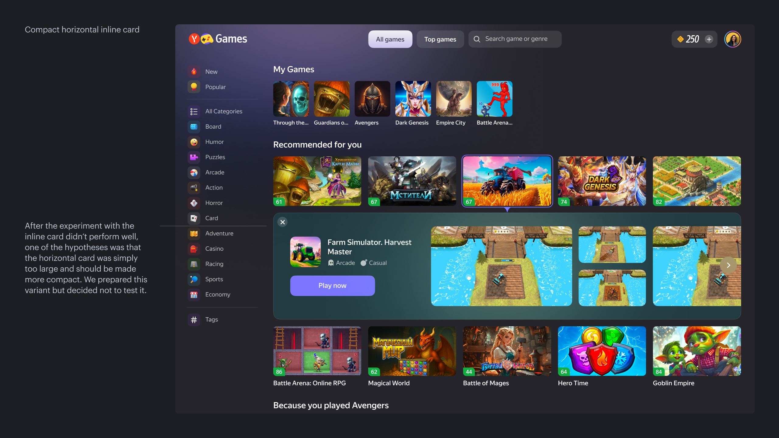
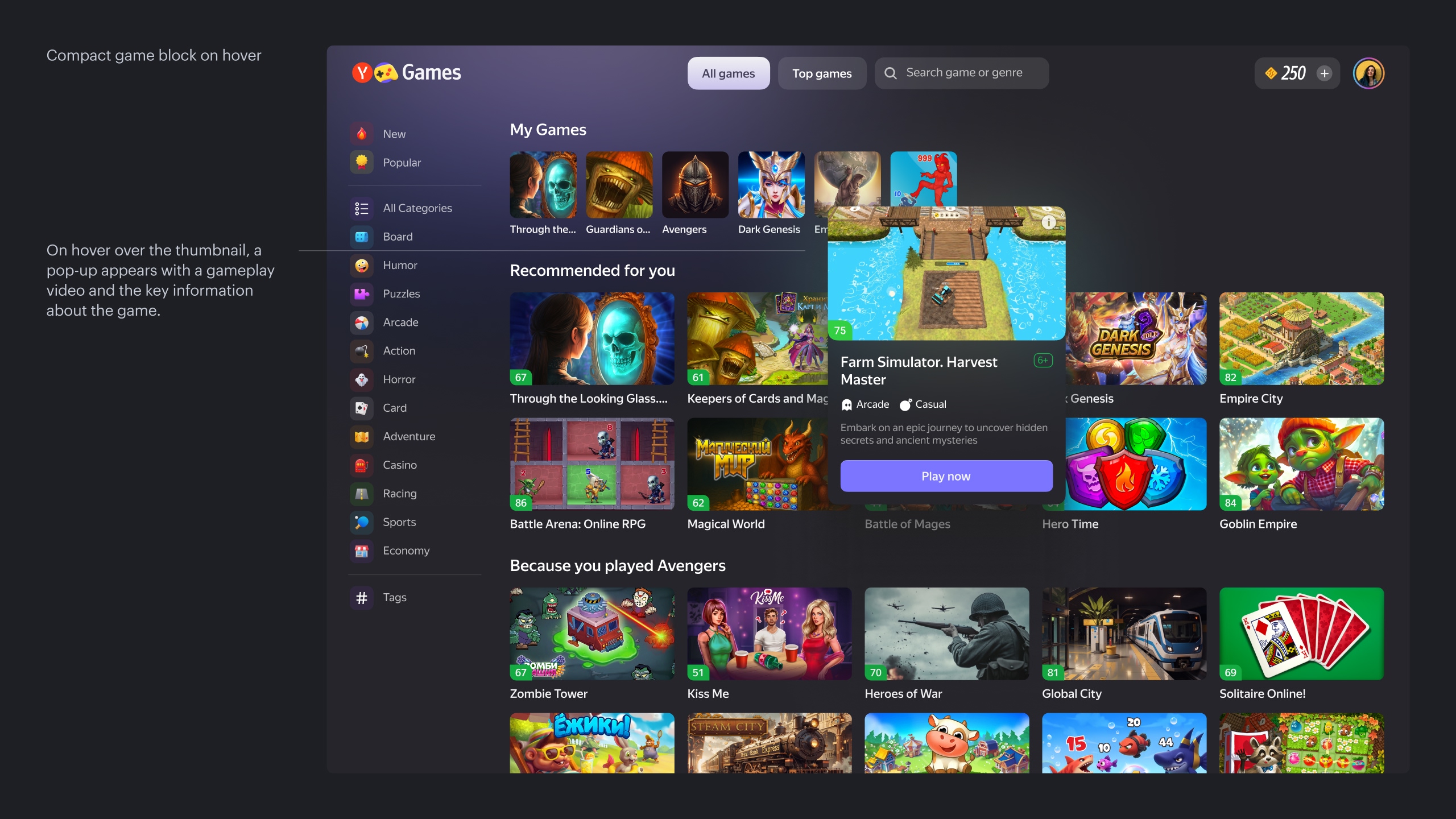
Hypothesis 2
If the inline card is too aggressive a format and radically changes the grid and user behavior on the page, then maybe we can keep showing gameplay but in a more compact way. This could help balance the drop in short sessions with an increase in time spent in long ones, while also avoiding such a dramatic decrease in conversion and, as a result, cushioning the revenue decline.
Solution
Show a compact game block on hover.
Result
This solution was more successful. The number of short and medium sessions went down, and long sessions remained unchanged. As expected, conversion to gameplay dropped by 2%. However, average gameplay time showed a statistically significant increase of 2%. The experiment was closed in favor of the control.
Interpretation
The effect was similar to the inline card. People clicked less on random games, but when they did choose a game, they tended to play longer on average. From a UX point of view, these are good signals, but business metrics were negative, as the increased time in-game could not compensate for the decrease in the number of sessions.
We could have kept the experiment running longer to see its impact on retention. But since the solution turned out to be technically complex to maintain and evolve, the experiment was closed in favor of the control despite the positive result.
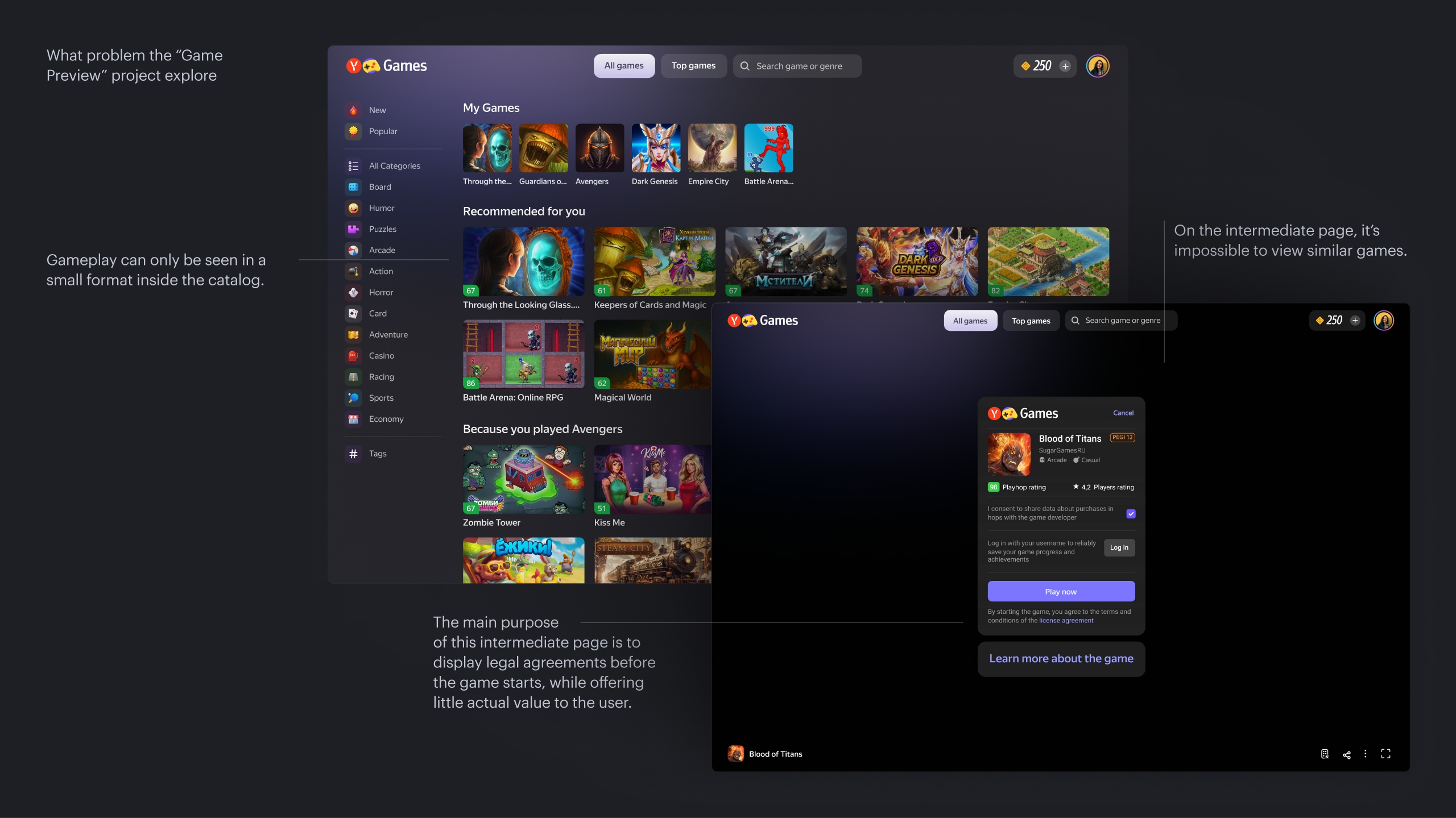
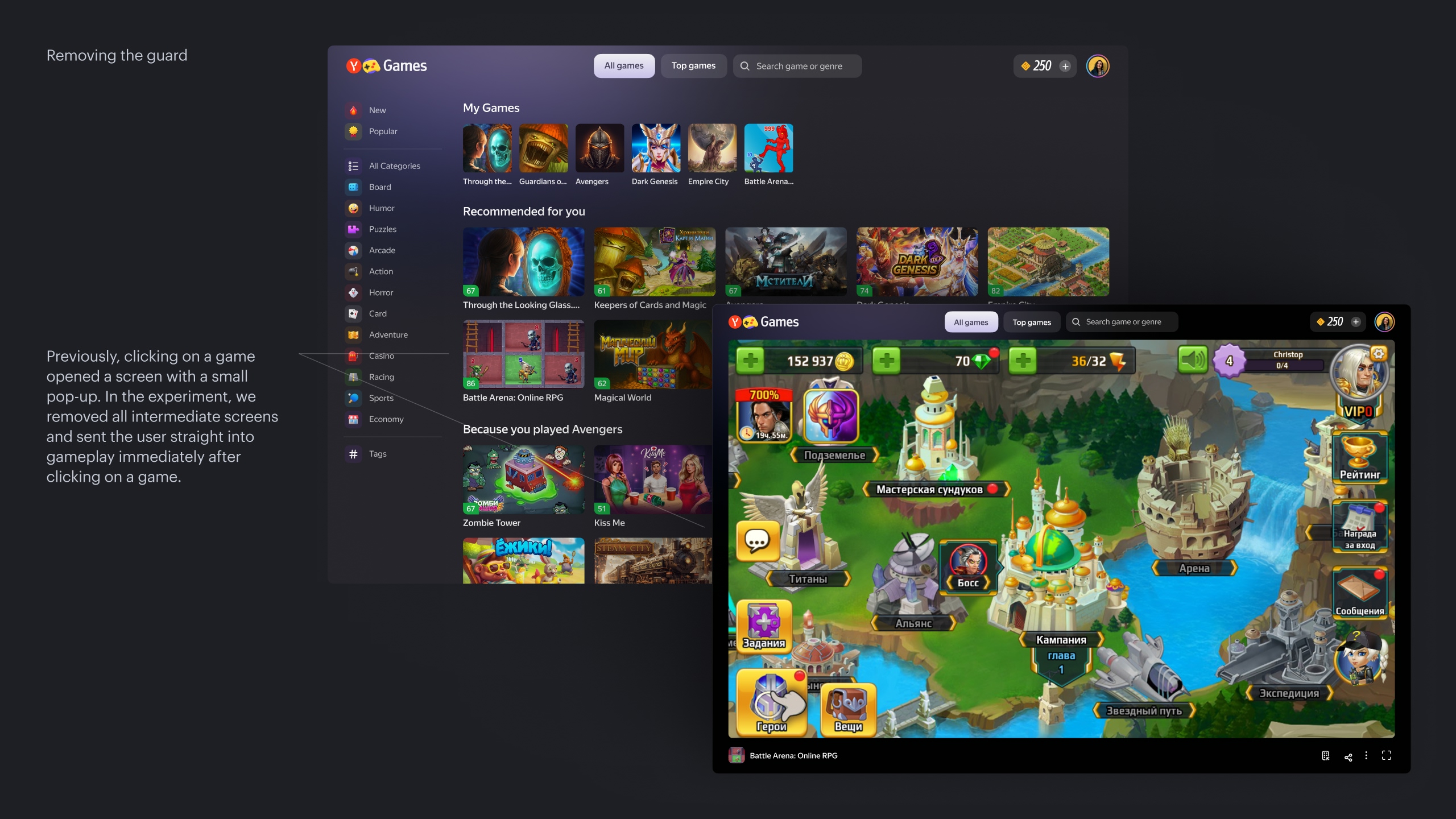
Hypothesis 3
If we remove the intermediate guard screen and stop showing any information about the game at all, immediately starting gameplay instead, then the ability to try the game faster, without evaluating it by video, should help increase time spent and the number of high-quality sessions.
Solution
Remove all unnecessary clicks. In our case, this came with legal complications, because the guard originally existed for a reason. Among other things, it served as a consent page for legal details.
Result
As expected, conversion to gameplay increased. But what we were hoping for did not happen: time spent did not grow. Moreover, user churn from the game page started to increase. As a result, the experiment was closed in favor of the control.
Interpretation
Each game weighs from 5-10 up to 30-50 megabytes or more. Although developers try to optimize size, it is still significant.
The existing guard screen, despite being somewhat meaningless, artificially shielded users from the waiting experience. A person could read information about the game while it loaded in the background. After removing it, the encounter with the loading screen happened immediately, and we as a service could not speed up this process. To some extent, this also explains the failures of previous experiments.
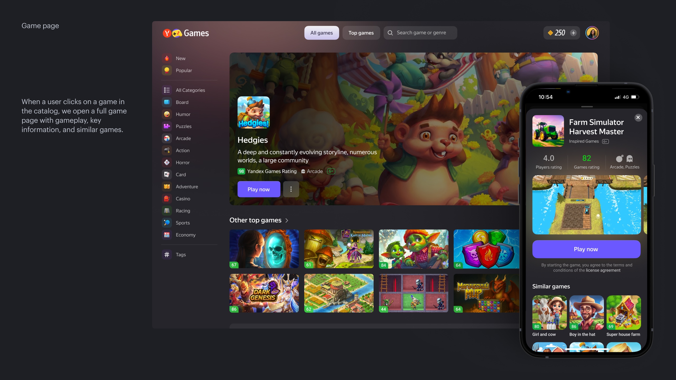
Hypothesis 4
If instead of the guard we create a regular game page with all the necessary information, it will be easier and more convenient for users to choose a game, because this format is more familiar to them. This should increase long sessions and overall time spent. As a bonus, it also solves the problem that we currently have two separate game pages: the guard and an SEO-focused game info page.
Solution
Replace the guard with a regular game page.
Result
After the previous experiments, we did not expect that a new page would magically solve all our problems. And that is exactly what happened. The short-, medium-, and long-session metrics reacted more or less the same way as in earlier experiments. Time spent grew slightly. However, we did not hurt business metrics, because on the game page we could show ads, unlike with other formats.
On top of that, this format could help us strategically. A dedicated page gives much more room for future experiments compared to small modal formats. So we decided to make it our primary approach and continue developing it.
The experiment was accepted.